





Offshore / Onsite
Hire Dedicated Team
Access a dedicated team of UI/UX designers and researchers, on-site or remote, who work alongside your engineers every week.
Get StartedMobile app design for iOS and Android that respects each platform instead of shipping one layout twice — with offline states, permission strategy and store assets treated as design work rather than an engineering afterthought.
Our Clients

















Mobile is not a narrow browser window. It is a device held in one hand, on an unreliable connection, by someone who will be interrupted within ninety seconds. Four constraints change every layout decision, and none of them show up in a desktop review.
Primary actions at the top of the screen, where they were on the desktop nav and where a thumb cannot reach.
Destructive and frequent actions placed by reach zone, with the bottom third reserved for what people actually tap.
A spinner and an error toast. Anything the user typed is gone when the request fails in a tunnel.
Optimistic updates, queued writes and a visible sync state, so losing signal is an inconvenience rather than lost work.
A long form that resets when the app is backgrounded, so the user starts again or gives up.
State preserved and restored, with progress shown so returning mid-task is obvious rather than disorienting.
One shared design applied to both stores, so navigation and gestures feel foreign on at least one of them.
Native navigation, gestures and typography per platform, sharing the brand rather than the component tree.
Screens are the smallest part of it. The rest is what decides whether the app gets kept past the first week.
iOS and Android designed against their own conventions — navigation, gestures, typography, system dialogs — sharing tokens and brand rather than layout.
The path from install to first value, with permission requests placed where the user understands why they are being asked rather than on launch.
Optimistic updates, queued actions, conflict handling and a sync indicator people can trust. Designed, not left to the network layer.
What is worth interrupting someone for, what belongs in an inbox, and the settings screen that stops uninstalls from over-messaging.
Dynamic type at the largest sizes, VoiceOver and TalkBack order, contrast in sunlight and hit targets that work with a real thumb.
Screenshots, captions and preview video that reflect what the app does, plus the what-is-new screens for each release.
The common thread: used standing up, in a hurry, or somewhere with poor signal and no patience.
Engineers, drivers and inspectors working offline, in gloves, one-handed. Every assumption a desk app makes is wrong here.
Where week-one retention decides the business case, and the first-run experience is most of that number.
A mobile surface for a web product, where the temptation is to port every feature rather than the three people need on the move.
Payments, bookings and applications, where an interruption mid-flow must not cost the user their progress.
Where accessibility, consent and audit are requirements rather than improvements, and store review is stricter.
An app with one-star reviews about crashes and confusion. Usually the structure, not the visuals.
Every app has a corpus nobody reads properly: store reviews, crash reports, support threads and session recordings. We classify all of it to find which screens people complain about and which release made things worse. Then a designer decides what to do about it, on a device, in their hand.
Store reviews and support tickets classified by feature and sentiment, then tracked against release dates so a drop in rating points at a specific change.
Draft copy across every locale you ship, checked against the longest string a layout can hold. Length overflow is the most common and most avoidable mobile defect.
Caption variants and layout adaptations generated across device sizes and locales, then art-directed rather than published as generated.
Thumb reach, gesture conflict and how a screen reads in sunlight are physical questions. They get answered on a real device, by a person, every time.
See our AI practiceA cluster of complaints is a hypothesis. We confirm it by watching someone hit the same wall before it becomes a design change.
Nothing is signed off from a monitor. Reach, gesture conflict and legibility are checked on real hardware, in both platforms.
Generated copy is a first draft for a native reviewer, never shipped raw. Tone and formality vary by market in ways a model flattens.
Generated variants are a starting grid. What actually goes on the store page is chosen and finished by a designer.
Every review happens on device. A screen that looks balanced at 200% zoom on a laptop can be unreachable, illegible or accidentally destructive in an actual hand, and there is no way to catch that from a desk.
Not every feature earns a place. We cut to what people genuinely do on a phone, standing up, in under two minutes, and put the rest behind a link to the web product.
Install to first value, with every permission request placed where the reason is obvious. This flow decides your week-one retention more than anything else in the app.
Native patterns per platform from shared tokens. Reviewed on real hardware every week, because reach and gesture problems are invisible on a monitor.
Offline, slow, interrupted, permission-denied, backgrounded and conflicted. This is the phase that separates an app people keep from one they uninstall in week two.
Screenshots, captions, preview video and release screens, plus specs and build reviews with your engineers through to store approval.
Your accounts, your repositories, your store listings. Everything below is handed over, including the device lab checklist we test against.



Your accounts, your repositories, your store listings. Everything below is handed over, including the device lab checklist we test against.





Your accounts, your repositories, your store listings. Everything below is handed over, including the device lab checklist we test against.


Your accounts, your repositories, your store listings. Everything below is handed over, including the device lab checklist we test against.



Your accounts, your repositories, your store listings. Everything below is handed over, including the device lab checklist we test against.




Case Studies
Selected work for retail, banking, telecom and defence teams, from brand identity and mobile apps to data platforms and AI assistants.
Panda
Reworked search, categories and checkout in Panda’s live app and website, in Arabic and English.
EDGE Group
Brand identity, website and print for a group of 12,000 staff, carried onto the IDEX show floor.
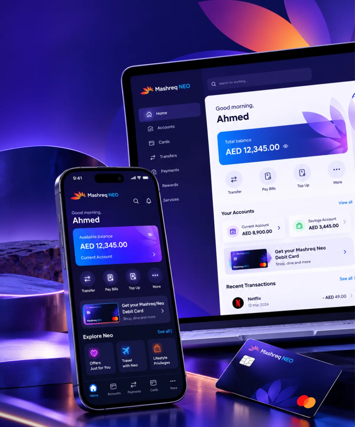
Mashreq NEO
Six performance areas in one index for leadership, plus NEO GPT, a private assistant for bank documents.
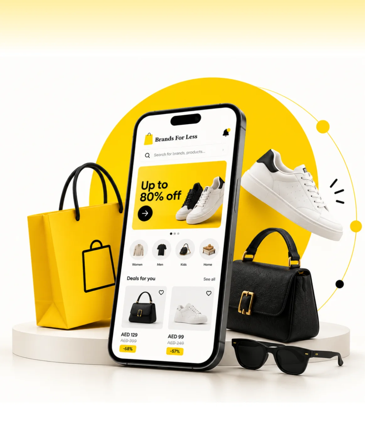
Brands For Less
Found where shoppers dropped off, then redesigned sign-up, banners and cart for a retailer with 120+ stores.
Omantel
Incident, SLA and workload reporting in one Power BI suite for Oman’s first telecom operator.



Client Testimonials
Client Success: Panda
We reworked Panda's live app and website, from search to checkout, for shoppers across Saudi Arabia.
"Thanks to UIUX Studio’s work, the client successfully launched their websites. The team maintained a professional approach and scheduled frequent in-person meetings to provide suggestions for improving the project and ensuring its timely delivery."
 Shreya LadCEO, Nutroponics
"The team is well-versed in the UI/UX domain and has designed a fantastic journey to support the site’s growth projection. Communication, timeliness, and quality of work have been very professional."
 Mohammed AbdullahZeaara.com
"The Studio has been an absolute game changer for us. After working on a few independent projects, they are now also helping our marketing team, proving their value to our business and earning praise from executives."
 BrandonProject Manager
"The UIUX Studio team consistently delivers exceptional work with dedication. We’ve completed an amazing app design together, and I’m excited to collaborate with them again in the future."
 Hani Farajvancouverhousefinders.com
"We are really pleased with the work that UIUX Studio team has completed for us in designing a website for a new brand. They completed the designs quickly, took on board changes, and the finished product is very professional."
 AnayaHead of Marketing, Freshminds
"I’ve worked with UIUX Studio team on two projects. They capture the vision and run with it! They create exceptional design! Couldn’t be happier with the quality work and files for my developers."
 Brandon PugmirePresident, Imprint City
 Client Results
Reviewed on Upwork, Trustpilot, Clutch, G2 and GoodFirms





Work With Us
Work with a dedicated design team, a fixed-scope project or hourly support. Every model gives you the same in-house designers and researchers.
Access a dedicated team of UI/UX designers and researchers, on-site or remote, who work alongside your engineers every week.
Get StartedGet clear, upfront pricing for a defined design project, such as product discovery, a mobile app design or a design system.
Get StartedGet design help by the hour, perfect for UX reviews, quick UI fixes, iterative changes or design QA before a release.
Get StartedDownloads are a marketing number. These are the ones design is accountable for.
How many people come back. Almost entirely decided by the first-run experience, which is why it is designed first.
Minutes from install to the thing the app is for. Every permission prompt and signup field in the way is measured against this.
Share of users who accept notifications, location or camera when asked. Low rates are a placement problem, not a copy problem.
Measured in moderated sessions on real hardware, one-handed, rather than clicked through on a laptop.
Design-relevant because the screens that crash are usually the ones with unhandled states nobody drew.
Rating and review themes tracked per version, so a drop is attributed to a change rather than to bad luck.
From retail apps and banking dashboards to a defence group rebrand, we bring proven domain knowledge to every product we design and build.
Talk to Our Team
Streaming, OTT & content platforms

Fan engagement & live data

EdTech & learning platforms

AdTech & campaign tooling

PropTech & marketplaces
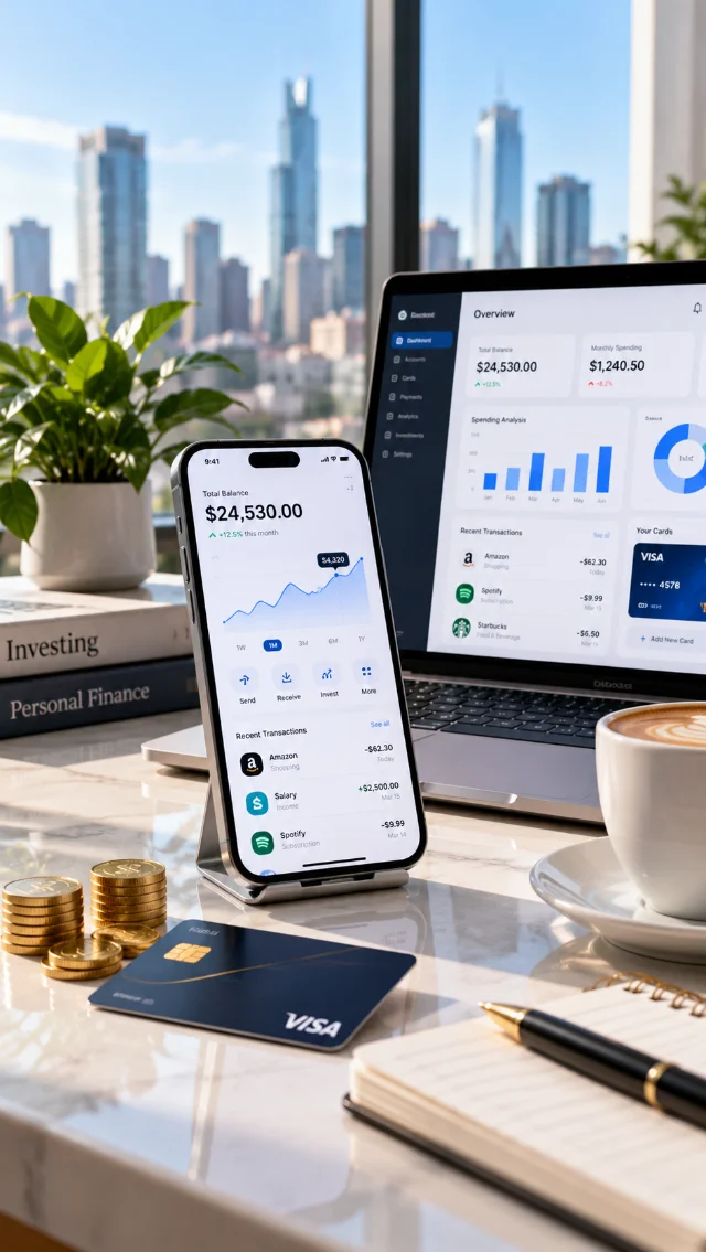
Payments, banking & wealth

Digital health & patient apps

Retail & D2C platforms

Supply chain & fleet ops
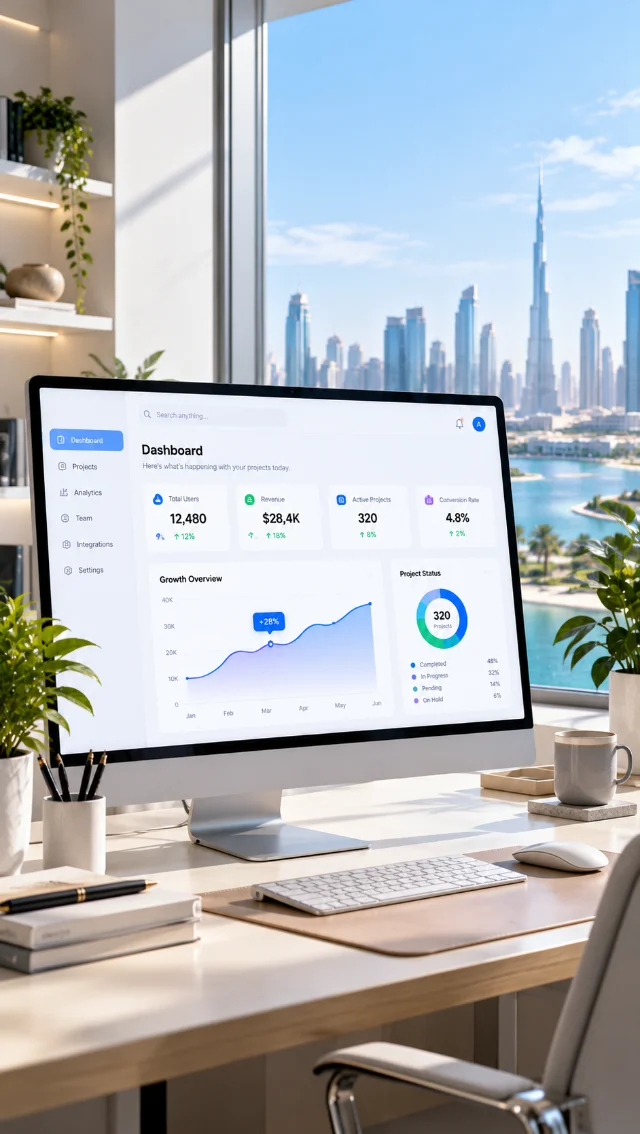
B2B products & dashboards
Mobile is rarely the only surface. These are the services most often scoped alongside an app engagement.
Testing the flows on device before build, where interruption and reach problems actually surface.
View service ↗Tokens shared across iOS, Android and web, so brand stays consistent while patterns stay native.
View service ↗Offline, sync and permission states mapped explicitly before any screen is designed.
View service ↗Specs and build reviews with your mobile engineers, through to store submission.
View service ↗Forty-five minutes with a mobile designer. We will install it, use it one-handed, and tell you which of your reviews are a design problem and which are an engineering one. No deck, no audit fee.
Design a mobile appBook a free consultation with our design, engineering and AI experts. Share your idea and we’ll come back within one business day with clear next steps.
Recognised By


Our Offices

UAE · Headquarters
Office OFF2-127, SMARK 2 Building, Plot No. 33-0, Ras Al Khor Industrial Second, Dubai, UAE

India
B-409, Bestech Business Tower, Sector 66, SAS Nagar, Punjab 160062

Australia
Tapleys Hill Road, Fulham Gardens, SA 5024