01Quicker to Shop
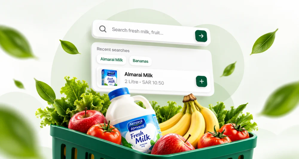
Smart search and clearer categories get customers to the products they want in fewer taps, along shorter paths.
 CASE STUDY
Panda is one of Saudi Arabia’s largest grocery retailers. UIUX Studio audited its live mobile app and website, then reworked the journeys that slowed customers down, so shoppers find products faster, check out with less friction and move between Arabic and English with ease.
THE CHALLENGE
Panda’s app and website were already live and in daily use across Saudi Arabia. Shopping on them took too many steps, and the two platforms did not always handle the same task in the same way.
OUR SOLUTION
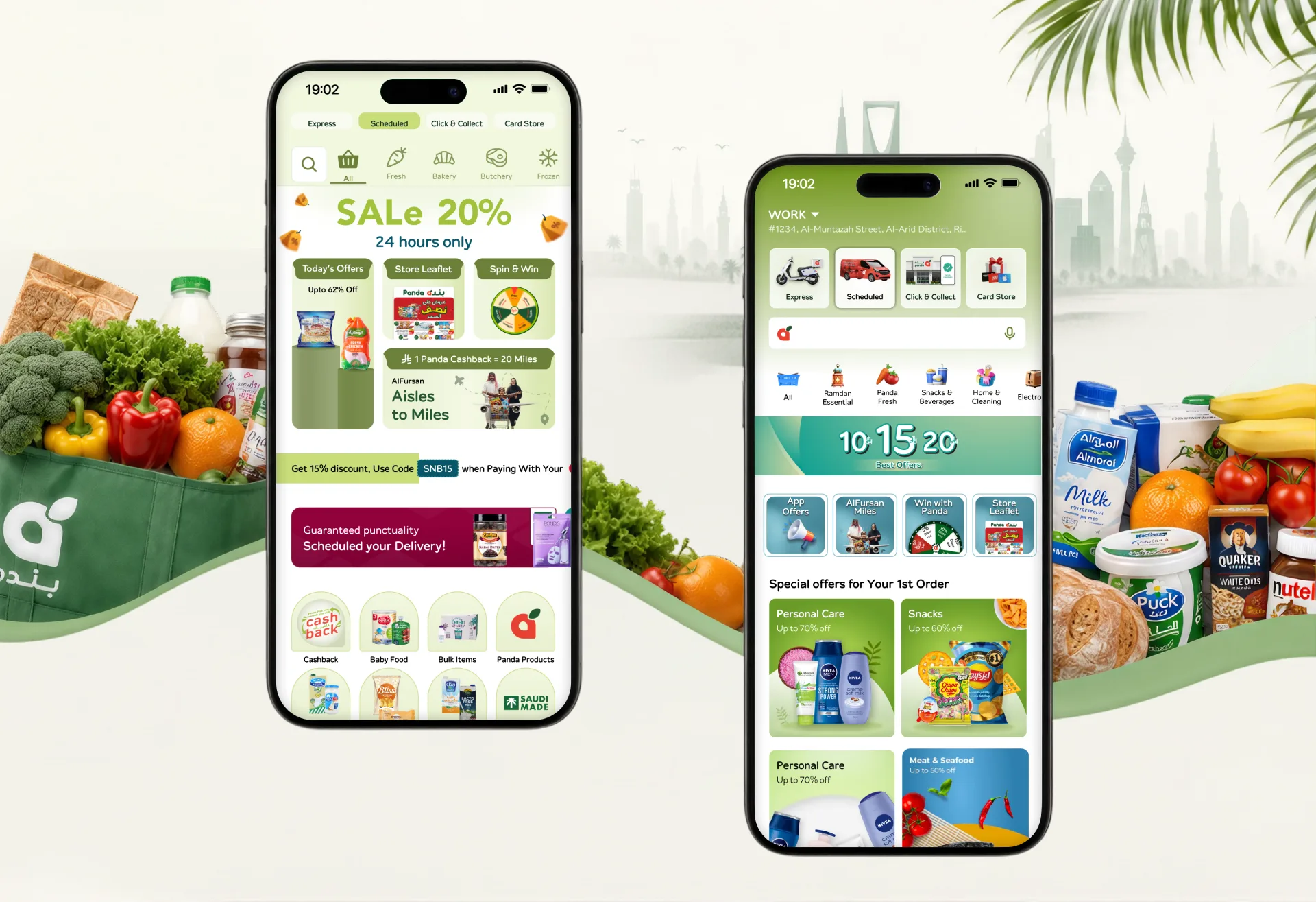
We kept what already worked and redesigned the flows that slowed customers down, on the app and the website.

Smart search and clearer categories get customers to the products they want in fewer taps, along shorter paths.
Arabic and English layouts brought in line, with right-to-left screens that make both languages feel equally complete.


ABOUT PANDA
Panda is one of Saudi Arabia’s largest grocery retailers, with supermarkets and hypermarkets in cities across the country. Its app and website had to feel as familiar and easy as walking into one of its stores, for every family that shops with it.
IN STORE
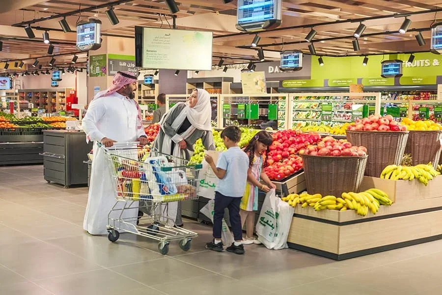
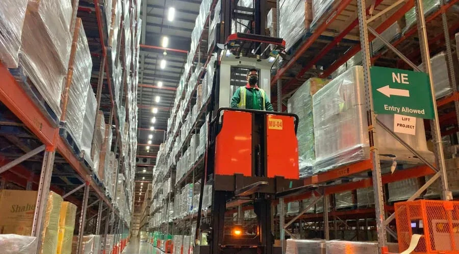
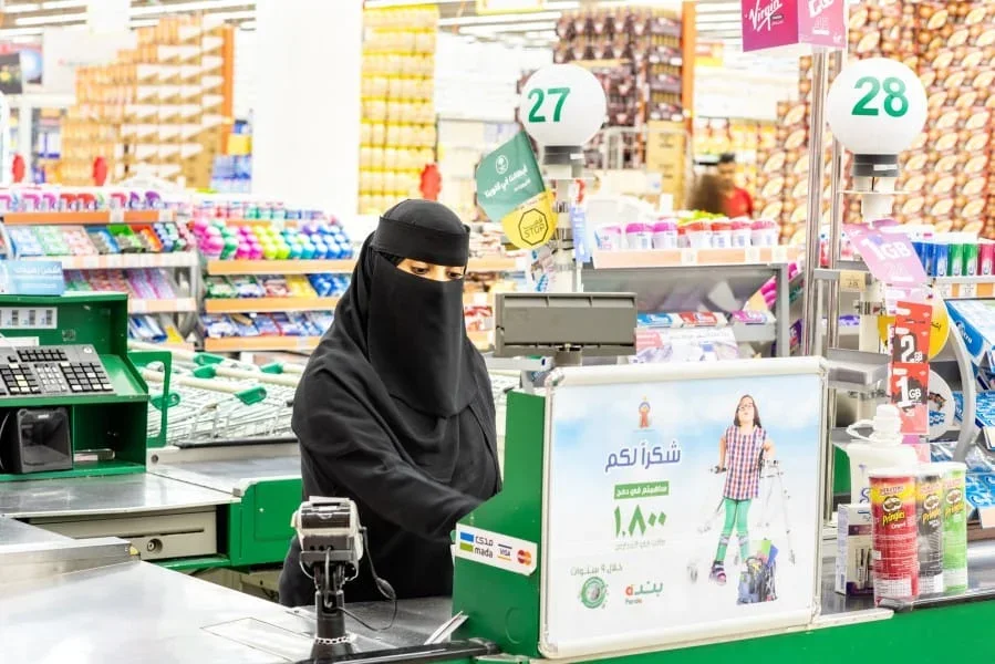
Every change had to work for the families who shop with Panda and for the store teams who pick, pack and deliver their orders.



OUR ROLE
AUDIT TO HANDOVER
We did not start from scratch. We audited Panda’s live app and website, pinpointed where shoppers struggled and improved those journeys with Panda’s product team, from search to checkout.
Book a Free Consultation

PANDA × UIUX STUDIO
06
Disciplines, One Team
One team covered the app and the website, from the first audit to developer-ready updates for both platforms.
We reviewed how customers used the live app and website and marked where they slowed down or dropped off.
We reorganised categories and navigation so a large catalogue is quicker to browse on both platforms.
Low-fidelity versions of each improved flow, tested and agreed with Panda before visual design.
We refined the existing screens for clarity and consistency, keeping the Panda brand customers know.
Arabic and English brought to the same standard, with right-to-left layouts that match.
Prototypes and annotated, developer-ready updates for the app and the website.
OUR PROCESS

We mapped the existing journeys on the app and website, marked where customers got stuck and reworked those steps as wireframes with Panda’s team. Fixing the structure first kept every visual change focused on what customers needed.
We reorganised the existing catalogue into clearer categories and shorter paths, so customers reach everyday items in fewer taps.
Browsing, search, product details, cart and checkout were reviewed on both platforms and reworked wherever customers slowed down.
Short review rounds with Panda’s product team agreed each change before visual work began, keeping decisions quick and shared.
HIGH-FIDELITY
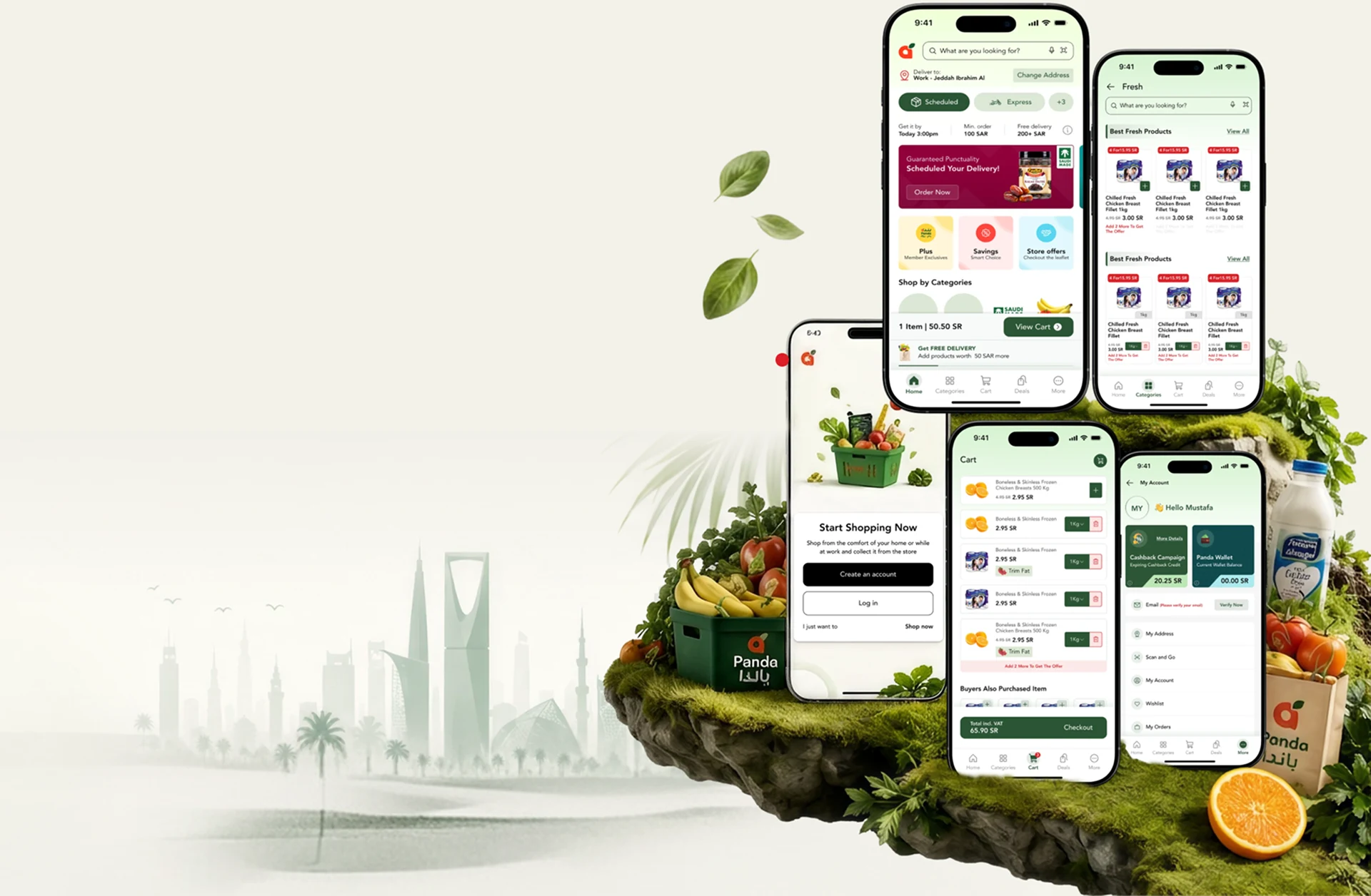
We applied the improved flows to Panda’s existing interface, keeping the brand familiar while making typography, colour and interactions consistent across the app and the website.
We aligned the Arabic and English screens so right-to-left layouts match the English experience in structure and detail.
Shared components and patterns mean the same task works the same way on the app and the website.
Annotated, developer-ready updates for each improved flow, so Panda’s developers could build every change as designed.

THE SOLUTION
Targeted UX improvements focused on clarity, convenience and consistency across Panda’s app and website, in Arabic and English.
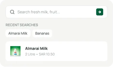
Smart search with suggestions, recent searches and quick access to popular items. Customers reach what they came for in fewer taps.
A clear hierarchy and visual categories help customers find exactly what they need. A large catalogue now feels quick to browse.
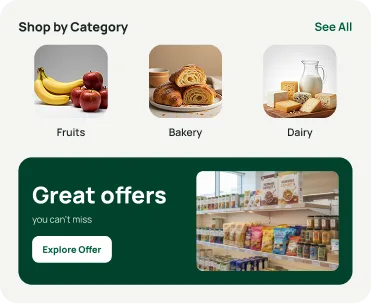
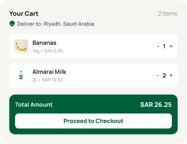
A shorter cart and checkout, with saved addresses and clearer payment options. Fewer steps stand between the basket and the order.
An English and Arabic switch that follows the right layout direction, content order and cultural details. Both languages feel equally complete.


RESULTS

Helping Panda customers shop the app and website faster, in Arabic and English.
Tools & Technologies
 Figma
 Miro
 Claude
 OpenAI
 Gemini
 Jira
 Trello
 Asana
 React
 Android
 SwiftFigmaMiroClaudeOpenAIGeminiJiraTrelloAsanaReactAndroidSwift
Client Testimonials
Client Success
We design and build digital products that are user-friendly, scalable and drive real business results.
"They helped us produce several concepts — product design, user scenarios and much more. Deliveries were fast and high quality, letting us make a strong impression on our clients."
 Shreya LadCEO, Nutroponics
"They capture the vision and run with it — exceptional design and clean files for my developers. Couldn't be happier."
 Brandon PugmirePresident, Imprint City
"Consistently exceptional work with real dedication. We shipped an amazing app design together and I can't wait to collaborate again."
"Really pleased with the website they designed for our new brand. Fast delivery, took on every change, and a very professional finished product."
 AnayaHead of Marketing, Freshminds
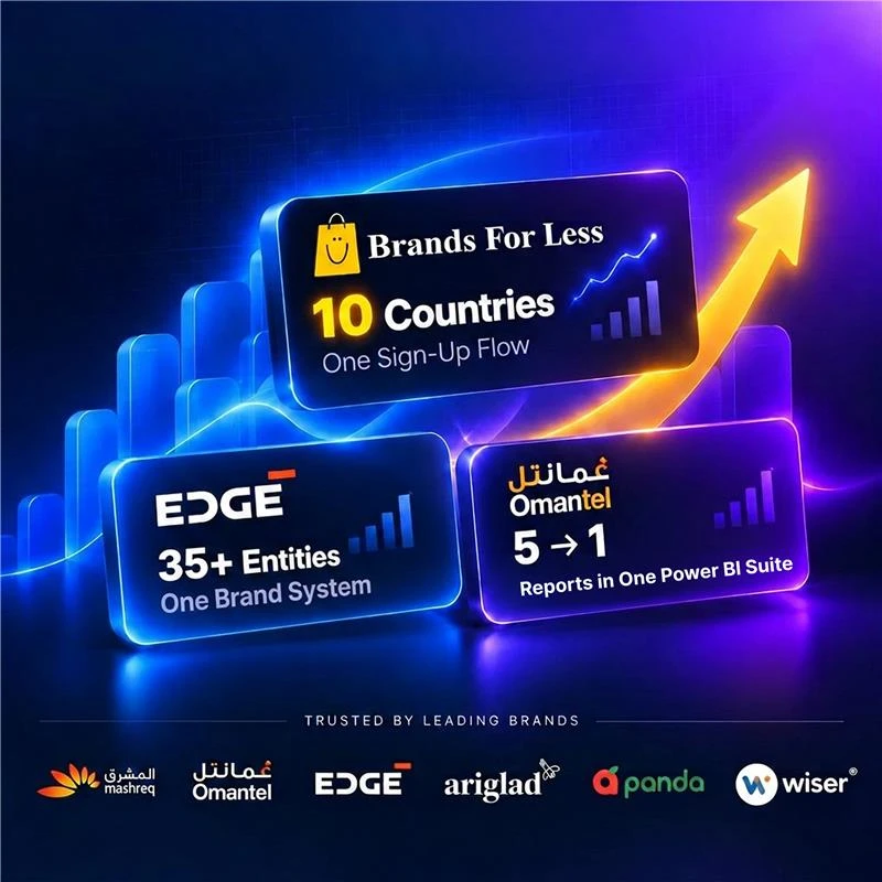 Client Results
Rated across every major review platform





More Work
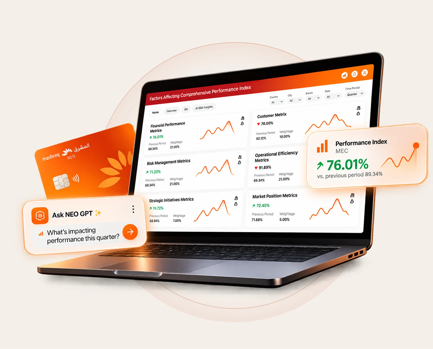
Mashreq NEO
Built one view of bank performance for leadership, plus an AI assistant that answers questions from internal documents.

Brands For Less
Designed a sign-up that adapts to each market, clearer homepage banners and a simpler cart for a retailer with 120+ stores.

Omantel
Brought incident, SLA and workload reporting into one Power BI suite for Oman’s first telecom operator.
Book a free consultation with our design, engineering and AI experts. Share your idea and we’ll come back within one business day with clear next steps.
Recognised By


Our Offices

UAE · Headquarters
Office OFF2-127, SMARK 2 Building, Plot No. 33-0, Ras Al Khor Industrial Second, Dubai, UAE

India
B-409, Bestech Business Tower, Sector 66, SAS Nagar, Punjab 160062

Australia
Tapleys Hill Road, Fulham Gardens, SA 5024