





Offshore / Onsite
Hire Dedicated Team
Access a dedicated team of UI/UX designers and researchers, on-site or remote, who work alongside your engineers every week.
Get StartedEnterprise UX design for tables, queues, dashboards and admin tools, built for expert users doing volume work. Whitespace and gentle onboarding help a first-time visitor; they slow down someone who has done this ten thousand times and knows exactly where to look.
Our Clients

















Consumer design optimises for a stranger’s first thirty seconds. Internal tools are used by the same forty people all day, every day, and every design instinct that helps the stranger taxes the expert. Four assumptions have to be inverted.
Airy layouts, one decision per screen, plenty of breathing room around each element.
As much as the eye can scan without error. Fewer screens means fewer context switches and less scrolling per case.
Every action visible and labelled, because the user has never been here before.
Frequent actions on keys, rare ones in menus. An expert wants speed, not a tour of what is possible.
Confirm anything destructive, because mistakes are costly and rare.
Undo instead of confirm. A dialog on the four-hundredth action is noise that gets clicked through anyway.
Guided first-run flow, tooltips and progressive disclosure.
A reference and a trainer. These users are taught the tool once and then use it for years.
Most of this work is systems rather than screens. Get the table and filter patterns right once and forty surfaces inherit them.
Column sizing, sorting, pinning, grouping, inline editing and row density options, defined once as a pattern rather than per screen.
Query building that an analyst can use without SQL, with saved and shared views so the setup work happens once per team.
Select-across-pages, partial selection states, progress feedback on long operations, and an undo path for all of it.
Work assignment, claim and release, escalation and hand-back. The patterns that decide whether a team of thirty stays coordinated.
A documented shortcut scheme, focus order and command palette, so the fastest users never need the mouse.
Virtualisation, pagination and progressive loading designed in, because a table that stutters at ten thousand rows is unusable regardless of how it looks.
The shared trait: a small number of trained users, high volume, and a real cost attached to every extra second per case.
Order, dispatch and exception queues where a team works through hundreds of cases a shift and seconds compound.
Account management, configuration and support tooling — usually the least designed and most used part of a product.
Screens where someone compares, filters and pivots all day. Density and keyboard speed matter more than visual polish.
Patient, claim or case records where all the context has to be visible at once and a missed field has consequences.
Real-time surfaces where updates arrive constantly and the design has to make change legible without being distracting.
Dashboards built for people who will interrogate the number, not just glance at it.
Dense interfaces produce a lot of evidence: interaction logs, filter usage, which columns nobody looks at, which queries get repeated daily. We read that at volume to decide what belongs on screen. Separately, AI belongs inside these tools — summarising a case, drafting a reply, ranking a queue — as long as the operator stays in control.
Interaction logs analysed to find the columns, filters and actions that are never touched. Removing them is the cheapest density improvement available.
Case history condensed at the top of a record, with the source rows one click away. Saves the reading, not the deciding.
Priority scored on urgency, value and likelihood of resolution, so a queue orders itself instead of being worked top to bottom.
A ranked queue is a suggestion an operator can override, and a summary never replaces the record. Anyone accountable for the outcome can always see the underlying data.
See our AI practiceA ranked queue can be re-sorted and a suggested action can be ignored. The operator’s judgement stays authoritative.
Every generated summary sits beside the record it came from. Nobody has to act on a paraphrase they cannot verify.
A column with no logged interactions is a candidate for removal, not a decision. We confirm with the people who use the screen.
If the interface acted on the user’s behalf, it says so and shows what it did. Silent changes destroy trust in an operational tool.
Nothing about this work can be done from a brief. The design comes out of watching an experienced operator work a real queue, including the shortcuts and spreadsheets they invented to route around the current tool.
A day beside your most experienced users, timing tasks and cataloguing every workaround. The spreadsheets people keep on the side tell you exactly what the interface fails to do.
What actually has to be on screen, at what priority, at what density. Usage logs and observation together settle arguments that opinion cannot.
The reusable patterns rather than individual screens: how tables behave, how filtering works, how selection and bulk operations feel. Every surface inherits these.
A prototype loaded with realistic row counts, tested with your actual operators on their own cases. Density problems only appear at scale, never in a demo dataset.
Component specs, the keyboard scheme documented, performance notes for engineering, and reference material for whoever trains new starters.
Including the performance and accessibility tooling, because a dense screen that fails a screen reader or stutters at scale has not been designed, only drawn.


Including the performance and accessibility tooling, because a dense screen that fails a screen reader or stutters at scale has not been designed, only drawn.






Including the performance and accessibility tooling, because a dense screen that fails a screen reader or stutters at scale has not been designed, only drawn.




Including the performance and accessibility tooling, because a dense screen that fails a screen reader or stutters at scale has not been designed, only drawn.




Including the performance and accessibility tooling, because a dense screen that fails a screen reader or stutters at scale has not been designed, only drawn.




Case Studies
Selected work for retail, banking, telecom and defence teams, from brand identity and mobile apps to data platforms and AI assistants.
Panda
Reworked search, categories and checkout in Panda’s live app and website, in Arabic and English.
EDGE Group
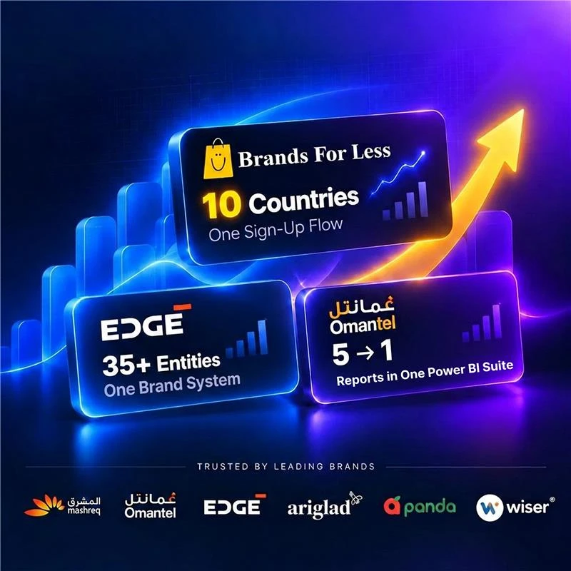
Brand identity, website and print for a group of 12,000 staff, carried onto the IDEX show floor.
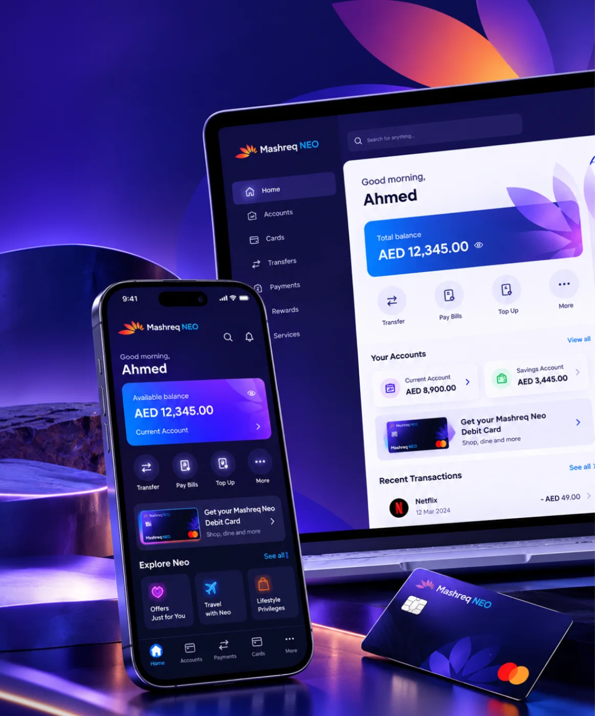
Mashreq NEO
Six performance areas in one index for leadership, plus NEO GPT, a private assistant for bank documents.
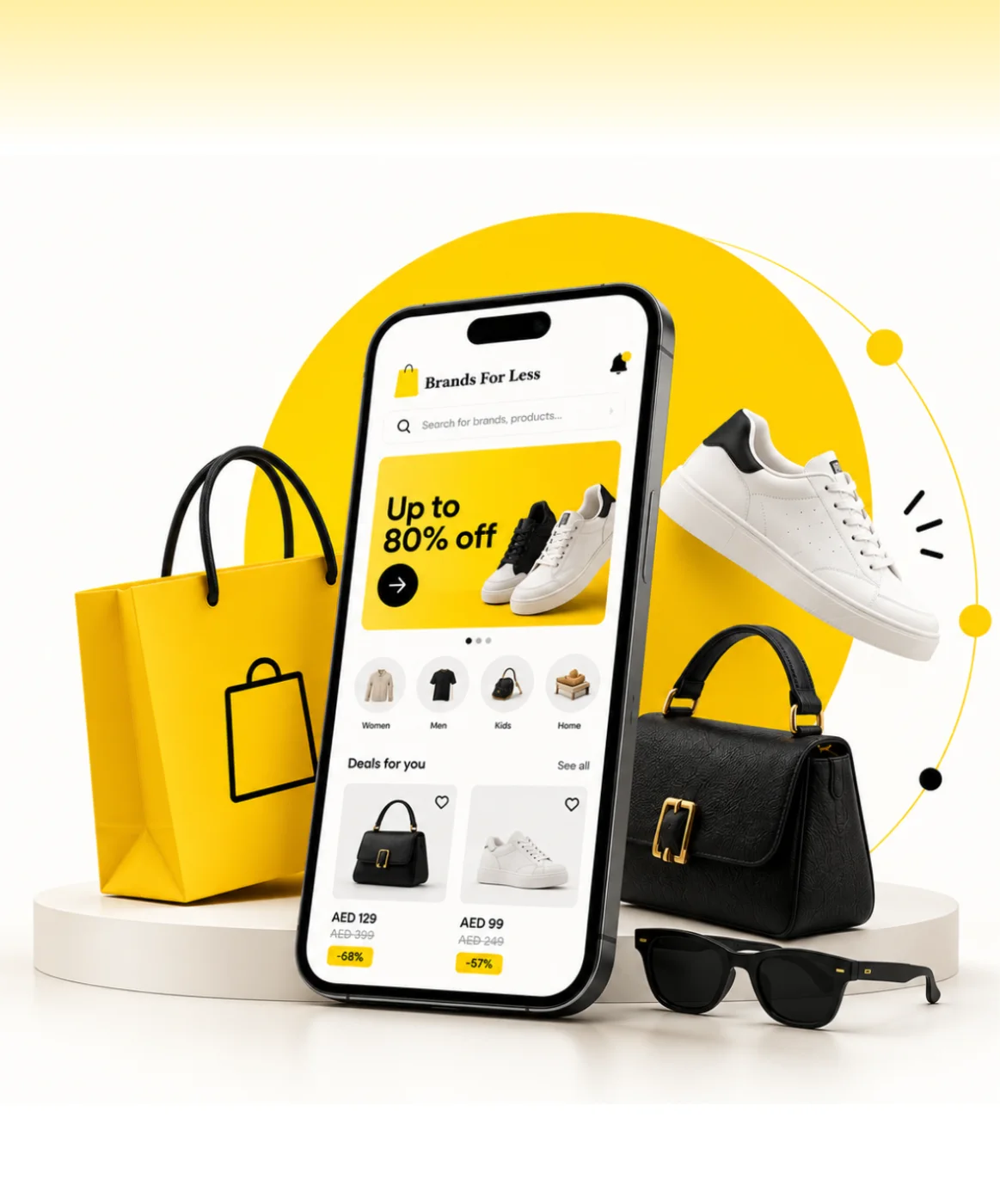
Brands For Less
Found where shoppers dropped off, then redesigned sign-up, banners and cart for a retailer with 120+ stores.
Omantel
Incident, SLA and workload reporting in one Power BI suite for Oman’s first telecom operator.



Client Testimonials
Client Success: Panda
We reworked Panda's live app and website, from search to checkout, for shoppers across Saudi Arabia.
"Thanks to UIUX Studio’s work, the client successfully launched their websites. The team maintained a professional approach and scheduled frequent in-person meetings to provide suggestions for improving the project and ensuring its timely delivery."
 Shreya LadCEO, Nutroponics
"The team is well-versed in the UI/UX domain and has designed a fantastic journey to support the site’s growth projection. Communication, timeliness, and quality of work have been very professional."
 Mohammed AbdullahZeaara.com
"The Studio has been an absolute game changer for us. After working on a few independent projects, they are now also helping our marketing team, proving their value to our business and earning praise from executives."
 BrandonProject Manager
"The UIUX Studio team consistently delivers exceptional work with dedication. We’ve completed an amazing app design together, and I’m excited to collaborate with them again in the future."
 Hani Farajvancouverhousefinders.com
"We are really pleased with the work that UIUX Studio team has completed for us in designing a website for a new brand. They completed the designs quickly, took on board changes, and the finished product is very professional."
 AnayaHead of Marketing, Freshminds
"I’ve worked with UIUX Studio team on two projects. They capture the vision and run with it! They create exceptional design! Couldn’t be happier with the quality work and files for my developers."
 Brandon PugmirePresident, Imprint City
 Client Results
Reviewed on Upwork, Trustpilot, Clutch, G2 and GoodFirms





Work With Us
Work with a dedicated design team, a fixed-scope project or hourly support. Every model gives you the same in-house designers and researchers.
Access a dedicated team of UI/UX designers and researchers, on-site or remote, who work alongside your engineers every week.
Get StartedGet clear, upfront pricing for a defined design project, such as product discovery, a mobile app design or a design system.
Get StartedGet design help by the hour, perfect for UX reviews, quick UI fixes, iterative changes or design QA before a release.
Get StartedNone of these are aesthetic. All of them are measurable on the floor with a stopwatch and your own logs.
Seconds from opening a case to resolving it, timed before and after. At volume this is the whole business case.
Interaction count for the most frequent job. Fewer is better, and keyboard paths should beat mouse paths.
Mistakes caught downstream. Density that causes errors is a failure however fast it feels.
How many context switches a single case requires. Consolidation is usually where the biggest wins are.
How long a new starter takes to reach the team average. A good expert tool is learnable in a session, not a month.
Response time on the largest real accounts. A pattern that only works on small data has not been designed.
From retail apps and banking dashboards to a defence group rebrand, we bring proven domain knowledge to every product we design and build.
Talk to Our Team
Streaming, OTT & content platforms

Fan engagement & live data

EdTech & learning platforms

AdTech & campaign tooling

PropTech & marketplaces
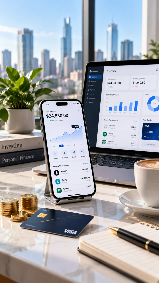
Payments, banking & wealth

Digital health & patient apps

Retail & D2C platforms

Supply chain & fleet ops
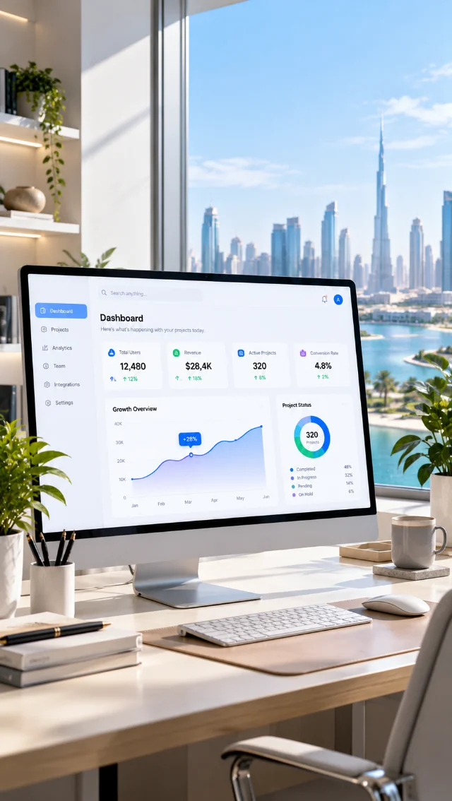
B2B products & dashboards
Enterprise surfaces lean harder on architecture and systems than any other design work, because the same patterns repeat across dozens of screens.
Role models, permission states and queue logic mapped before any table is drawn.
View service ↗The table, filter and action components made reusable across every internal surface.
View service ↗Timed testing with expert users at production data volumes, where density problems actually appear.
View service ↗Performance, virtualisation and keyboard specs handed to engineering with build reviews.
View service ↗Forty-five minutes with a designer who has done this work. We will find the workarounds your operators have invented, tell you what they reveal about the interface, and what a fortnight of observation would settle. No deck, no audit fee.
Tame a complex screenBook a free consultation with our design, engineering and AI experts. Share your idea and we’ll come back within one business day with clear next steps.
Recognised By


Our Offices

UAE · Headquarters
Office OFF2-127, SMARK 2 Building, Plot No. 33-0, Ras Al Khor Industrial Second, Dubai, UAE

India
B-409, Bestech Business Tower, Sector 66, SAS Nagar, Punjab 160062

Australia
Tapleys Hill Road, Fulham Gardens, SA 5024