






Offshore / Onsite
Hire Dedicated Team
Access a dedicated team of UI/UX designers and researchers, on-site or remote, who work alongside your engineers every week.
Get StartedUI and visual design where type, colour, spacing and motion are decided as a system rather than per screen — so the tenth screen takes an afternoon instead of a week, and the product still looks like one product after a year of shipping.
Our Clients

















It happens one reasonable decision at a time, under deadline, across four squads who never had a shared answer to fall back on. Designing as a system from the first screen is the only thing that reliably prevents it.
Nothing in the set was quite right, so someone typed a hex code. Two years later there are forty greys and no rule for choosing between them.
Hover, focus, disabled, loading and error get invented by whoever implements the screen, differently each time.
Each screen is beautiful in isolation and shares nothing with the others, so the build duplicates work and the product feels assembled.
Contrast and focus order become an audit finding, and fixing them means revisiting the palette the brand already signed off.
The screens are the visible part. Everything else here is what makes the next fifty screens fast and consistent.
A restrained set with rules for when each value applies, sized so a designer never has to invent one under deadline.
Default, hover, focus, active, disabled, loading, error and empty — drawn once and reused, not reinvented per screen.
Desktop, tablet and mobile designed together, so responsive behaviour is a decision rather than whatever the grid does.
Transitions, feedback and micro-interaction timing specified, because unspecified motion is where a polished product becomes a jittery one.
Built on tokens from the start where you need it, so a second theme is a mapping exercise rather than a second design project.
Contrast ratios, focus states, target sizes and text scaling handled in the design, so WCAG 2.2 AA is not a remediation project later.
Visual work is easy to defer and expensive to defer indefinitely. These are the points at which it stops being cosmetic.
The product does the job and looks like it was built by engineers under deadline, because it was. Buyers read that as risk.
Teams shipping independently with no shared answer, so the product reads as several products stitched together.
Marketing has the new identity and nobody knows how it applies to a data table, a form or an error state.
A procurement requirement or a legal one, with a palette and component set that will not pass as they stand.
Every screen needs a designer because nothing is systematised, and engineering waits on files.
The product will be demoed to people who judge maturity partly on how it looks, fairly or otherwise.
Generating every state of a component, checking contrast across a whole palette, filling a table with realistic data — all mechanical, all easy to skip when tired. We automate that and keep taste, hierarchy and the decision about what the product should feel like where they belong.
Components expanded across their full state and size matrix with realistic content rather than placeholder text, so a design review sees what users will.
Every foreground and background pair tested against WCAG 2.2 AA at the moment the scale is defined, not in an audit six months later.
Files scanned for values that bypass the token set. A one-off hex is flagged at review rather than discovered a year into the product.
Nothing a model produced reaches your product as final artwork. It expands, checks and fills; a designer draws, judges and signs off.
See our AI practiceIllustration, photography and iconography are commissioned or drawn. Nothing synthetic goes into an identity you have to defend.
Generated states are a starting grid. Each is kept, corrected or discarded deliberately before it enters the library.
Automated checks are re-tested manually on the components that matter, because a passing ratio can still read badly in context.
What deserves emphasis on a screen is a judgement about the user’s job. No model has the context to make it.
We settle the visual direction on two or three real screens before building anything reusable. Committing to a system around a direction nobody has agreed is the fastest way to rebuild it twice.
What exists today, what the brand allows, what your engineers can realistically build, and which screens carry the most weight. Constraints are far more useful than inspiration at this stage.
Two visual directions applied to actual screens from your product, not moodboards. Real content, real density, real edge cases, so the choice is informed rather than aspirational.
The scales behind the direction, with contrast checked as they are defined. Named so a designer knows which value to reach for without asking.
Buttons, inputs, tables, navigation and the rest — drawn once with every state, then composed into screens. Reviewed weekly with the engineers who will build them.
Redlines where they help, tokens exported to your stack, and visual QA against the built screens. We sign off on what shipped rather than what was drawn.
Set up under your account, in the tools your engineers already reference. Files nobody can open are the same as files nobody made.




Set up under your account, in the tools your engineers already reference. Files nobody can open are the same as files nobody made.




Set up under your account, in the tools your engineers already reference. Files nobody can open are the same as files nobody made.





Set up under your account, in the tools your engineers already reference. Files nobody can open are the same as files nobody made.


Set up under your account, in the tools your engineers already reference. Files nobody can open are the same as files nobody made.


Case Studies
Selected work for retail, banking, telecom and defence teams, from brand identity and mobile apps to data platforms and AI assistants.
Panda
Reworked search, categories and checkout in Panda’s live app and website, in Arabic and English.
EDGE Group
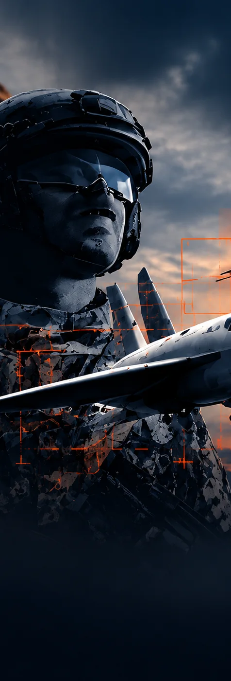
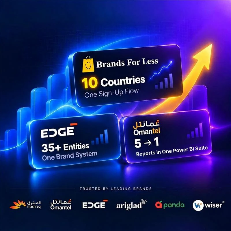
Brand identity, website and print for a group of 12,000 staff, carried onto the IDEX show floor.
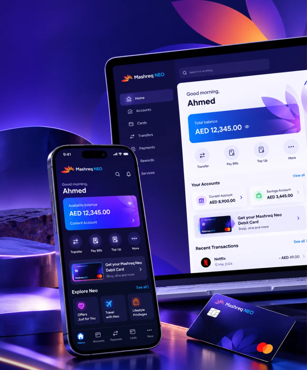
Mashreq NEO
Six performance areas in one index for leadership, plus NEO GPT, a private assistant for bank documents.
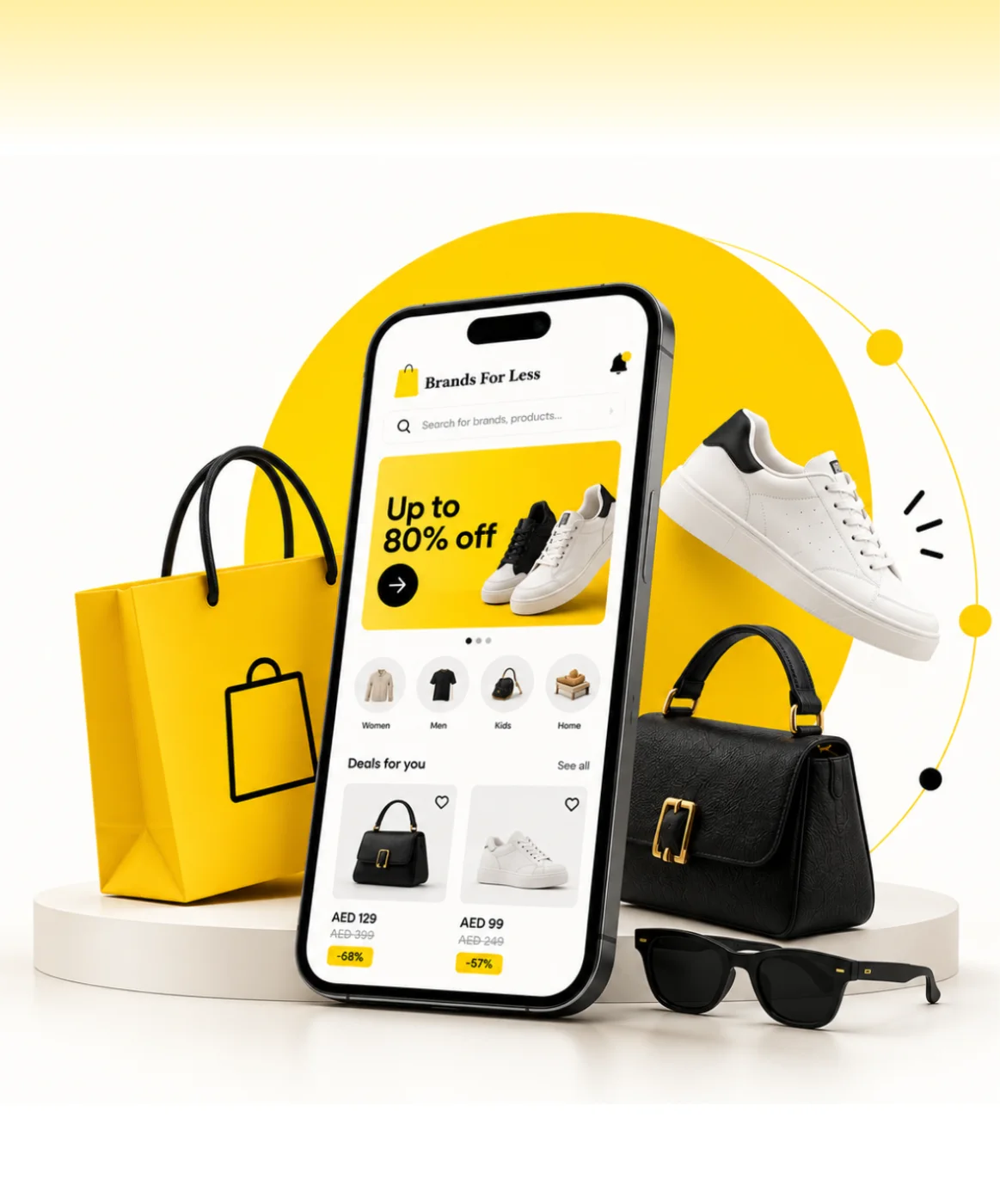
Brands For Less
Found where shoppers dropped off, then redesigned sign-up, banners and cart for a retailer with 120+ stores.
Omantel
Incident, SLA and workload reporting in one Power BI suite for Oman’s first telecom operator.



Client Testimonials
Client Success: Panda
We reworked Panda's live app and website, from search to checkout, for shoppers across Saudi Arabia.
"Thanks to UIUX Studio’s work, the client successfully launched their websites. The team maintained a professional approach and scheduled frequent in-person meetings to provide suggestions for improving the project and ensuring its timely delivery."
 Shreya LadCEO, Nutroponics
"The team is well-versed in the UI/UX domain and has designed a fantastic journey to support the site’s growth projection. Communication, timeliness, and quality of work have been very professional."
 Mohammed AbdullahZeaara.com
"The Studio has been an absolute game changer for us. After working on a few independent projects, they are now also helping our marketing team, proving their value to our business and earning praise from executives."
 BrandonProject Manager
"The UIUX Studio team consistently delivers exceptional work with dedication. We’ve completed an amazing app design together, and I’m excited to collaborate with them again in the future."
 Hani Farajvancouverhousefinders.com
"We are really pleased with the work that UIUX Studio team has completed for us in designing a website for a new brand. They completed the designs quickly, took on board changes, and the finished product is very professional."
 AnayaHead of Marketing, Freshminds
"I’ve worked with UIUX Studio team on two projects. They capture the vision and run with it! They create exceptional design! Couldn’t be happier with the quality work and files for my developers."
 Brandon PugmirePresident, Imprint City
 Client Results
Reviewed on Upwork, Trustpilot, Clutch, G2 and GoodFirms





Work With Us
Work with a dedicated design team, a fixed-scope project or hourly support. Every model gives you the same in-house designers and researchers.
Access a dedicated team of UI/UX designers and researchers, on-site or remote, who work alongside your engineers every week.
Get StartedGet clear, upfront pricing for a defined design project, such as product discovery, a mobile app design or a design system.
Get StartedGet design help by the hour, perfect for UX reviews, quick UI fixes, iterative changes or design QA before a release.
Get StartedAwards and portfolio shots are not on this list. These are the things a client can actually check.
How long a designer or engineer takes to produce the next screen using what exists. Should fall sharply after the first month.
Share of values in the product coming from the scale rather than typed in. The single best predictor of whether drift returns.
Gaps between the design and the built screen at review. Persistent ones usually mean the spec was ambiguous, not that engineering was careless.
Contrast, focus order and target sizes passing at design time, verified again on the build rather than assumed.
How many rounds a screen takes to approve. More than three usually means the direction was never actually settled.
Whether two teams shipping independently produce screens that look related. The reason the system exists.
From retail apps and banking dashboards to a defence group rebrand, we bring proven domain knowledge to every product we design and build.
Talk to Our Team
Streaming, OTT & content platforms

Fan engagement & live data

EdTech & learning platforms

AdTech & campaign tooling

PropTech & marketplaces
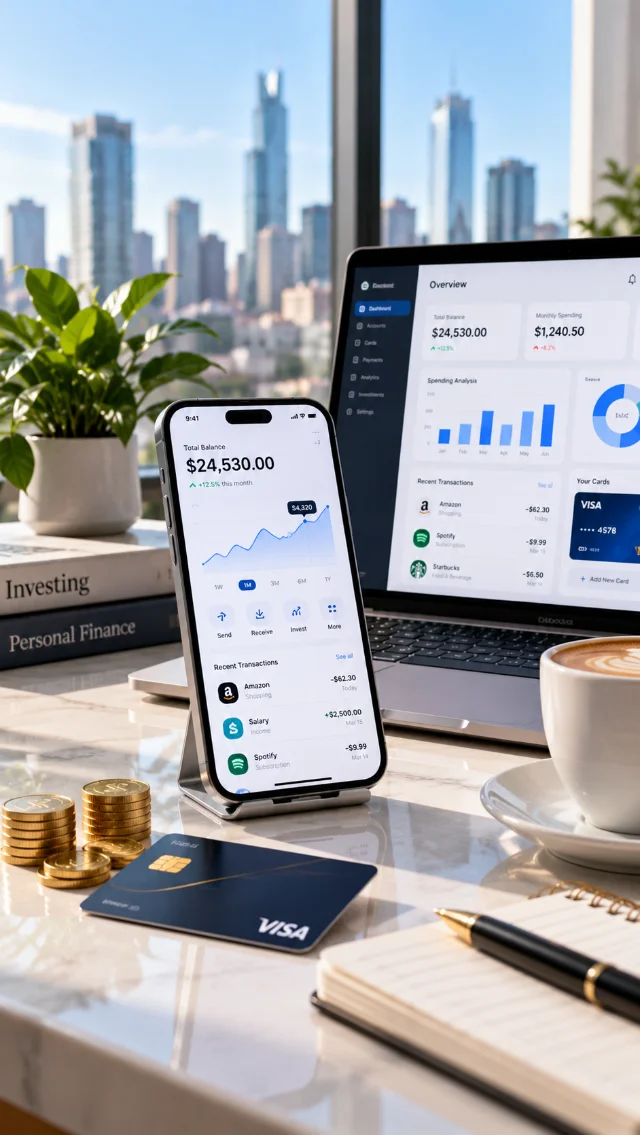
Payments, banking & wealth

Digital health & patient apps

Retail & D2C platforms

Supply chain & fleet ops
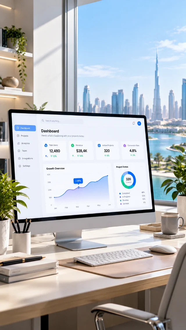
B2B products & dashboards
Interface design assumes the structure is settled and hands off to a build. These are the services on either side of it.
The structure and states this design applies to, settled before anything is styled.
View service ↗Turning the components into a governed library with tokens, documentation and a contribution model.
View service ↗Specs, exported tokens and build reviews, so what ships matches what was drawn.
View service ↗Establishing which screens matter before spending design time on the ones that do not.
View service ↗Forty-five minutes with a designer. We will tell you whether the problem is visual, structural or content, what the cheapest fix is, and whether a system would prevent it recurring. No deck, no discovery fee.
Book a design reviewBook a free consultation with our design, engineering and AI experts. Share your idea and we’ll come back within one business day with clear next steps.
Recognised By


Our Offices

UAE · Headquarters
Office OFF2-127, SMARK 2 Building, Plot No. 33-0, Ras Al Khor Industrial Second, Dubai, UAE

India
B-409, Bestech Business Tower, Sector 66, SAS Nagar, Punjab 160062

Australia
Tapleys Hill Road, Fulham Gardens, SA 5024