





Offshore / Onsite
Hire Dedicated Team
Access a dedicated team of UI/UX designers and researchers, on-site or remote, who work alongside your engineers every week.
Get StartedContent design and UX writing: interface copy written with the design rather than filled in afterwards. Labels, empty states, errors that explain the fix, and terminology that matches what your users already say instead of what your database calls it.
Our Clients

















Placeholder text lets a layout look finished before anyone has decided what it says. By the time real words arrive, the space they have to fit is fixed and the argument is about length rather than about whether the sentence helps.
Real sentences squeezed into a box sized for placeholder text, so the useful half gets cut.
Copy drafted with the wireframe, so the layout accommodates what actually needs saying.
"Something went wrong." True, unhelpful, and it leaves the user with no idea what to do next.
Every error names the cause and the next action, written by someone who knows both.
Labels taken from the database schema, so users learn your data model instead of doing their job.
Terminology drawn from what users say in support tickets and interviews, then tested for comprehension.
A new user’s first screen is an empty grid with no explanation of what belongs there or how to start.
Empty states designed as the onboarding moment they actually are.
Words are the cheapest thing to change and the most expensive thing to get wrong, because every user reads them.
Labels, buttons, headings, helper text and confirmations written directly in the design file so nothing ships as a placeholder.
Every failure and empty condition with copy that names the cause and the next action, reusable across the product.
One agreed word per concept, drawn from user language and applied consistently across product, support content and marketing.
Short, practical and specific to your product. Written so an engineer or a support agent can apply it without a workshop.
First-run guidance, tooltips and contextual help written to be read in three seconds rather than skipped entirely.
Transactional messages and alerts, which are usually written once under pressure and then never revisited.
In each of these, there is nothing to design but a sentence — and the sentence determines whether the user continues or leaves.
The user has no context and thirty seconds of patience. What the screen says matters more than how it looks.
Something has already gone wrong. The copy decides whether the user recovers or contacts support.
Label wording and helper text are the difference between a clean submission and three validation attempts.
Where the request has to be understandable and honest, and where regulators as well as users are reading.
A page made almost entirely of words, where ambiguity costs conversions directly.
The moments most likely to be written defensively, and most likely to determine whether someone ever returns.
Generating options is genuinely useful — forty error messages in a minute means the sixth-best idea gets considered rather than the first acceptable one. What AI cannot do is know which words your users actually use, which is the entire foundation of this work and comes from reading their tickets and hearing them talk.
Multiple phrasings per string, generated fast so the choice is made from a real set rather than settled on the first draft that fits.
Every string across the product checked against the glossary, so "organisation" and "workspace" stop being used interchangeably.
Support tickets and interview transcripts read at volume to find the vocabulary your users bring — evidence for the glossary rather than a guess.
Every string that ships is chosen by a writer who has read your support tickets. Tone, restraint and knowing what not to say are judgements a model consistently gets wrong in the same flattering direction.
See our AI practiceGenerated variants are a menu. What ships is selected, edited and often rewritten by a person who knows the product.
The glossary is built from what users say in tickets and interviews, never from what a model considers standard for the category.
Where a word matters, we test it with real users. Whether a label is understood is an empirical question, not a stylistic one.
Consent, financial and clinical wording goes through your legal and compliance review. No generated string ships unread.
Content design done at wireframe stage changes the layout. Done after visual design, it just fills boxes. The order is the whole method.
Support tickets, interview transcripts, sales calls and reviews, read for vocabulary. The gap between your words and your users’ words is usually the finding that matters most.
One word per concept, agreed with product, support and marketing. Without this the same thing gets three names and users learn none of them.
Real sentences in the layout while it can still change. Where the copy will not fit, the layout adapts rather than the sentence being amputated.
Each failure and empty condition given copy that names the cause and the next action, written as a reusable set rather than improvised per screen.
Comprehension tested on the words that matter, then a short tone guide your team can apply without us. Long style guides are the ones nobody opens.
Copy delivered where your engineers will actually pick it up — the design file and your string management, not a spreadsheet emailed round.


Copy delivered where your engineers will actually pick it up — the design file and your string management, not a spreadsheet emailed round.


Copy delivered where your engineers will actually pick it up — the design file and your string management, not a spreadsheet emailed round.





Copy delivered where your engineers will actually pick it up — the design file and your string management, not a spreadsheet emailed round.




Copy delivered where your engineers will actually pick it up — the design file and your string management, not a spreadsheet emailed round.


Case Studies
Selected work for retail, banking, telecom and defence teams, from brand identity and mobile apps to data platforms and AI assistants.
Panda
Reworked search, categories and checkout in Panda’s live app and website, in Arabic and English.
EDGE Group
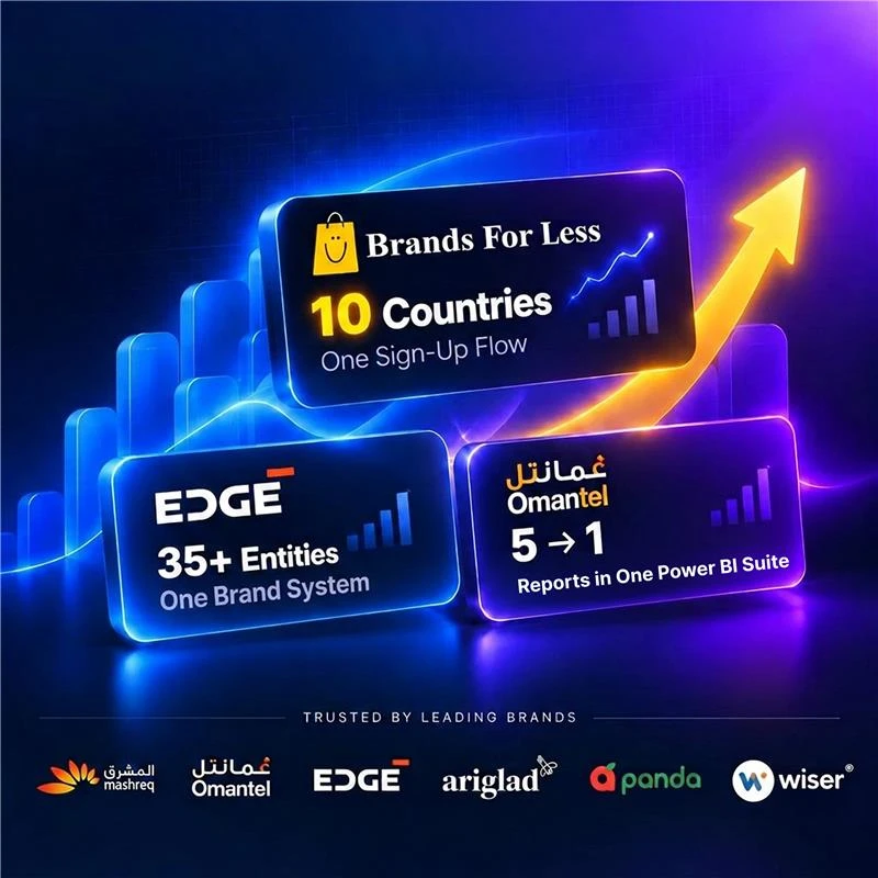
Brand identity, website and print for a group of 12,000 staff, carried onto the IDEX show floor.
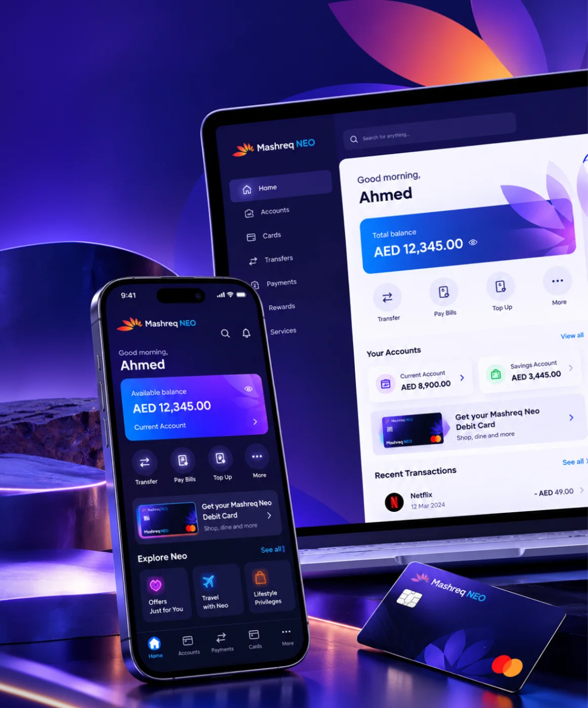
Mashreq NEO
Six performance areas in one index for leadership, plus NEO GPT, a private assistant for bank documents.
Brands For Less
Found where shoppers dropped off, then redesigned sign-up, banners and cart for a retailer with 120+ stores.
Omantel
Incident, SLA and workload reporting in one Power BI suite for Oman’s first telecom operator.




Client Testimonials
Client Success: Panda
We reworked Panda's live app and website, from search to checkout, for shoppers across Saudi Arabia.
"Thanks to UIUX Studio’s work, the client successfully launched their websites. The team maintained a professional approach and scheduled frequent in-person meetings to provide suggestions for improving the project and ensuring its timely delivery."
 Shreya LadCEO, Nutroponics
"The team is well-versed in the UI/UX domain and has designed a fantastic journey to support the site’s growth projection. Communication, timeliness, and quality of work have been very professional."
 Mohammed AbdullahZeaara.com
"The Studio has been an absolute game changer for us. After working on a few independent projects, they are now also helping our marketing team, proving their value to our business and earning praise from executives."
 BrandonProject Manager
"The UIUX Studio team consistently delivers exceptional work with dedication. We’ve completed an amazing app design together, and I’m excited to collaborate with them again in the future."
 Hani Farajvancouverhousefinders.com
"We are really pleased with the work that UIUX Studio team has completed for us in designing a website for a new brand. They completed the designs quickly, took on board changes, and the finished product is very professional."
 AnayaHead of Marketing, Freshminds
"I’ve worked with UIUX Studio team on two projects. They capture the vision and run with it! They create exceptional design! Couldn’t be happier with the quality work and files for my developers."
 Brandon PugmirePresident, Imprint City
 Client Results
Reviewed on Upwork, Trustpilot, Clutch, G2 and GoodFirms





Work With Us
Work with a dedicated design team, a fixed-scope project or hourly support. Every model gives you the same in-house designers and researchers.
Access a dedicated team of UI/UX designers and researchers, on-site or remote, who work alongside your engineers every week.
Get StartedGet clear, upfront pricing for a defined design project, such as product discovery, a mobile app design or a design system.
Get StartedGet design help by the hour, perfect for UX reviews, quick UI fixes, iterative changes or design QA before a release.
Get StartedCopy is unusually easy to measure, because the same screen with different words can be tested directly against the old one.
Whether more people get through, measured against the same flow before the rewrite.
Questions that stop being asked once the interface answers them. Often the fastest visible return.
Failed validation attempts per submission. Label and helper wording moves this number more than field design does.
Share of users who continue after hitting an error rather than abandoning or contacting support.
Whether users can explain what a label means in their own words. Empirical, not stylistic.
Share of product strings using the agreed term. A countable proxy for whether the glossary is holding.
From retail apps and banking dashboards to a defence group rebrand, we bring proven domain knowledge to every product we design and build.
Talk to Our Team
Streaming, OTT & content platforms

Fan engagement & live data

EdTech & learning platforms

AdTech & campaign tooling

PropTech & marketplaces

Payments, banking & wealth

Digital health & patient apps

Retail & D2C platforms

Supply chain & fleet ops
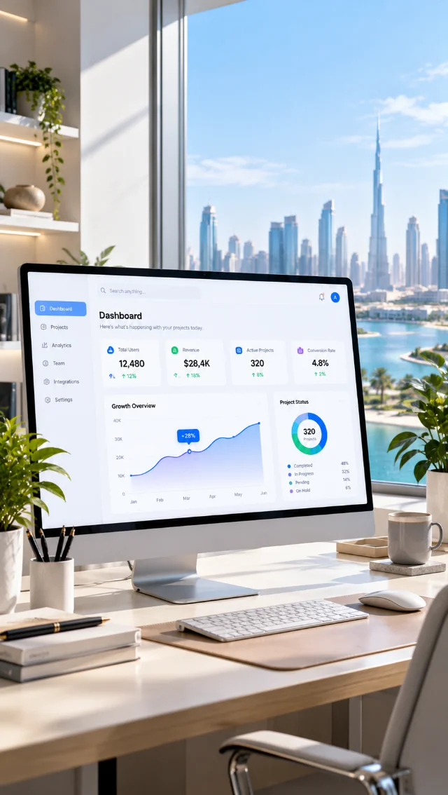
B2B products & dashboards
Content design is most effective when it runs with the other design disciplines rather than after them.
Structure and states settled first, so copy is written into a flow that works.
View service ↗Where the user vocabulary comes from — interviews and support data read properly.
View service ↗Testing whether the words are understood, which is the only way to settle a naming argument.
View service ↗Error, empty and helper text patterns encoded in components so consistency is automatic.
View service ↗Forty-five minutes with a content designer. We will tell you which of your words came from your database rather than your users, which errors leave people stuck, and what a week of auditing would find. No deck, no audit fee.
Fix the wordsBook a free consultation with our design, engineering and AI experts. Share your idea and we’ll come back within one business day with clear next steps.
Recognised By


Our Offices

UAE · Headquarters
Office OFF2-127, SMARK 2 Building, Plot No. 33-0, Ras Al Khor Industrial Second, Dubai, UAE

India
B-409, Bestech Business Tower, Sector 66, SAS Nagar, Punjab 160062

Australia
Tapleys Hill Road, Fulham Gardens, SA 5024