Adobe vs Sketch involved many factors in the UX designing process. Sometimes it looks complex because it includes many elements in a designing process. There is a need to use advanced tools, techniques, structures. UX design agencies in San Francisco use many tools and also rely on Adobe vs Sketch.
In UI/UX designing, designers cover user research, analysis, wireframing, mockups, iteration, usability testing, UI prototyping, and many other factors. These factors help and make easy interactions with stakeholders, developers, and other designing team members. We can discuss Adobe XD vs Sketch with detail.
Schedule Your 30 Minutes FREE Consultation
Adobe XD
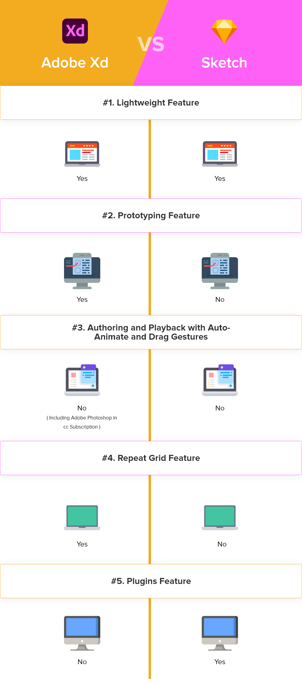
Adobe XD or Adobe Experience Design is a lightweight vector graphics editor and prototyping tool that was released at Adobe MAX 2015 as Project Comet. It introduced software in preview in March 2016 as a component of the Creative Cloud. Nowadays; it receives updates frequently and comes with the latest features. There are many ways to access Adobe XD vs Sketch.
Adobe XD comes with many advanced features in the world of web design/web design dubai. It gives a distinct edge to the work of expert UI /UX designers. Every technique or tool has the best features or pros as some features become cons because designers are not happy with some basic features.
Sketch
Sketch is the best design tool that has experienced remarkable growth since its launch in 2010. It appears with a set of tools on the left side of the screen and has greater layers of the panel and effective properties. Therefore, it is very easy to use, to learn, no matter what tool you used earlier.
It has become a favorite tool for a large majority of UI/UX designers because of its basic interface, an extensive number of plugins, comprehensive toolkit functionality, and updates regularly in Adobe vs Sketch.
This design tool is fully vector-based and its primary focus on user interface design. New UI/UX designers can easily use it because of its simplicity. It’s appropriate for today’s need for designing for multiple devices.

Let’s Discuss All Its Pros and Cons
Pros Of Adobe XD
User Interface
Every UI UX designer wants to use the tools that give a comfortable interface for designing. It is the best feature of Adobe XD tool. When we use this tool, it gives us a fresh experience. Adobe dragged out from the familiar Creative Cloud, darker keys, menus, and alternatives to offer the best of two worlds in Adobe vs Sketch.
Grid
Adobe XD has a set of exceptional details like the Repeat Grid, a tool that allows you to design a group of objects like a Material Design card. It has mutable data which has configurable spacing between the copies.
You can easily use this with a click of a button that helps in the tiresome process of renewing content. We can easily drag images to reverse text, imagery, and text files onto the Repeat Grid. It becomes easy for development from wireframe to higher fidelity designs.
3D Transforms
UX designers quickly add viewpoints to your designs with 3D Transforms. We can perform augmented or virtual reality, in-car infotainment systems, or presenting work in interesting ways. It becomes easier with the automatic space controls as well as 3D Transforms.
Shareable Libraries
When a designer works in a team or with multiple teams, it is difficult to share all materials. Adobe XD comes with creative cloud libraries. It becomes easy to share design systems and also receive updates when we perform changes in colors, brand styles, or other factors.
Responsive Resize
We design products for advanced technologies like smartwatches, tablets, smart TVs. There is a need to design softwares in every size or shape. Responsive Resize effectively catches our layouts, therefore designing for a new pattern is as manageable as dragging to fit.
Plugins
It affected plugins for enhancing the power of Adobe XD to fit according to the needs of the designer. We get a quick approach to icon sets or stock imagery. It becomes easy to fit according to designs with existing data and copy. We can ensure that it works with convenient color combinations, so it works with plugins according to our preferences.
Prototyping
We can create an interactive prototype without using third-party plugins. The Adobe XD prototyping editor enables designers to interact spaces with other screens using wires and setting up developments.
When UX designers use the interactive prototype, they can easily publish and share the prototype. It is very easy to view on the web or with the Adobe XD mobile app or discuss Adobe vs Sketch.
Auto -Animate
It helps in including motion and micro-interactions into our designs. We can easily bring the latest design to life, assist in user testing, and present visual feedback in user flows with Auto-Animate.
Auto-Animate checks are spontaneous and also powerful for expressing the design vision when we add a category to a button or animating a dashboard packing arrangement.
Scroll Groups
Scroll Groups opens a new level of communication in our Adobe XD prototypes. We can quickly add scrollable sections, horizontally or vertically, and produce maps and other fields to life with the horizontal and vertical scroll possibility. It helps in designing social apps or creating sturdy analytics dashboards.
Voice Prototyping
Adobe XD allows us to create rich voice skills by designing voice assistants, convenient applications, and more. It comes with complete audio-only user flow designs for advantage voice commands matched with speech and audio playback. We can preview these prototypes on a compatible device for creating a workflow like Alexa or Google Assistant.
Cons Of Adobe XD
Every tool has its advantages, but it also comes with some flaws like it is not compatible with Adobe products. We are becoming used it’s some variations between each product, there are some differences like :
Text boxes
When we design a text box, the primary state feels ineffective and has to change a few settings for it to behave like an Illustrator text box.
Pen tool
The pen tool lives in XD, but it does not function as Illustrator or even Photoshop.
Repeating objects
Sometimes it feels like we are repeating something like in other vector-based software. We can do this by using the Ctrl + D command in Adobe XD.
Customized Shapes
Shapes are an essential part of any design but in Adobe XD we cannot design patterns other than circles, ovals, squares, and rectangles. There is no option like customized shapes that become its cons.
CSS
We can easily create unique designs but there is no feature to get CSS exported from the design we create in Adobe vs Sketch.
Pros Of Sketch
Personalized Toolbar
It is compatible with MacOS’s design language. We can easily customize the toolbar when we right-click on it. UI UX designers quickly set all their favorite tools by dragging in the ones that you want. It has some tools that every designer will love to use like Symbols, Scissors, Outlines, Round, or Pixel.
Artboards
We consider Artboards as the screen of the app. Each Artboard describes a screen or an interaction within a screen. In today’s advanced technology, a dynamic workflow is necessary for a modern designer.
Prototyping, delivering assets, and coding can make our designs easy. Now designers can easily manage many screens in your entire app in the Sketch file.
We can easily create an Artboard, with a single press key A. Adobe XD fresher UX designers want sketch selects from an extensive list of screens, for iOS, Android, Web, Print can also be customized.
Pages
In designing work, every page shows as a platform or with another intention. UI UX designers easily create an entire project with a single Sketch file It saves your time to switch from screens and platforms in Adobe XD vs Sketch.
UI Templates
It has many preloaded user interface templates for iOS, Material Design, and Responsive Web. We can easily access them by directly going to File, new from the template, and its iOS or Material Design templates are complete. It becomes an interesting point for any designer, beginners, and experts as well.
iOS UI Kit
The iOS UI Kit comes preloaded as a Library. It has several important factors like a status bar, navigation bar, and tab bar. We can use them by going to Symbols, iOS UI Design.
Smart Guides
Smart Guides are essential while using Sketch. We set up to drag in layers, there are red lines that tell us that the design is well-aligned or centered properly. It also appears when you design.
Colors
Many times designers struggle with colors, it becomes easy with Sketch’s Color tool. It is simple to store colors always or for a specific document and uses the Eyedropper tool to select any color inside or outside of Sketch. You can also use your palette. iOS, Material Design, and Flat UI are the best starting palettes.
Cons Of Sketch
There are lots of uses of Sketch tools in UI/UX designing but sometimes it annoys designers. Let us check the flaws in this tool.
Slow Process
Its plugins are heavy and produce bugs to the software, which can easily slow your process down. It becomes laggy during dealing with big or complex files.
Prototyping Functionalities
It has very few prototyping functionalities, so designers want to use another tool. The sketch comes with only the option to add click interactions and becomes easier if it was all in one place.
Editing Tools
There is also a need for some editing tools, for images or creating letters or information. Major point is that it has no version for Microsoft so there is a need to add more features so we can use it easily on every platform.
Which One Is Best For You?
Adobe XD vs Sketch are the best tools for UI/UX designing. Most of the time professionals use both tools according to their requirements. Every designer has their preferences according to their work. It is difficult to tell us which tool is best because it depends on the project design.
Sketch has its uses because fresher UX designers want to use this tool for designing. After all, it is easy to use. Adobe vs Sketch is an ongoing debate, so UX designers always use both tools in their designing work according to the need of the project. Adobe XD has their own features & sketch has their special features which make them unique to others.
Most of the time UX designers use tools according to their projects. Every tool has its advantages, so it is an individual choice which tool they can prefer to use in Adobe XD vs Sketch.
How Do We Use Adobe XD vs Sketch In Our Projects?
UIUX Studio provides designing works for 14+ years. We have a team of expert certified designers who can easily manage their designing projects worldwide.
Our designers always prefer to use the best tools according to their project needs. In selecting Adobe XD vs Sketch, we prefer to use tools according to projects.
We design your website or app from scratch; it helps to boost your business.
Schedule a call or chat with us for designing proposals.


