UI patterns provide a detectable and likely solution to an interface design problem. A design pattern solves many developing problems and the concept of design patterns comes from architecture and programming.
It gives advanced solutions to the idea that work competently in given contexts. Basic and behavioral features of a pattern are close to users. Product design companies can revive the data, to provide complete ease and use of their product.
UI patterns design is effective for familiarizing design decisions that need to change according to your users’. It slightly shifts the trends of UI patterns and its business needs.
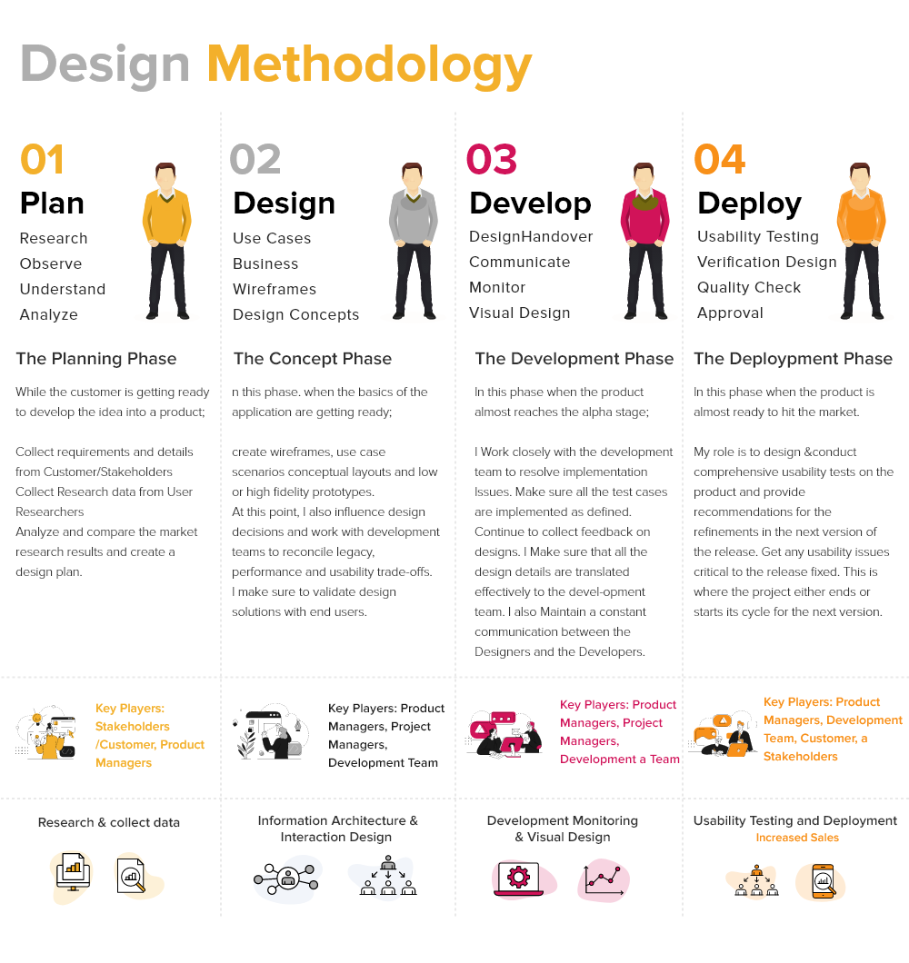
Process of Our Design Methods
We use the latest UI patterns in our projects and use them according to the needs of projects. First, Our UX designer team analyzes the project and does their UX audit to know their pain points.
In the second part of the design method, we can design the website or apps according to a niche of clients. When our team is in the development phase, here our UX designer team produces a project that is easy to deploy.
In the last phase, our UI UX designer team does usability testing, verified designs also do quality checks. Now our project managers approve all designs so that we can deploy the projects in the best way.

The Latest UI Design Patterns In 2024
People are facing COVID-19 that changes the shape of every industry. Many businesses and their various services shifted to digital transformation. It slightly shifted the trends of UI patterns compared to the last few years.
People visit many websites every day, so there is a need to show extra creativity to draw their attention. Many companies concentrate on the visual appeal and usability of their web solutions to make users remain there.
There is a need to monitor the latest UI UX patterns trends to compete with their competitors. Most UI patterns are versatile with changing trends. UI designers can use various patterns like implement card-style or grid-based layouts.
With the flexibility of UI patterns, design is possible for them to continue looking at the latest trends. Some UI design patterns forever help to design attractive websites and boost the business of clients.
Schedule Your 30 Minutes Free Consultation
Let’s Discuss Some Latest Trends Of UI Patterns
Card-style
Many sites use card-style web layouts for several sites like Pinterest, Facebook, Twitter, and many more. It is now used for news sites or blogs to adjust content on news sites or blogs. It helps to hold every piece separate.
Card-style layouts come with content blocks that relate to physical cards of various shapes and sizes. Two basic layout arrangements come with arranging cards with equal proportions on a grid while the other uses a fluid layout with varying size cards designed into orderly columns without specific rows.
Card-style layouts always work better with several contents to organize thoroughly while maintaining all the pieces separate. Cards are easy for people because they know card-shaped features from the present. It becomes easy if the user is using the website for the first time.
Split-Screen Layouts
It becomes accessible design and uses where two factors have given the equal emphasis on a page. UI UX Design Agency always uses designs where text and an image requires to be featured in the best way. We can set them side by side, there is no need to lay vertically or text overlaying images.
We calculate it to design preferences that present the latest quality. Two images arranged side by side followed, with text overlays. UI designers divide moderately these designs with various ratios like 33:66 or 40:60. When our designer divides a screen into a minimal size of ⅓, it looks more like a sidebar than an actual split-screen design.
Split-screen designs especially go well with a product page on eCommerce sites. It helps to design the websites according to the product images that need to be leading on these pages. We can easily use basic information like price, specifications, add-to-cart buttons, and product options. It is a new trend in UI UX patterns.
Big Typography
This web layout has been used for many years since the web has gained popularity when mobile design became accepted. It becomes popular in headings, titles, and a body copy on various sites.
When the right font is used, the larger text becomes more readable and improves the user experience. It creates an interesting visual statement with minimalist design, where other visual factors are not used.
Personalization
Every trend is changing with time, and new trends will come. There are few trends that are always useful in designing, like personalization algorithms.
The latest trends of AI have made these algorithms more beneficial and come with advanced features, as suggestion algorithms. It helps to know the trends of the public about what they want to buy, watch, read and learn.
Many sites offer memberships according to the requirement of content. There are entertainment sites that use predictive algorithms to know which audience will like which movies most.
There are also Ad network algorithms that are so advanced to predict the interest of people towards products. It also predicts people’s trends when they buy products online. UI designers always correctly use these types of algorithms.
Grids
We use UI patterns to design grids many times in books and newspapers. CSS achieved acclaim for designing layouts, UI UX designers produced more elegant grid structures, such as the 960.gs grid.
Grids confer visual stability that offers content adaptable for people to consume. Grids offer versatility in a web layout and grid techniques use 12 or 16 columns with channels.
Many websites use grid-based layouts to make the grids a notable feature of the design. In comparison, there are multiple, with the grid that grows visible upon inspection where an actual grid is loaded onto the design.
UI designers used baseline grids in web design where space factors are used horizontally. It’s noticeable in typography when considering the spacing between lines of body copy and headlines. We relate baseline horizontal grid spacing to the vertical grid spacing used in web design.
Magazine-style
It is popular in news and periodical sites or online magazines. With the passage of time, it becomes more popular in various sites or apps such as eCommerce sites or blogs.
Magazine-style layouts add a featured article or multiple featured articles in a carousel or the same formats. It is used as secondary or tertiary articles on the homepage and has many columns for content. Sometimes designers divide into sections and web layouts work perfectly where there is a need to add content daily.
Single-page Layouts
Single-page layouts set all essential content for a site on a single web page. In this layout, we complete navigation by scrolling, with shortcuts to jump to specific sections.
In UI UX patterns, we use secondary pages for terms and conditions, privacy policies, or other sections.
It is an attractive resolution for sites with scattered content and becomes a perfect choice for fictional content, such as children’s books.
F- and Z-Patterns
It helps us to know how a person’s eye movements over the page and scan the content. An F-pattern has content over the top of the page, with new content arranged under the left side of the page or in F shape. A Z-pattern has content on the top, with added value content.
We move the eye from the upper right to the lower left of the page or in a “Z” shape. It is more useful with added content than Z-patterns when there’s a very limited visual hierarchy. It becomes more useful when two pieces of equally important content that visitor has seen.
Asymmetry
It becomes a more important part of UI patterns and it is helpful to create a higher dynamic and organic visual impact. UX designers use asymmetry using images and text that do not completely assess each other.
Asymmetry also creates or strengthens using background elements, such as using a unique pattern between multiple page sections.
It creates an interesting visual impression that is useful for brands to convey images. Asymmetry is unpredictable, for generating designs more significant, and has practical uses in a symmetrical layout.
Clean & Simple Layouts
It has an interesting point of layouts that they concentrate objectively on the content, without visual clutter.
Clean layouts are relevant for virtual types of websites. It works well with other UI patterns with clean layouts form of grids, magazine-style layouts, asymmetrical designs, and split-screen layouts.
Navigation Tabs
Navigation tabs are a pillar of skeuomorphic design, highlighting tabs on file folders or binder dividers. Every factor in a menu has visual division from other menu items and pop-ups with a menu item.
It is more suitable for smaller menus with a few items. We use UI patterns designed with drop-downs for submenus to add to their functionality and seen in a horizontal navigation.
Carousels
We use it in the header or hero section of a website and include images with text. UI designers used to present various content pieces within a particular section of a website.
Carousels work well and feature content on a blog or news site for carousels. In eCommerce sites, it includes products, promotions, and sales.
It looks on the top of a web page, within subsections to highlight relevant content, and becomes the best alternative for homepage content or individual pages for specific categories of content or products.
UI patterns are always useful and easy to use. We use it at the time of designing websites. UI designers also use these patterns in their designs to make more innovative designs.
Wrap Up
Every UI UX design company uses the latest trends of UI pattern design in projects. Our major concern is to deliver a company that enhances the business of the clients and boosts their organic traffic.
UIUX Studio has successfully worked with many companies worldwide.
Get in touch with us and let’s review your current challenges with our professional team. Connect with us on sales@uiux.studio or schedule a call with our experts.
Our experts are always ready to serve you with the UX strategy, product and user research, UX/UI design, and many more things.


