We all read and see the notification on the mobiles or websites. It helps in bringing information to the user and they read without opening the app. Design notification is the best way to engage with users attractively.
It is practical to use a unified way of notification design to heighten user experiences. Designing perfect notifications is the best way to engage with users and provide all information briefly.
There are various design notification examples, such as email notification alerts or transaction messages flash on smartphone screens. Design Consulting Firms design notifications for a better user experience.
The style or behavior of notifications demands to be set by the UX designer. There is a need that copies of notification must be clear, compact, and impressive. A well-designed notification system is set up with approachability in mind and also supports various languages.
The terms used for notifications are competent but alter from project and company. The designer must manage the notification framework terminology and use what, where, and how.
Schedule Your 30 Minutes FREE Consultation
Types Of Design Notification
We come across many types of notifications. Let us check the leading notifications types.
User-Generated
It is an appropriate type of notification. The mobile message comes in the simplest design notification examples, such as social media posts, comments, likes of social media. We focus only on a specific user or target audience.
Context Generated
It is a rapidly growing type of notification where the apps formed a notice based on the consent of its users. The location-based notifications for cabs or delivery apps are the best examples. Nowadays, meeting updates or sports is very common in this category.
System-Generated
These are notifications created by the app, such as security alert notifications or resetting or forgotten passwords.
Push Notifications
It is a broad term that is used for any notifications. Many notifications come under this category. They pushed all notifications from the system, so we know them as push notifications.
We subdivide it into two categories: immediate & passive notifications. All notifications need quick action from the user, such as password change, email notification, sale discount, codes, and many others.
- Passive Notification
Informational notifications come into this category. In case the user does not need to take action immediately. The best example is weather channels or entertainment apps. - Smart Notifications
It has the exclusive competence to be delivered to each app. Users set up triggers to stimulate the app to send the notification. We know the timing of notices is significant because the primary aim of pushing notifications is to secure the user to catch immediate action.
The system predicts when the interaction level is maximum and delivers a positive experience to the user. The user can easily track the smart notifications to evaluate the results. It sets up the system to invent the quality of the notice that concludes the fulfillment rate of the notification campaign.
Varieties Of Design Notification
Various kinds of notifications are more helpful to design notifications for UX.
In-Browser
When we crossed to a website, they asked to approve in-browser notifications. These notifications are challenging to design, as the effectiveness of the messages is high for users. They give consent to enable notifications to be allowed on every new device or browser.
In-App Cards
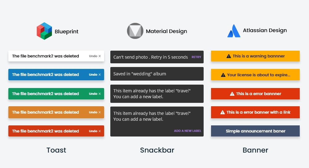
When we notification page design uses a card or banner format. It is the best way to communicate less with frequent messages such as Dropbox or Quickbooks. They regularly recall users to upgrade services. Quickbooks use this format to emphasize to users about upcoming tax dates. It depends on the user how frequently they log in to the app to view the message.
Modals
When there is a need for immediate action, then pop up the window, but it is inconvenient for the user. We use this format for specific actions. The user becomes annoyed when they see ads on a website doing other work. It is the best example of a modal.
Pop-Ups
It is the best way to know that users are in the right direction, especially beneficial in showing additional features or onboarding.
Chatbot
Automated chat services are an attractive way of interacting with users. It needs all UI UX design skills to design chatbots. It is the best way to contact users without logging into the app.
Well-designed chatbots present interactive customer support that helps users to find quick answers to their questions. It is more effective than standard customer support.
In-App chat
We also considered it as an alternative to a chatbot. It is in-app messaging software, which is regulated by the customer service team.
Text Messages
We use it for effective reminders from various apps, such as tax reminders, payment information. It is available when users sign up to receive messages.

Advantages Of UX Design Notification
There are many ways to design UX notifications. Let us check the best practices of UX design.
Non-Intrusive
It applies to design notifications in the best way so users do not irritate with these notifications. The chief feature of notification is non-interfering, so there is a need to fulfill the aim of engaging the user to inform them that an important thing is on the way.
Miniature Size
The best design of notification is dynamic and small. The most excellent example of a notification is a calendar notification that usually slides on the top of the mobile screen. It is more attractive and modest.
Circumstantial
Push notifications come into this category, especially location-based. They give alerts to various locations, like restaurants, shops, malls, and hospitals. It depends on the wish list you create online.
Create Warnings
It is the best part to design notification for UX because it works as a confirmation message. Most of the time, we use it when we remove apps or specific information. It gives us the warning not to erase urgent messages or apps.
UX Design Notification Ways
We don’t send notifications every time, because constant checks cause inconvenience. These points are helpful in design notification.
UX designers design various notifications with the best user experience. There are points to remember while designing messages.
Thinking Design
It is necessary to analyze unique design aspects. There is a requirement to select a particular design for a specific type of notification. It is preferable to pick the right colors for designing passive notice. We always prefer the lighter design & relevant icons to attract more users.
Provide Information
The main idea of notification is to notify about an issue to inform and help perform the process. In this, we need various kinds of information. When a UX designer works on notification page design, they make sure that there is a sufficient clue to figure out the content of the notification.
Control To User
When UI UX design agency design notifications for UX, they prefer to give control to users. They have the choice of switching off notifications. Go beyond that and give them opportunities in types of design notification examples they want to receive when they want to receive, and the number of messages.
Smartly Handle Notifications
It is always better to design one notification that describes all information because multiple notifications annoy users. We can also use summary notifications to show four notifications so that you can check all messages.
A/B Testing
The most reliable approach to look at design right is to present it to accurate testing. It is better to use unique designs and test them. They know which design is getting the user to take the needed action. You can also know which style works better and which does not.
Notification Framework
It is crucial to design notification frameworks. There is a need to think of notifications uniquely so that more users engage & send messages in a balanced approach. The multiple notices sometimes give negative feedback to users.
UX Designers always contemplate the UX and send messages with a well-represented goal. They also give users the flexibility to turn off all or some notifications.
The primary form of notification design requires analysis on three levels: high, medium, and low attention. There is a need to give priority to notifications designed on specific stages at three levels, such as success messages, warnings, alerts, confirmations, errors, or status indicators.
It is best to set up an analysis of several notifications to make up the framework. The notification type depends on the type of product or service.
We can classify according to product or services. In the high attention category, include alerts, errors, exceptions, confirmations.
We include warnings, acknowledgments, or success messages in medium attention. The informational messages, badges, status indicators come under low concern.
In the framework of notification, the minor details need more attention. The accessibility, legibility, specific location needs to be kept in mind. Most important is the language support.
The push notifications in mobile apps need meticulous design. It is essential to look at when and how to ask permission to send the messages.
UX Notification Design
UI UX designer always prefers to make a list of situations where the notifications are accessible. In this process, they associate with a developer to assist & fix edge problems.
Designers work on multiple interactions through user testing to add power to strengthen the UX. The following action is to classify the information depending on the needed recognition level and associates.
It is vital to give importance to the content of notifications because it helps to engage users more. There is a need to give priority to urgent messages also on repeated messages.
The most important is to select the colors and icons according to messages. There is a need to consider every detail, so notification appears in the best way.
Placement Of Notification
The notification placement is significant because user engagement depends on the best placement of the notifications. It appears on the bottom or top or in corners.
Designers need to test the responsive design so that they know the view of the notifications. It is only relevant for error messages.
Designers also analyze actionable notifications to support people to reach without opening an app.
They allow users to perform minor tasks without advancing into an app as a powerful tool in enhancing UX. The UX best method is to delay notifications of any kind till people explore the app.
Closing Remarks
UIUX Studio is providing services to many clients worldwide. Our experts have deep knowledge of design notifications so that they quickly design UX notifications.
We always give importance to appealing design notifications so that our clients expand their business quickly. Our designers know the importance of notification designs.
Get In Touch with us by telling your business requirements in the email at sales@uiux.studio


