Enhancing accessibility, collaboration & financial insights for investors
Mesha, a cutting-edge investment platform, simplifies wealth management by offering seamless investment opportunities, portfolio tracking, and data-driven insights. Designed to empower investors, the platform required a strategic digital revamp to enhance usability, engagement, and overall user experience.
To create a seamless journey for investors, an intuitive, responsive, and visually compelling website was essential. A streamlined user experience was developed to ensure effortless navigation, clear financial insights, and a structured interface tailored to modern investors’ needs.
Key Challenges & Strategic Solutions
Complex Financial Data Presentation
Challenge: Investors often faced difficulties in interpreting complex financial data, making decision-making less efficient.
Solution: A clean and structured interface was designed, integrating interactive data visualizations, real-time market updates, and clear financial breakdowns for an intuitive investment experience.
Lack of Engagement & Retention
Challenge: A high bounce rate and low engagement indicated that users found it difficult to navigate and interact with the platform effectively.
Solution: A user-friendly, visually engaging design was implemented, ensuring seamless interaction, easy access to critical insights, and a frictionless user journey.
Mobile Responsiveness & Accessibility
Challenge: The platform required a mobile-optimized experience to cater to investors managing their portfolios on the go.
Solution: A fully responsive design was introduced, ensuring seamless usability across all devices, from desktops to mobile phones.
Trust & Credibility in Financial Services
Challenge: Establishing credibility was crucial for financial platforms, as users needed assurance before committing to investments.
Solution: A professional, trustworthy visual identity was created, incorporating secure UI elements, clear messaging, and a structured content hierarchy to build user confidence.
Scalability & Future-Readiness
Challenge: The platform needed a future-proof design capable of adapting to new features, market trends, and user demands.
Solution: A scalable architecture was implemented, allowing for seamless updates, integration of new financial tools, and evolving investor needs.
Our Solution
Fragmented Investment Data & Workflow
Challenge: The investment ecosystem was burdened by siloed data sources and manual processes, making it difficult for investors to evaluate opportunities efficiently.
Solution: A centralized digital platform was developed to consolidate investment data, automate workflows, and offer seamless access to curated opportunities in one unified interface.
Limited Real-Time Risk Visibility
Challenge: Investors lacked access to dynamic insights, particularly around financial and ESG risk factors, impacting decision-making confidence.
Solution: We integrated a powerful analytics engine that delivers real-time data visualizations, enabling comprehensive, informed investment evaluations.
User Experience & Adoption Barriers
Challenge: A complex and non-intuitive interface hindered user engagement, especially for time-sensitive investment actions.
Solution: A clean, modern UI/UX design enhanced usability, with intuitive navigation, clear information hierarchy, and streamlined workflows tailored for all user types.
Need for ESG Integration in Risk Assessment
Challenge: Incorporating environmental, social, and governance factors into risk assessments required a system that balanced depth with usability.
Solution: We embedded ESG scoring models within the platform, making these critical insights easily accessible and digestible within the investor workflow.
Scalability for Platform Growth
Challenge: As TIG’s investor and corporate base expanded, the platform needed to scale without compromising performance or user experience.
Solution: A modular and cloud-based architecture was implemented to ensure seamless scalability, supporting platform growth and feature enhancements with ease.
Streamlined Approach
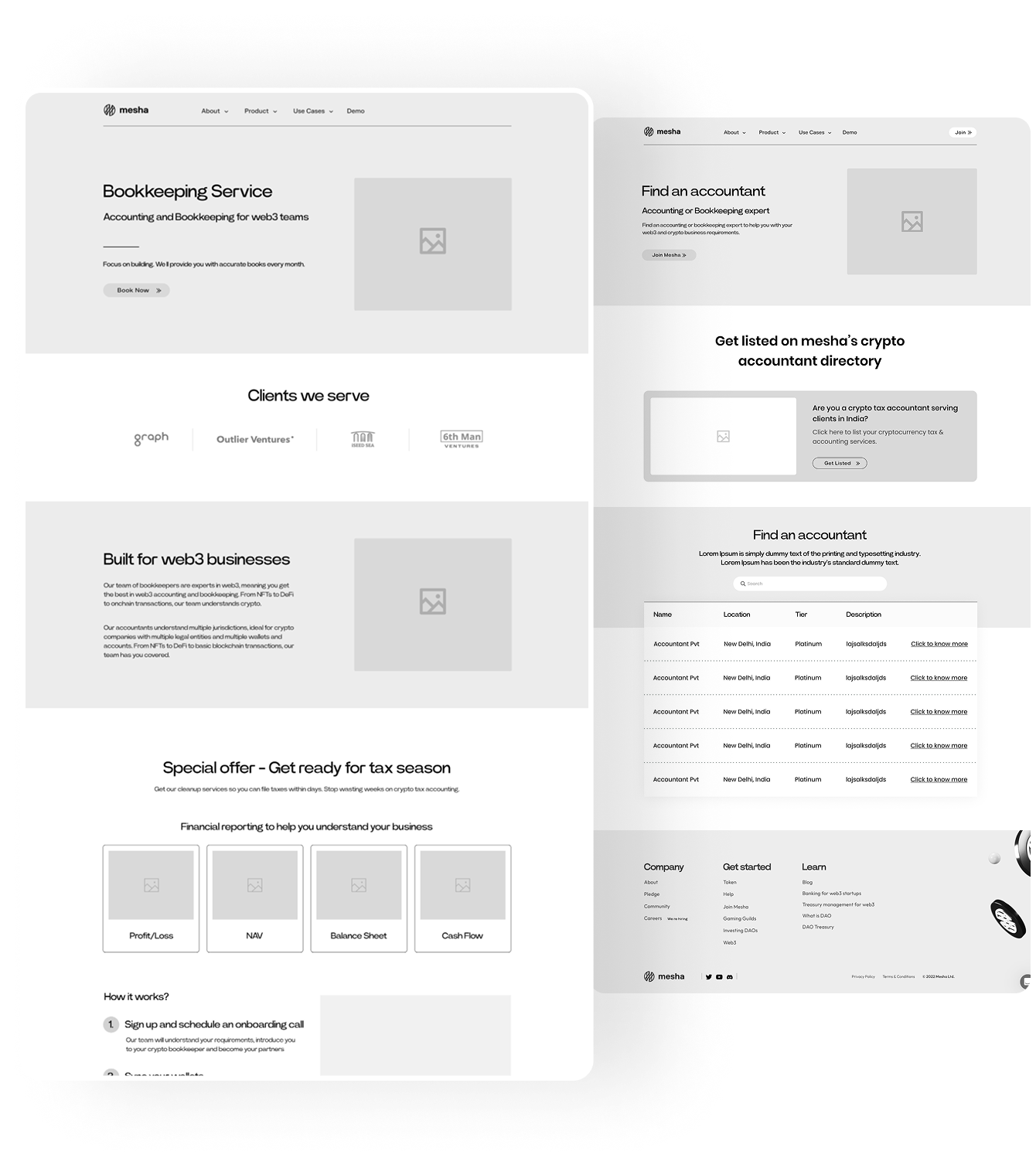
Our redesign process involved an in-depth analysis of user behavior and competitor benchmarking. We restructured the website’s layout for better content flow, optimized CTA placements for higher conversions, and introduced a modern design language that resonated with Mesha’s innovative brand identity.

Refined Visual Experience
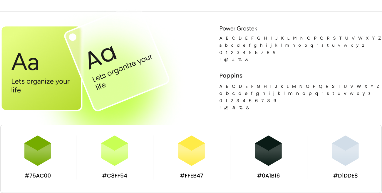
The new website featured a sleek, fintech-inspired UI with clean typography, a sophisticated color palette, and intuitive design patterns. We focused on clarity, accessibility, and responsiveness to ensure a seamless experience across devices.

A Future-Ready Investment Platform
The enhanced Mesha platform now delivers a seamless, engaging, and data-driven investment experience:
- Seamless Investment Experience – A centralized platform was established, enabling effortless portfolio tracking and financial management.
- Enhanced User Engagement – A modern, intuitive interface improved navigation and overall user experience, increasing platform retention.
- Optimized Performance & Speed – Advanced performance enhancements ensured smooth, real-time data processing and seamless transaction handling.
- Scalable & Future-Ready Platform – A flexible, modular architecture was implemented to support future growth and evolving financial services.
- Compliance & Security Strengthened – Robust security protocols and compliance measures were integrated, ensuring a trustworthy financial environment.


