Mobile devices have become the primary means of accessing the internet for a vast number of users. As a result, designing with a mobile-first approach has become essential for creating successful digital experiences. This strategy involves designing the mobile version of a website or application before the desktop version, prioritizing the needs and constraints of mobile users.

Key Strategies for Mobile-First Design
Prioritize Content: Identify the most important content and features for mobile users and prioritize them in your design. This ensures that mobile users can quickly find what they’re looking for without having to navigate through unnecessary information.
Optimize for Touch: Design elements should be large enough to tap easily and spaced out to avoid accidental taps. Buttons and links should be easily clickable, and users should be able to navigate the site with one hand.
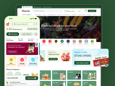
Responsive Design: Use responsive design techniques to ensure your website looks and functions well on a variety of devices. This includes using fluid grids, flexible images, and media queries to adapt your design to different screen sizes.
Performance Optimization: Optimize images and code to reduce loading times and improve performance on mobile devices. This includes minimizing the use of large images and unnecessary code, as well as leveraging browser caching and compression techniques.
Progressive Enhancement: Start with a basic, functional design and enhance it with additional features for larger screens. This approach ensures that your website is accessible to all users, regardless of their device or screen size.
User Behavior: Mobile users have different behaviors and needs compared to desktop users. They are often on the go and require quick access to information. Designing for mobile-first ensures that your content is easily accessible and optimized for these users.
SEO Benefits: Google prioritizes mobile-friendly websites in search results, making mobile-first design crucial for SEO. By designing with mobile users in mind, you can improve your search rankings and reach a larger audience.
Improved Performance: Designing for mobile-first encourages developers to prioritize performance, resulting in faster and more efficient websites. This is crucial for mobile users who may have slower internet connections or limited data plans.
Future-Proofing: With the increasing use of mobile devices, designing with a mobile-first approach ensures your website is ready for future trends. By starting with mobile, you can adapt your design to new devices and technologies as they emerge.
Case Study: Airbnb’s Mobile-First Redesign
In 2016, Airbnb embarked on a significant redesign of its website and mobile apps with a mobile-first approach. The goal was to enhance the user experience for their rapidly growing mobile user base. The redesign was driven by the understanding that a seamless mobile experience was critical for their business, as a large percentage of their traffic and bookings came from mobile devices.
Simplicity and Intuitiveness: The new design focused on simplicity, with a clean and intuitive interface that made it easy for users to find and book accommodations on their mobile devices. The layout was optimized for smaller screens, with clear navigation and prominent call-to-action buttons.
Improved Performance: One of the key objectives of the redesign was to improve performance on mobile devices. This involved optimizing images and code to reduce loading times and ensure a smooth user experience, even on slower internet connections.
Personalization and Localization: The redesign also introduced personalized recommendations and localized content to enhance the user experience. This helped users find accommodations that were tailored to their preferences and location, improving the overall booking experience.
Results: The mobile-first redesign was a resounding success for Airbnb. It resulted in a 30% increase in bookings on mobile devices, highlighting the effectiveness of a mobile-first design strategy. The improved user experience also led to higher user engagement and satisfaction, further solidifying Airbnb’s position as a leader in the online accommodation booking industry.
Key Takeaways
Airbnb’s mobile-first redesign is a testament to the power of designing with mobile users in mind. By prioritizing the needs of mobile users and focusing on simplicity, performance, and personalization, Airbnb was able to significantly improve the user experience and drive business growth. This case study underscores the importance of mobile-first design in today’s digital landscape and serves as a valuable example for other companies looking to enhance their mobile user experience.
Designing for mobile-first is no longer just a trend; it’s a necessity in today’s digital landscape. By prioritizing the needs of mobile users and following key design strategies, you can create engaging and responsive mobile experiences that drive user engagement and satisfaction.


