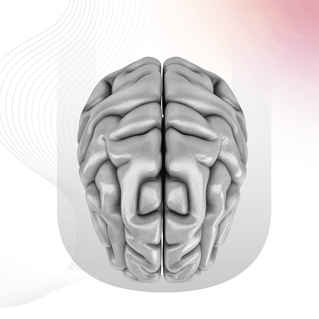
In the ever-evolving landscape of technology, user interfaces (UI) play a pivotal role in shaping our digital experiences. Gone are the days of clunky, unintuitive interfaces that left users scratching their heads. Enter the era of Neuro-UI, a cutting-edge approach that marries cognitive science with design to create interfaces that seamlessly integrate with the way our brains work. In this blog, we’ll embark on a journey through the fascinating world of Neuro-UI, exploring its principles, applications, and some intriguing examples that illustrate how it’s revolutionizing the way we interact with technology.

Understanding Neuro-UI
Neuro-UI, short for Neuro-User Interface, is all about designing interfaces that align with the principles of cognitive science. It seeks to create digital experiences that are not only visually appealing but also cognitively efficient. The idea is to enhance user experience by understanding how the human brain processes information, makes decisions, and reacts to stimuli.
1. The psychology of color and contrast:
One of the fundamental aspects of Neuro-UI is leveraging the psychology of color and contrast. Different colors evoke different emotions and responses, and smart use of these can greatly impact user engagement. For example, Facebook’s iconic blue color is not just a random choice; it’s a carefully selected hue associated with trust and reliability. Similarly, contrast plays a crucial role in ensuring readability and accessibility. High contrast between text and background enhances legibility, especially for users with visual impairments. Google’s Material Design principles, with its emphasis on vibrant colors and clear contrasts, exemplify how Neuro-UI principles can be seamlessly integrated into design.
2. The power of simplicity:
In the fast-paced digital age, simplicity is king. Neuro-UI recognizes that our brains prefer information that is easily digestible. Complex and cluttered interfaces can overwhelm users and hinder cognitive processing. Take Apple’s design philosophy, for instance. The clean lines, minimalistic approach, and intuitive gestures of iOS are a testament to the power of simplicity in enhancing user experience. A classic example of simplicity in action is Google’s search engine. The sparse, uncluttered homepage, with just a logo, search bar, and a couple of buttons, highlights the Neuro-UI principle of minimizing cognitive load. Users can focus on their task without unnecessary distractions.
3. The art of micro-interactions:
Neuro-UI doesn’t just focus on the big picture; it also dives into the details with the concept of micro interactions. These are subtle, almost unnoticed animations or responses that provide feedback to users, making interactions more engaging and satisfying. Consider the heart animation on Instagram when you like a post. It’s a small detail, but it adds a touch of delight to the user experience. These micro interactions tap into the brain’s reward system, creating a positive association with the interface.
Applications of Neuro-UI
Now that we’ve delved into the principles of Neuro-UI, let’s explore its real-world applications across various domains.
Healthcare:
In healthcare, where precision and efficiency are critical, Neuro-UI is making significant strides. Medical devices and software interfaces are being designed with a deep understanding of human cognition. For instance, in surgical navigation systems, interfaces mimic the way surgeons think and operate, streamlining complex procedures.
An exciting development is the use of virtual reality (VR) in therapy applications. VR interfaces, designed with Neuro-UI principles, can create immersive and therapeutic experiences tailored to an individual’s cognitive needs. This not only enhances the effectiveness of the therapy but also makes the overall experience more enjoyable.
Education:
Neuro-UI has the potential to transform the way we learn. Educational platforms are incorporating these principles to create interfaces that adapt to individual learning styles. For example, personalized learning apps analyze user interactions to tailor content delivery, ensuring optimal engagement and knowledge retention.
Gamification in education is another area where Neuro-UI shines. By incorporating game-like elements such as achievements, progress bars, and rewards, learning platforms tap into the brain’s reward system, making the educational journey more enjoyable and motivating.
Automotive Industry:
The automotive industry is not untouched by the influence of Neuro-UI. In-car interfaces are now designed with a keen understanding of driver cognition. Heads-up displays (HUDs) provide essential information without diverting the driver’s attention from the road, minimizing cognitive load and enhancing safety.
Voice-activated controls in modern vehicles also leverage Neuro-UI principles. By aligning with natural language processing and understanding the nuances of human speech, these systems make the driving experience more intuitive and less distracting.
Examples of Neuro-UI in action
Waze: Navigating with the brain in mind:
Waze, the popular navigation app, is a prime example of Neuro-UI in action. Beyond its robust mapping capabilities, Waze leverages user data and real-time information to optimize routes. The app’s intuitive interface presents information in a visually digestible manner, ensuring that drivers can quickly process and act on the information.
The use of gamification elements, such as earning points for reporting incidents or contributing to the community, taps into the brain’s reward system. This not only encourages user engagement but also fosters a sense of community among Waze users.
Netflix: Tailoring recommendations with neural networks:
Netflix, the streaming giant, has mastered the art of personalized recommendations through the application of Neuro-UI principles. The platform employs complex algorithms and neural networks to analyze user behavior and preferences. The result is a curated content feed that aligns with individual tastes, keeping users engaged and satisfied.
The AutoPay feature between episodes is a subtle but effective use of Neuro-UI. By reducing decision fatigue and keeping users immersed in a binge-watching experience, Netflix maximizes user satisfaction and retention.
Duolingo: Language learning made fun:
Duolingo, a language-learning app, seamlessly integrates Neuro-UI principles to create an engaging and effective learning experience. The app’s interface is designed with simplicity in mind, breaking down language lessons into bite-sized, easily digestible segments. The use of gamification, including point systems, streaks, and challenges, taps into the brain’s reward system, turning language learning into a fun and addictive activity. Duolingo’s mascot, the green owl, adds a touch of personality, making the learning journey more enjoyable and memorable.
Neuro-UI is not just a buzzword; it’s a transformative approach to design that places human cognition at the center. By understanding how our brains perceive and interact with information, designers can create interfaces that are not only visually appealing but also intuitive and efficient. As technology continues to advance, the marriage of cognitive science and design will undoubtedly play a pivotal role in shaping the interfaces of the future. The journey into the world of Neuro-UI is not just about pixels and code; it’s a fascinating exploration of the intricate dance between the mind and the machine, where design becomes a conduit for a seamless and enjoyable user experience.


