Web layouts need to be simply unique and the best layouts. People keep on using the old templates to make their website look tired and old. UI trends are upcoming a currently ongoing trend that is going to spread like a fire in the shattered forest. The trend of UI designs is going too far and becoming so vast that people are now looking for something new and unique.
The UI patterns are so much adaptive and adjustable that they can be moulded into anything to form new and unique designs for the business. There are many layouts of the UI designs that never get outdated no matter what.
Web layouts are adaptable and thus this gives a modern touch to the website and thus will make the website look more engaging and unique in their own terms and thus adds a modern touch in the website making it more engaging for the audience.
Here are some examples of the layouts that never go out of trends and these are the trends that are always coming up no matter what trends are coming up;
Card- Style Web layout Pattern
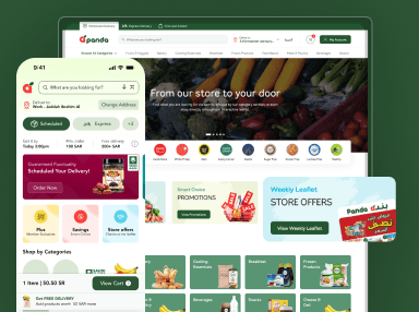
Card style web layout pattern specifies from its name that using a layout in cards that we generally find on Pinterest, Twitter and other social media. These layouts are very popular among the blog posts on various social media websites and are important to take into consideration as these are trending.
The name speaks for itself just like the physical card that we provide to the person. It is just like that with different dimensions, shapes and so on. According to me, cards layout are proven to be the best layouts as they are the ones which can be used multiple cards for different contents and can align them accordingly.
Card shape layout is famous as the people recognize the shape, size of the cards from the real world as they are already familiar with the card thing and it makes it easy even for someone who uses such a layout as they are known to the cards from the physical world.
Magazine style layouts
As from the name it directly came, the journalist and the newspaper editors are the big users of the magazine-style layouts. This layout was used by the most influenced magazine houses who use websites for publishing their news and blogs and even articles that are important for the website to be published.
These websites use most influential posts on the homepage of the website and others using different layouts for the different content. These layouts have multiple sections that are divided into different columns for creating different content for their website. These type of layouts are very much inn for those who are bloggers or writers and add their daily content on the website.
F- and Z-Patterns
F- and Z-patterns are those patterns which analyse the direction of the eyes movement over the page. This is basically judging how the person sees the content. An F-pattern has persistent alignment and content is at the top of the page, and some addition to content is on the left side (in roughly an “F” shape).
A Z-pattern is that pattern that is constant with the content along the top and adds valuable content further down. The eye is drawn diagonally from the upper right to the lower left of the page this is the beauty of z shaped pattern.
These patterns are made in such a context that make sure that how people see the content on a particular website. This patter follows abasic psychology of moving the eyes through the website and watching the content.
Asymmetry
Symmetry means systematic alignment whereas asymmetry means not in symmetry. The designs that are made out of this is more systematic, dynamic, organic and creates a good visual impact on the people. Generally, it is seen that the images and the content do not go hand in hand and they do not balance each other but that is the beauty of this layout.
Asymmetry is not static which makes the designs more amiable and admirable and content do not work in symmetry but they will gain attention through the dynamic designs, visually viable and they share their message through the images on the website.
Grids
Grids are table based patterns and these are the part of UI designs. Balance is important to understand the pattern and grid designs help the people to easily grasp the content as the grid are very flexible designs there are column-based grid designs that are most common among the usage of these patterns.
Grids are used with the subtle one’s to make them look more vibrant and aesthetic and the grid designs will attract the people through visual images and will be very effective though.
Timeless Web Layout Best Practices
The UI design- timeless web layout is user friendly as it will attract the audience toward the website. This pattern is an evergreen pattern that is used 10 years from now and today also it does the justice to 10-year-old pattern.
Using this pattern will never let you down or feel like it is for a short span of time, rather it is a long racehorse that will never let you down no matter what. Timeless web layout best practices as these will give you long term advantage and matter how much trend change bt the trend for this layout will remain stable.
Summing up
These are the layout patterns that are trending and some are which never go out of trend no matter what trends pop up. Rather these patterns will make your website more dynamic, viable and virtually aesthetic.
The layout should be such which makes the website more organic and will gain more customers to the website as the uniqueness in the layout patterns will make the game change on the part of business as they will be the reason for gaining the attention of more customers to the website.