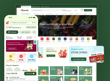
UI elements are components that are used in creating apps or websites. It combines collective user interface elements to present touchpoints for the user. It helps in navigating multiple features such as buttons, scrollbars, menu items, and checkboxes. UI elements are crucial for websites, web apps, mobile apps, augmented reality, or virtual reality apps.
It handles communications between user and app. It enables effective user navigation, input or output data. User interface design agency uses user interface elements to form language. It provides stability across products & makes it user-friendly and quick to navigate on the user’s part. Users need to understand how UI elements work. It helps to set up better apps or websites to engage more users.
Schedule Your 30 Minutes FREE Consultation
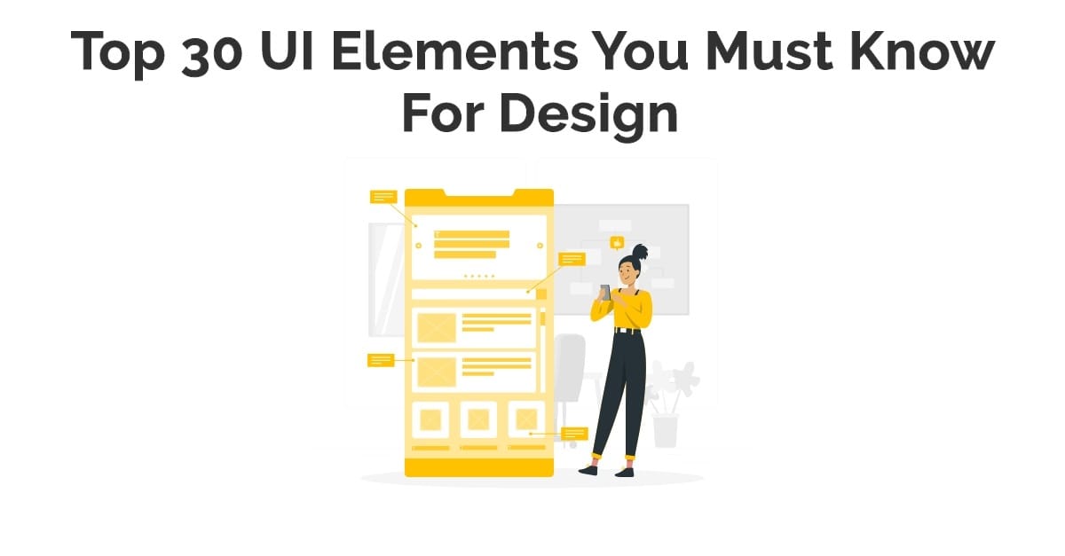
Various UI Elements
UI designers create websites or apps interfaces. There are multiple options for UI components. Users become comfortable with these elements, enabling them to integrate tasks, increase abilities, and enhance comfort.
We use various UI elements in different digital products during design interfaces. The three essential user interface elements involve:
Input Elements
It handles various user inputs that are part of the input authorization method. It enables users to input data into practice, such as users need to tell their location. Most used input factors include list boxes, buttons, toggles, text fields, date fields, checkboxes, radio buttons, drop-down lists.
Output Elements
It confers results against several user instructions, such as showing alerts relating to suggestions, success, and error messages to users.
Helper Elements
The other UI elements come into this category. We broadly used helper elements that include pagination, slider, tags, icons, breadcrumb, slider, search field. It also assists users in going around a product or website. Many UI components come in this section of user interface elements.
There are also three categories of these helper elements.
Navigational
The UI navigation is competent. There are many navigational helper factors, including navigation menus, links lists, and breadcrumbs.
Informational
It provides information to users such as tooltips, icons, and progress bars. Many components come into these subcategories.
Groups or Containers
It is efficient in maintaining multiple components such as widgets, containers, and sidebars for part of this category.
All primary UI components become part of these three elements. It is crucial to know all factors with their subparts. We discuss all components and how UI designers use them in their designs. It is crucial to use these UI factors in the best way to provide a better user experience.
Dropdown
It enables users to prefer one part at a time from a long list of choices. It is smaller than a radio button and helps to maintain space. There is a need to include a label, assistant text as select one, choose, preference and others. This feature allows users to select an item from a list into a dropdown menu.
Checkboxes
It helps users to pick one or more choices from a preference set. It is the best method to represent checkboxes diagonally. There are multi-columns to analyze space and other elements accurately.
The checkbox looks specifically as the name represents: a small square box on the screen that the user checks or unchecks. It enables users to choose multiple benefits from a list, with a specific checkbox that works for an individual. There is a need to mark the checkbox with a slight click.
Combo boxes
It empowers users to type a system value personally or to prefer from a list. It is a mixture of a drop-down list or list box, single-line input field. This helps users to choose according to their preferences. It also encourages users to know more details.
Buttons
It enables users to engage with touch or tick and labels with text, icon, or both. It is essentially part of the UI component that is necessary to design a button that users easily click. Most time, it presents shapes, labels, buttons. It helps users to perform particular engagements, such as submission.
Toggles
It helps users to advance a view, value, setting between two positions. It has its advantages for toggling between on or off state or shifting between list view and grid view.
Text or password
It provides users with access to text and passwords and allows single-line or multi-line inputs. Multi-line input fields, also known as textures and password fields, allow a single password to enter.
Pickers
The user probably picks a date or time with a date picker from apps or websites & submits it to the system. It becomes easy for users to select dates and times for various uses. The benefit of employing pickers over input areas is the ability to hold data. The user’s access typically forms in a database to make data flexible and accessible.
Radio Buttons
The users prefer any of a pre-defined collection of commonly exclusive options. The extensive use of radio buttons is to pick gender preference in sign-up forms. Mostly, users are confused with checkboxes, radio buttons are little circular factors. It helps users to prefer one option.
Confirmation Dialogues
It is effective for getting user approval for specific processes, such as deleting actions on various activities.
Alert
It suggests a short, powerful message that engages user attention and informs users about various situations and outputs. There are small red dots throughout the interfaces. It tells you that there is a new message, like to check out or payment messages. It also tells us about any error or the complete process.
Toast
It refers to UI components where user input, server acknowledgment, calculation in a small text box pop up on the screen. It occurs on the mobile or left or right side on the desktop at the bottom. The primary difference between alert and toast is former doesn’t remove itself and the latter appears after a specific time.
Badge
It creates a small badge at the top-right of its content that displays a little counter or indicator. This shows a numerical number of elements over the cart icon or online symbol that show superscripts or subscripts or tests to feature data. It draws attention to a particular factor.
Charts
It is the best way of communicating complicated data sets and illustrates specific data varieties & observations. There are two points to consider data are interacting and what you are conveying about that data.
Navigation Menus
It is a UI element with different values that users are quickly select. It takes an extra area of website or app from there. The navigation menu drawer slides in from the side of the suggested view. It drops in from the left but neglects many times. The menu theories on a mode that displays multiple menu types. We relate the menu element to the root content element.
List of Links
It comes with various rows of components that include icons, thumbnails, text, buttons, toggles, and much more. It has segments with equal data content, such as images and text. The best example of this is the sidebar. The links have internal or external links & present compatible styling for creating text and images.
Breadcrumbs
It helps users to understand their current location in a system. User yields a clickable trail of coming pages to navigate them and consider within a website. It locates at the top of a site, so users see their present location on process pages and click to move between steps.
Search fields
It comes with two UI elements, an input field or button & enables users to insert a keyword also submit it to the system. It helps to get relevant results that represent the input area with a magnifying glass. The search fields support users to input data to search within the system. There is a need to click on the clear button that erases the text field and input. It helps to get focused on them.
Paginations
It separates content within pages so users easily navigate them. Most times paginations are close to the bottom of a page that creates content into pages. It helps users to know where the page is within and click to go into other sections. This also depends on the length that automatically scales components. It also keeps the current page with the v-model attribute.
Tooltips
It helps users to refer when it hangs that shows the name or purpose of the component. It comes with tips that assist users to figure out a part or process at the interface. This factor is suitable for communicating data when a user hangs over a factor. It automatically manages tooltips and activates its display for text labels and selects the statement of its function.
Icons
It is the abstract symbol that helps users to navigate the system that performs information and show enactments. It is the best way to get across multiple things to users and generate a particular action.
Progress Bars
It presents the development of a process, but it is not clickable. This helps users to reflect the sequence of steps used at the time of checkouts. It also tells about various stages a user requires performing billing, saving updates, form submission. This is also under two categories determinate and indeterminate.
Notification
It is a revised symbol that informs users about newly available updates. It also tells about the new item to check, messages, date of loan payments, and other details.
Message Boxes
It is a limited window that transfers data to users but does not stop them from continuing with tasks. This box shows suggestions, warnings, and other suggestions.
Modal Windows
It is a practice to present content on top of the app that prevents interaction with the page. The modal window is a little box that includes a subject or information to interact with them or return to flow. The brief message that popped up asking you to confirm that you wanted to remove it is a modal. There is a need to choose items with multiple opportunities. It needs to clarify features forgiven with many other matters.
Widgets
These are user interface elements of interaction with the chat window, parts of a dashboard, or fixes to various services.
Containers
It keeps multiple items with text, images, valuable media, and more. The best example of current UI is cards that have various containers.
Sidebars
It has various groups of factors and items. We quickly switch between the deflate and apparent position. The sidebar represents a group of navigational activities or content directly on the side of a page that is striking or hidden points.
Search Bar
It keeps various search fields or options that are used to search collections. We display them inside of a toolbar or the main content. There is a clear button that shows when search bar text field. There is a click on the clear button that eliminates the text field and input. It activates the cancel button and clears input.
Carousel
The users browse with content, such as images or cards that hyperlink to various content or sources. The symbolic recognition of using carousels in UI design is that they enable over one piece of content & the same space on a page or screen.
Accordion
Web and app design agency use these UI elements in the best way in their UI design. It is a diagonally piled list of features that employ to show or hide uses. There is a need to click on the label to enlarge part of the presentation of content. It has one or more items that show at a time with default states. It displays one or more parts without the user’s click.
Wrap Up
The core strength of UIUX Studio has been designing UI UX products for clients around the world for many years. We know the importance of user interface elements in our designs. Our designers use these UI components in the best way so that users probably use all features. It is necessary to use the relevant elements in design so that it becomes user-friendly. It provides the best user experience for various digital products.
There are many ways to use these UI components to make them more engaging. We strive for all features that require you to design and create UI elements. It helps in facilitating designs with unique features so that more users engage easily. We create innovative digital products for you & contact us at sales@uiux.studio


