Ask any book reader about leading typography and they will tell you about the fat books with less line spacing. Similar is the case on the internet. This is why you know why most of the websites that have an excellent SEO, follow certain fixed patterns. It helps in maintaining a good flow on the website. But according to different algorithm’s ranking basis, it is important to know the leading typography trends in the industry. That is the reason some say to follow the trend with your aim in focus. Now, leading typography is important in websites because it makes the reader want to stay on your site. Along with that, it encourages the reader to read and ultimately take the action that you want him to take. In this blog post, you’ll find out what is leading in typography and tips to improve leading definition typography.
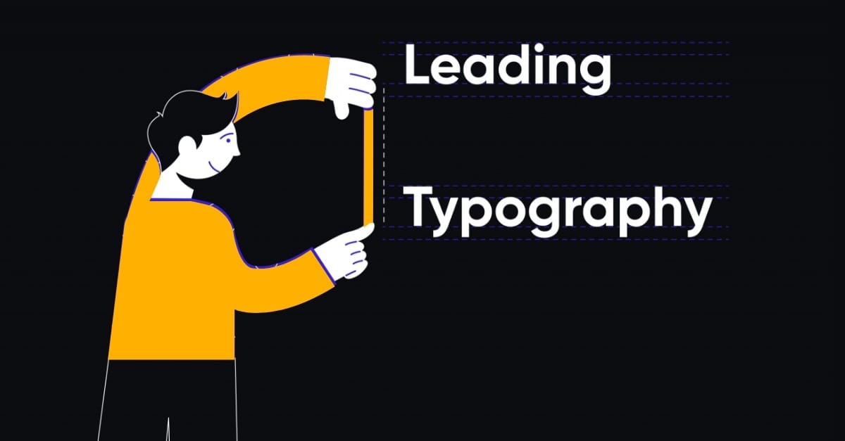
What Is Leading In Typography?
For writing, there is a baseline that helps us write different letters and identify them. The space between such two baselines is known as leading typography. Leading definition typography can be defined as the leading space between two baselines. Though the word leading has originated from typewriters or hand typesetters, it is still used in the industry by almost everyone. However, it is also known as line spacing as renamed by typographers recently. This was all about What is Leading in typography.
Schedule Your FREE Consultation
Why Is Leading In Typography Important?
Dealing with texts on any website’s interface or even in printed format can be tricky. Leading can instantly make the text readable. Also, as a major design element, it makes the job easier for the designers. It is not only simple but also the quickest way that appeals to the reader to read it. It is important for the reader because of the appearance of typography. In this highly crowded world, people tend to search for a clear and pleasant online environment. With so many options available, the visitor judges your information first by its appearance. Leading in typography can easily make the whole look of the online product sophisticated. Coming to its importance as a designing element, there are different software that set different default typography leading. Designers know how to make the appearance of the text squashed, clumsy. Also, different types of audiences have different choices, so designing according to that changes the whole outlook of the website. So, as a designing element, leading typography can be recognized as a major element in arranging, designing, and making the text instantly attractive for the reader.
What Is The Ideal Size In Leading Typography?
Considering different styles and elements of designing and the purpose medium in which the lead typography is used, the size of leading in typography differs. Also, some of them might demand a particular type of size and spacing in the typography. However, think as a reader here and consider line spacing that would make the text readable and enhance the interface at the same time. Having a lot of white space can not only take a lot of space can make the page spacious and boring, whereas very little can compress the text and make the interface crowded even though it is not. Typography leading should meet its purpose and make the text readable for the audience. Also, make sure that it adds a touch of design to the page and makes the page sophisticated. Now that you know what the leading definition of typography is, and are ready to use that as a major designing element in your designs, here are some of the tips that can instantly enhance your process as a whole.
Tips for In-Line Spacing That Instantly Make Your Text Better
Line spacing is the silent element that can make the design instantly better. It has the power to lure the reader into staying on the web page for a longer time. The content that you are providing to your audience can be useless if it is not presented properly. For enhancing the interface of your website and giving it a nearly perfect appearance that will also achieve its purpose, here are some of the tips that you need to follow in order to make your efforts count.
Choose the Right Software Designers use various software for designing their creative, blogs, etc. However, knowing your purpose a designer must know the software they are using to make the design. For designing a newspaper or a magazine, even for blogs, many designers use Adobe InDesign, Illustrator, Photoshop, or Coreldraw. This software offers everything that a designer requires. Often a design requires being a combination of two software. It is important to know the software inside and make every design that you make them count. Choose the software that your designer is more comfortable in and maintain consistency in the line spacing. The default setting for most leading typography software is 120% of the type size. Remember to adjust the size before proceeding with further work. This habit can avoid mistakes in case you work on someone else’s design or device.
Choose The Background Carefully Often time designers have to work on different backgrounds, animations, etc. Writing on such a background can make the designing process tough as well as hard to read for the reader. Sometimes the inconsistency in colors can make the interface of the website interesting, but the elements that make the reader stay aren’t effective. The credibility is somewhere lost. So, increase the line spacing, and all your problems are solved. This not only makes the text clear but also can reduce some of the copywriters’ work by giving fewer words to write.
Typefaces Demand Line Spacing Every typeface has its unique x-height, this is what makes them different from others. As the basis of the letters change, it demands to keep itself in such a particular phase. For example, Helvetica Neue has a larger x-height, which is 12/14, which can make the words appear more crowded. Technically it would require more line spacing to make it readable. Similarly, in Bernhard Modern, the shorter x-heights allow it to adjust in small spaces and still be visible. A Tip in this can be to use different line spacing into distinctive content.
Colors and Background Matter! There are dozens of examples that have spoiled the whole interface with wrong line spacing on a colored background. Make it a rule to use more line spacing when working on a colored background. Oftentimes it is the light background you work on, other than black and white. It is highly advised to use a lighter-weight typeface and increase the typography leading to make the text more visible. However, the best combination that is advised and heavily used is the classic black and white.
Headlines and Text Are Different From Each Other Headlines need to be attractive and at a distance from the followed by text. Using tighter headlines in the headline and giving a space in the body can instantly make it effective. Designers keep consistency in the headlines with negative leading in headers with multiple lines.
Test, Improvise and Then Confirm When it comes to maintaining consistency on different backgrounds it can be difficult. There is no specific, full-proof method that can answer because it changes depending on the project. So when you design it makes it a habit to first complete the project in typeface and then play with different leading typographies. It will either give you detailed insights into how to work on different backgrounds and projects. Test it, make notes and improvise on the designs and go with the one that suits the interface the most.
Tip for Beginners
Even playing with different designs, one thing that confuses most is negative leading and positive leading, and what are these exactly? Well, tight leadings are considered negative leadings. It happens when the point size is less than the point size of the chosen font. Even if the type size and chosen size are the same then that leading or line spacing is considered negative leading. Positive leading on the other hand is when the lines give more spacing. Going with less negative leading can compress the text and make the lines coincident lines. Also, different fonts give different point sizes that make it difficult to tell specific negative leading for the ideal design. Make it clear and experiment with different fonts, which will make you understand the design structure better and enhance the whole design. Different types of designs and mediums require different typography line spacing and for that, you need to understand leading definition typography. For those who are into new-age designs in the digital world, it is important to not forget the traditional element like consistency. Set a pattern and maintain a consistency that will enhance your game.
EndNote
Now you have understood what is leading in typography. Working frequently on landing pages, blogs, etc. can require in-depth knowledge of leading in typography. So, experiment and choose the consistency in your project. It is crucial to know the difference because it is not the whole design that is in focus but the entire UI and UX.
With UIUX Studio, we research and understand the design and interface then work on leading typographies. We help you set a pattern that will enhance your entire performance of the Users’ first meeting point.