Color Theory in Design is both art and science. It is the concept of how humans understand and perceive color. In simple language, color theory is a guideline for designers to communicate with the customers. Designers communicate with the help of multiple visual interfaces such as complementary color schemes, appealing color schemes, etc. Color theory was created by Sir Issac Newton in the year 1666 by mapping the color spectrum in a circle.
Color Schemes for Design
When designers design the screen for any website or for any application they use the model of addictive color design and use primary colors such as red, blue, and green. It is an important part of screen design as the choice of color dictates the experience of your audience. A good color scheme enhances the experience of your audience along with attractive interfaces and high usability.
Schedule your free consultation call
Here are some of the main color schemes that you could consider and your shortlisted design consulting firms can use in your designing process—
Monochrome
Under this color scheme, we take one color and create multiple variations and tints from it.
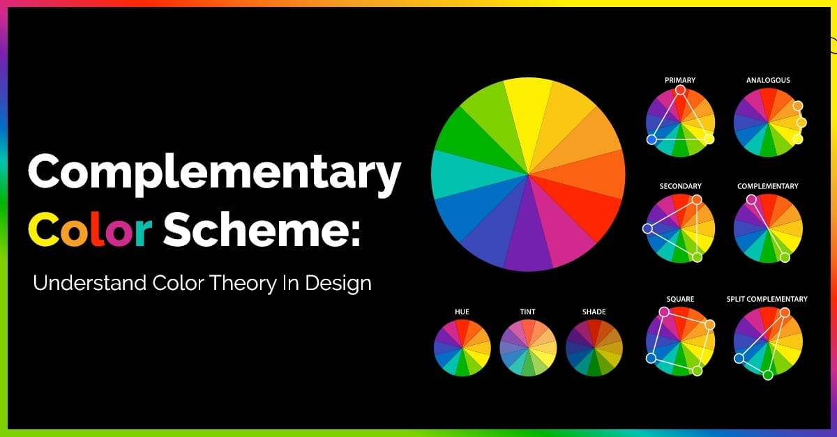
Analogous
This color scheme of three different colors that are located beside each other in one color wheel. With the three colors, we create multiple variants by mixing white colors with them. Thus forming a high-key color scheme.
Complementary Color Scheme
This color scheme is all about using two opposite colors to maximize the contrast of the design. The classic complementary color scheme examples are blue and yellow.
Compound Harmony
The color scheme is also called a split-Complementary color scheme. This color scheme is for softening the contrast of the design by adding colors from either side of the complementary color pairs.
Triadic
The color scheme is best for visually appealing designs as it maintains the contrast and harmony in the design. This color scheme uses three colors hence the name triadic. The colors used are at equal distance in the color wheel.
Tetradic
Under this color scheme, we use four colors that are complementary pairs. This ensures rich designs and from those 4 colors, we choose one dominant and make a balance among the remaining three. The complementary color scheme examples are orange, yellow, blue, and violet.
Square
Square color scheme is a variant of a tetradic color scheme. In this, we find four colors that are evenly placed in the color wheel. For instance, each color is at an angle of 90 degrees from one another. This color scheme works best when you use all four colors in even proportion.
These are some of the color schemes that will help you design a perfect template for your project. Further, we will see how you can use color schemes like the complementary color scheme in design.
This Is How You Use Complementary Color Scheme In Design
Complementary color scheme examples are quite tricky as it comprises both warm and cold colors. So when it comes to design the designers should carefully examine the colors and decide the dominant one. It is advisable to designers that when using a complementary color scheme they should use primary colors first and then use the following color for accents. It is this particular choice of a designer that will decide the final impression i.e. warm or cold.
Complimentary color schemes in design are quite useful for designers when they want to emphasize something. This color scheme lets you focus your undivided attention on a particular object. Designers also use this scheme when they want their designs to look more traditional. The complementary color scheme uses two colors only but we can add variations by adding multiple shades with various intensities and saturation.
Steps To Create Complementary Color Schemes
Here are some of the steps that you could use to create complementary color scheme examples for your designs.
Step 1- Pick the Color
The first step in creating complementary color schemes is by picking a color from the palette. After choosing the color we change the color to HSB. HSB is for Hue, Saturation, and Brightness of the particular color.
Step 2- Value of Hue
It is an important step in the process of creating a color scheme. This step gives you the complementary color of your dominant color. Copying the dominant color increases the value of its Hue (H) by 180 points and Voila! You have your complementary color ready.
Step 3- Tint and Shades
This step is for making a color palette by making light and dark variations of the colors. If you want the dark variant of a particular shade, set the Brightness value of the respective color to 30 points. If you want a lighter version of a particular shade, set the Brightness value of that respective color to 90 points. For better accessibility set the saturation value to 50 points.
Step 4- Time to make your Complimentary color scheme
After creating your color palette it’s time to choose the colors accordingly for the design. Select one primary or dominant color and the darker version of your primary color for the heading or the titles. Try to choose the lighter version of your complementary color as an accent. It will give you a good design.
Step 5- Application of Color Scheme in design
The last step in the process is to apply your complementary color scheme in designs and see the results.
Relationship Between Colors and Brand Awareness
Color theory plays a vital role in the brand value of your organization. If you understand the color design it helps in brand awareness. With the help of color, theory designers can evoke multiple emotions that help to convey messages. It is one of the best ways to convey the objective of the brand and the message of the designers to its audience. It helps in guiding your brands and making decisions along with this it also lets you understand competition. With your competition in the market and the kind of complementary color scheme, you can use specific color combinations for your brand as well.
Almost all of the marketing tactics use emotions with the help of color schemes to drive actions from their audiences. Color schemes are one of the easiest ways to accomplish things such as driving emotions from your audience and brand recognition. In some situations, multiple brands have trademarked their colors that represent their brands. A brand with the help of color theory builds a strong presence and awareness in the market.
Each color has its meaning for example Pink color, brands associated with female products so you see brands use pink color for packaging products that are for females. On the other hand, luxury brands use the color Black to evoke a sense of mystery and power.
It is advisable for designers that they should be as creative with the colors as possible. With the help of color theory and Psychology, you can easily convey the message of your brand to your audiences.
Challenges Faced By Designers
When it comes to designers choosing colors for the design everyone has their set of preferences. Some choose warm shades while others go for cooler variations. It is quite important to find the middle ground and choose the color that best suits the personality of the brand. Try to get preferences of color out of the loop if you want to meet the brand specifications.
Designers should follow the trends of the color schemes and see what is in the trend and market these days. As different cultures interpret different colors differently. So designers need to have a thorough knowledge of colors before deciding the design. The designers should know the target audience for their brand to make a good design.
At the end of the designer’s design to please everyone, they end up not pleasing anyone.
Conclusion
With the help of the above findings, we can conclude that color theory plays an important part in the design process. When it comes for designers to choose colors, the designer must have a thorough understanding of the theory of colors. This will help the designers to generate good designs. A complementary color scheme in design is one of the basic color schemes that will help you in understanding the color theory better.