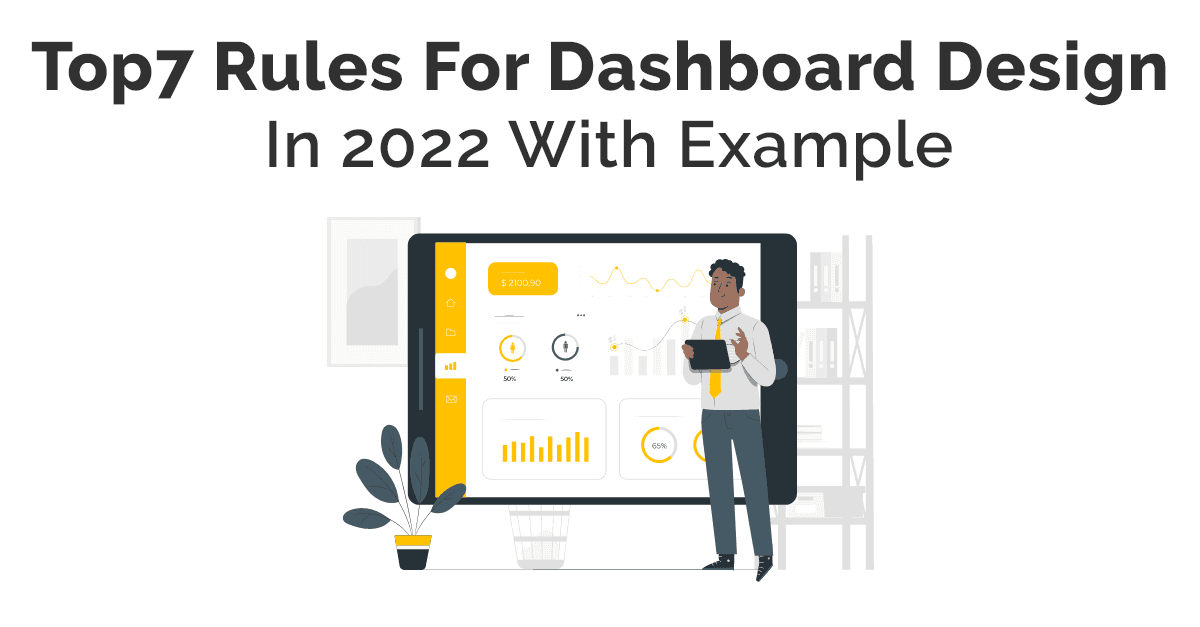
Most companies want to make some unique dashboards to engage more traffic. They use dashboard design to make them exceptional. It is a type of screen where data displays to provide information. It presents an overview of the user with an approach to relevant data, operates, and manages. The dashboard is the type of homepage that provides various pieces of information.
UI design agency focuses on dashboard UI design to make them more engaging. We collected these data from various sources. In this process, stakeholders or clients take part in the method. UI designers use multiple tools to show information. It depends on the type of dashboard and its relevant information, such as charts, graphs, and maps. It helps to access meaningful data efficiently.
Elements in Dashboard Design UI
Companies always want to manage all information so that it becomes easy to maintain all data. They want design services for better engagement. Expert designers know how to design a dashboard. It is essential to include all elements for better results. The dashboard UI design combines multiple data so users easily understand all facts. It is significant to approach various details to analyze them.
- Interpret complex data
- Access all facts
- Reveal the meaning of data
- Present transparent user interface
They include many details on the business dashboard. It has a professional graphical user interface to access necessary metrics and KPIs. It helps to track projects, processes, reactions that help to make quick decisions. There are distinct ways for dashboard design UX. UI designers use all design rules to make them better. Data sources, metrics, KPIs, navigation, penetration, and a good deal of other metrics are included.
There is a need to include more filters to get a better dashboard UI design. It helps to manage data by selecting various date fields, fields, or sections. Users search for data efficiently with manageable navigation lists.
Schedule Your 30 Minutes FREE Consultation
Dashboard Design UX Rules
It is crucial to use principles in the dashboard. Various types of dashboards help in creating the best dashboard UI design. UI UX designers use advanced and latest tools to make them simple and accessible for business. It is crucial to know how to design a dashboard with its principles.
Let us discuss the primary principles of dashboard design UI.
User Needs
We know digital products revolve around user needs. It is essential to know your target audience and its needs. It helps to make dashboard design UI more pleasant to analyze the various data. We use data on the dashboard to maintain our design process. It is necessary to associate with these experts using multiple APIs. There is a need to attract a target audience because it is crucial to address user concerns.
It is imperative to know the context or device that the user uses to access dashboards. It depends on companies because it helps in deciding the process accurately with a particular audience in mind. In case the audience is familiar, they want simple designs. If the user of your company is modern, they prefer to use stylish designs. The users always prefer simple charts so they easily understand. It is better to make them simple so that every person understands and uses your services or products.
Selection Of Dashboard
It is necessary to select the right dashboard because all things involve this. There are multiple types of devices. There is a need to choose a dashboard according to all devices. When designers design dashboards for presentations or prints, you need to keep all information on one page.
There are four main types of dashboards used in the design.
- Strategic
It concentrates on observing the long-term methods of a company. There is a need to evaluate methods by reviewing the broad reach of meaningful data. - Operational
It is a quick way to follow, control, and control methods or services with a recent or short time scale. - Analytical
The specific dashboard design UX has large flows of complete data. It enables experts to check accurate conclusions to maintain the company. It helps with development at the management level. - Tactical
These dashboards contain information that helps in planning various types of growth projects. It includes movements, powers, and gaps in different sections.
We create every dashboard for a specific user for the best process for decisions. It uses knowledge in its business policies. There is a need to use all these in the best ways so that it helps to get excellent results.
Relevant Information
It is necessary to use all data on the dashboard. The best way is to make them precise. It is always better to use design principles for better methods because it is a golden rule. There are various types of audiences, so their needs are different. Companies have sales managers, marketing experts, logistics professionals, HR departments, and many more.
It is important to make separate sections on dashboards, such as marketing, investment, and many others. There is a demand to create a blog, website, product page, and other relevant factors. Dashboards need to develop according to the type of information. UI designers use multiple tabs, filters, selectors, and drop-down lists, which makes them complicated. They create a simple dashboard for every dashboard so it becomes easy to understand. Sometimes they also use software to create dashboards.
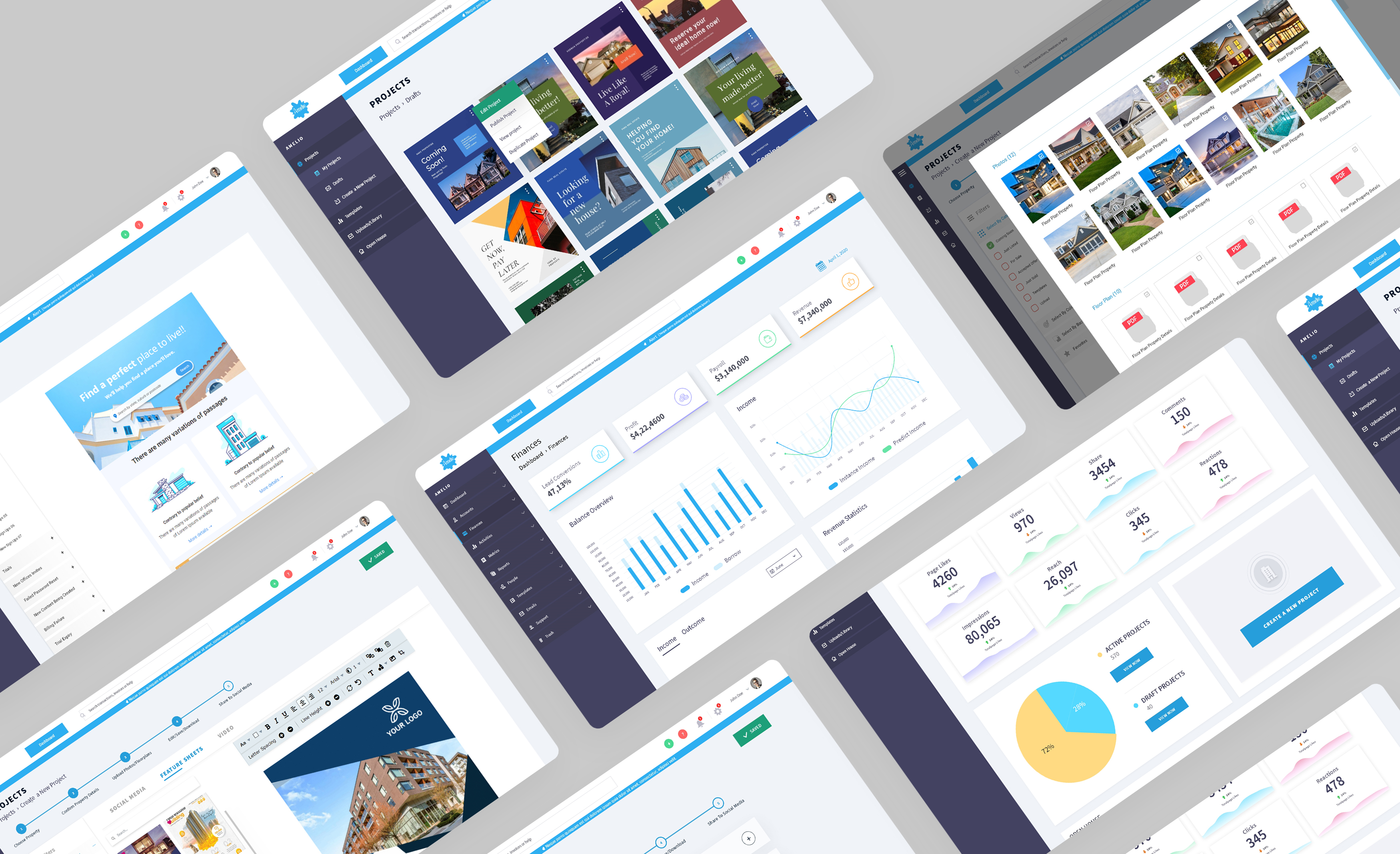
Our designers designed the dashboard of Amelio. It is a real estate agency that provides various solutions to buyers and dealers.
Select Right Chart
The dashboard looks attractive with the use of charts according to information. Selection of the perfect type of chart provides information in the best way. It is crucial to analyze material to select the best chart to visualize data for better performance. There are various types of charts to present data. Let us check these charts that are used for visualization.
- Line Charts
It reveals methods of variation across a continuity specifically. This pattern is familiar to interpret at a glance. - Bar Charts
The bar charts are used to compare features in the same category, such as page analysis with the country. They quickly figured out these charts in precise and compact ways. - Pie Charts
Designers prefer not to use these charts because it is difficult to compare the sizes of pie charts. The chief challenge in these charts is their size because users quickly notice big slices. Small portions are complex to see, so using an accurate size is the primary concern. - Sparklines
User interface design agency has an expert team to design dashboards in multiple ways. It is used to represent the latest trends that quickly scan these metrics. Users don’t easily notice it. Most of the time, UI designers prefer to use fewer charts such as scatterplots, bubble charts. They know how to design a dashboard with these charts. It has a lack of clarity or accuracy in quantitative methods.
They also use interactive displays for users. Sometimes they need more mental effort to read this information. It provides minimum efficiency to users. These charts or visualizations in the dashboard fall into various categories, such as communication, pattern, style, and analogy. It is crucial to use these categories to provide information in dashboard UI design entirely.
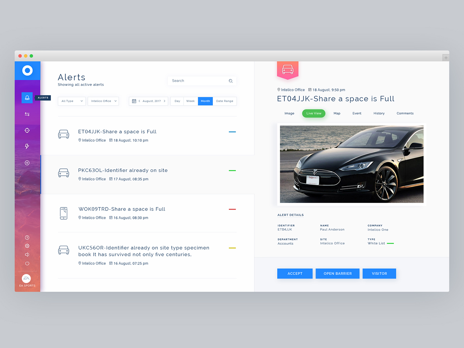
We designed dashboards for Intelico. It collects data for multiple sectors to comprehend real-time activities.
Appropriate KPIs
It is imperative to select appropriate KPIs in dashboard design UI. These are very important to use relevant key performance indicators for any business. The visual illustrations provide meaningful opinions that depend on individual sections of the organization. These are important in how to design a dashboard.
The primary aim is to target the audience, so there is a need to prefer accurate KPIs to present in the dashboard. It helps to provide specific KPIs to provide information for business, industry, and other platforms.
It shows accurate data on sales of products at a time. These metrics are significant for merchants to analyze their demand for products or services. These factors constantly change, so it is the best way to recognize these areas.
Selection of Colors
It is a crucial factor in dashboard design UX. The most important factor is a selection of specific colors to interpret all data. UX design firms use their UI UX skills. It is necessary to use relevant colors so the user regularly understands them. There are various alternatives to illustrate concepts according to advantages. The dashboard has the interactive approach of data to provide information. The stylish dashboard has transparent & simple because flat designs are in trend.
Color Palettes
It becomes essential to select colors according to the brand logo or fonts. We use different color Consultation palettes in logos or fonts. It is necessary to use relevant colors, but not too many colors. There is a need to select three or four colors for the dashboard. Sometimes there is a use of highly saturated colors that has a negative impact. The user becomes confused and does not understand actual data. Our skilled designers use the primary principle in dashboard design UI.
When we use intense colors, it attracts the target user quickly. It is also helpful to use matching features in the chart. All components in each group need to be displayed. We relate it to these categories, such as grade standards or lead progress. There is a need to use specific colors for all factors so that it is accessible to identify. It uses various colors to identify multiple factors for creating dashboards. It helps to understand all these factors. The user quickly gets all information accurately from dashboard UI design.
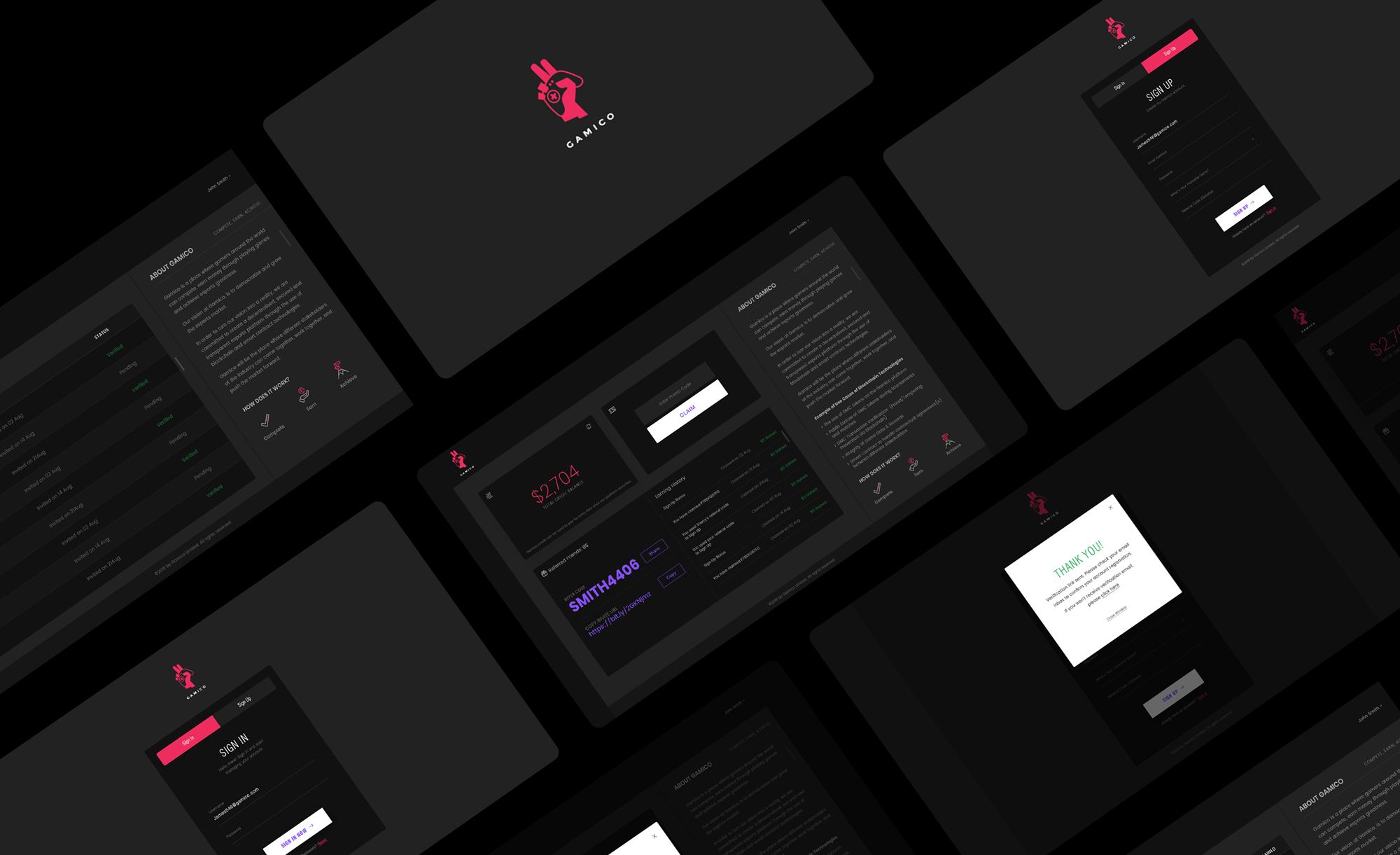
Our UI designers create a dashboard for Gamico. It is a virtual platform for gamers to meet other sports lovers and win real money.
Selection of Simple Designs
The primary focus is on simple designs in the coming year of 2022. There are lots of options available to create charts in dashboard design UX. Designers freely use frills, frames, effects, gridlines, background, and many others.
There is a need to give focus on font, size, and color. It is unnecessary to use space for decorations and others. There are many ways to display multiple dashboard design UI. It is crucial to use shadows to highlight various areas on the dashboard to provide more intensity. Most UX designers focus on a simple dashboard. There is a proper process to meet these factors. These factors help in how to design a dashboard.
Wrap Up
UIUX Studio is one of the world’s leading design agencies. We provide services worldwide to multiple clients. Our experts know how to design a dashboard. It is crucial to create dashboard design UX for websites or apps. It helps our clients to engage more audiences.
Our designers also design dashboards for you according to your niche. Send us your business requirements at sales@uiux.studio