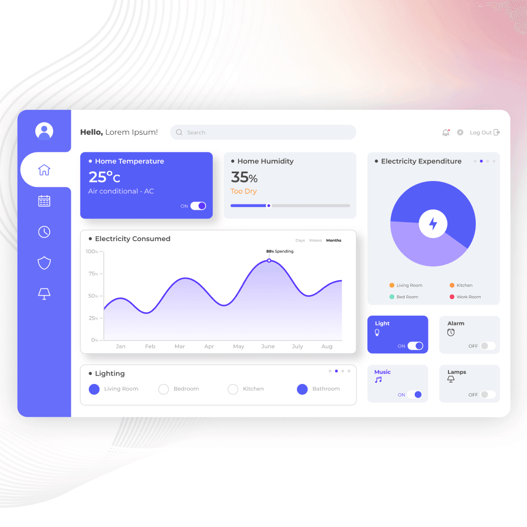
Dashboards have become the cornerstone of this capability, serving as dynamic, visual interfaces that transform raw data into actionable insights. Picture a dashboard as the control center of a spaceship, where every gauge and display offers vital information that guides decisions and actions. Just like those control panels, a well-crafted dashboard provides clarity and focus, empowering businesses to navigate the complexities of their data with ease.
Creating an effective dashboard is both an art and a science. It’s about more than just assembling charts and graphs; it’s about telling a story with data, where every element works in harmony to provide a clear, cohesive picture. Imagine you’re a chef crafting a gourmet meal—each ingredient (data point) must be carefully selected, prepared, and presented to create a dish that is not only delicious but also visually appealing. Similarly, in dashboard design, every data visualization, color choice, and interactive element plays a role in enhancing the overall user experience.
However, the journey to creating a dashboard that truly works is filled with challenges. How do you ensure that the information is not only accurate but also relevant and easy to digest? How do you balance aesthetics with functionality, ensuring that your dashboard is as beautiful as it is practical? These are the questions that every designer must grapple with, and the answers lie in understanding the fundamental principles of effective dashboard design.
In this blog, we’ll take you behind the scenes of crafting dashboards that do more than just look good—they deliver real value. We’ll explore the key considerations and best practices that can help you create dashboards that are intuitive, insightful, and impactful. Whether you’re designing for executives who need high-level overviews or analysts who require detailed, granular data, these guidelines will help you build dashboards that meet the needs of your users and drive better decision-making. So, let’s dive in and uncover the secrets to designing dashboards that truly work.
Understanding your audience
Before you start designing your dashboard, it’s crucial to understand who will be using it and what their specific needs are. Consider the following:
- Who are the primary users? Are they executives, managers, or analysts?
- What information do they need? Focus on the metrics and data points that are most relevant to their roles.
- How will they use the dashboard? Determine whether it will be used for quick checks, detailed analysis, or presenting data to others.
Tip: Conduct user interviews or surveys to gather insights directly from your audience.
Defining clear objectives
Every dashboard should have a clear purpose. Defining specific objectives helps ensure that your dashboard remains focused and relevant. Ask yourself:
- What is the main goal of this dashboard? Is it to track sales performance, monitor website traffic, or manage project progress?
- What key performance indicators (KPIs) should be included? Select KPIs that align with your objectives and provide meaningful insights.
Tip: Create a list of must-have metrics and nice-to-have metrics to prioritize your data effectively.
Simplifying and prioritizing information
A cluttered dashboard can overwhelm users and obscure important insights. Simplify your design by prioritizing the most critical information and using clear visual hierarchies. Consider these strategies:
- Use minimalism: Focus on essential data and remove unnecessary elements.
- Organize content logically: Group related metrics and place the most important information at the top or center.
- Utilize whitespace: Give your data room to breathe, making it easier to read and interpret.
Tip: Use bullet points, headings, and separators to break up information and guide the user’s eye.
Choosing the right visualizations
Selecting the appropriate visualizations is key to making your data comprehensible and engaging. Different types of data require different visual representations:
- Bar charts: Great for comparing quantities across different categories.
- Line charts: Ideal for showing trends over time.
- Pie charts: Useful for illustrating proportions or percentages.
- Heat maps: Effective for displaying data density or intensity.
Tip: Avoid overcomplicating your visualizations. Keep them simple and intuitive.
Ensuring data accuracy and timeliness
Accurate and up-to-date data is the backbone of any effective dashboard. Implement processes to ensure data integrity:
- Automate data updates: Use tools and integrations that automatically refresh data in real-time or at regular intervals.
- Validate data sources: Regularly check and verify the accuracy of your data sources.
Tip: Include time stamps on your dashboard to indicate when the data was last updated.
Making it interactive
Interactive dashboards allow users to explore data and gain deeper insights. Incorporate interactive elements to enhance usability:
- Filters and drill-downs: Enable users to filter data by different criteria and drill down into more detailed views.
- Hover effects: Provide additional context or details when users hover over specific data points.
- Responsive design: Ensure your dashboard is accessible and functional across different devices and screen sizes.
Tip: Test your interactive features thoroughly to ensure they work seamlessly.
Designing for clarity and consistency
A visually appealing dashboard is not only more enjoyable to use but also easier to understand. Focus on clarity and consistency in your design:
- Use consistent colors and fonts: Stick to a color palette and typography that align with your brand.
- Employ clear labels and legends: Ensure all data points are clearly labeled and easy to interpret.
- Maintain alignment: Use grids and alignment tools to keep your layout tidy and organized.
Tip: Use color strategically to highlight key information and draw attention to important metrics.
Crafting an effective dashboard requires a blend of understanding your audience, defining clear objectives, prioritizing information, choosing the right visualizations, ensuring data accuracy, incorporating interactivity, and designing for clarity and consistency. By following these key considerations and best practices, you can create dashboards that not only look great but also deliver valuable insights, helping your team make better, data-driven decisions.
Remember, a dashboard is more than just a collection of charts and graphs—it’s a powerful tool that can drive your business forward. So, take the time to design it thoughtfully and watch your data come to life.