UX design psychology plays a significant part in a user’s experience. It becomes necessary to know how our designs are noted. We make improvements in our designs to create more impressive results in attaining the goals of the user.
In this, Wikipedia says that User experience (UX) is a person’s emotions and attitudes about using a particular product, system, or service. It includes a person’s perceptions of utility, ease of use, and efficiency.
UX designers read the minds of people to understand what they require & design a product that meets those needs. It helps to know the perception of the user. Psychology in UX design plays an important role to create engaging designs for multiple clients.
When our UI UX design uses this psychology in designs, it comes with creative and perfect designs.
Therefore, to generate a successful user experience, the UI UX design company has to consider the person who is advancing to use it & knowledge of psychology in UX design comes into use.
Schedule Your 30 Minutes FREE Consultation
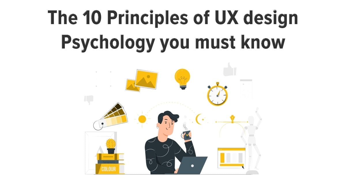
Principles Of UX Design Psychology
There are many ways to create attractive designs for websites or apps. Here we discuss the primary psychology of UX design so it helps UX designers to create engaging sites.
Hick’s Law
It specifies time decides on increases with the number, and complication of options displayed to the user. It inspired the user with choices, to take them to decide. We easily explain with an example of a restaurant with a long and amazing menu.
If the restaurant has many items on the menu, there is a need to read all the options, and deciding takes much longer, but if it has fewer items, it becomes easier to select from them. It same happens with designing interfaces.
In UX design, if we want the user to have a pleasant experience with your product, try to lessen the number of choices you present to them. User research is the most reliable way to identify these key features to include in your design.
Hick’s law in design also relates to how you organize your information architecture. It is always best to give wide categories then break them into subcategories. Wherever its long list makes them short also reduces alternatives.
An outstanding example of this is splitting the checkout process into many screens, such as shopping cart > delivery details > payment information > submit. The other way to include Hick’s Law is to feature suggested choices for your users, not to confuse them with preferences. Modern onboarding is a special way to reduce the sensible load for new users.
Gestalt Principles
Many times, our approach is managed by how we see objects and also link them to specific based on spacing. Our brain ignores gaps, discrepancies, or disorders based on the laws of organization.
UI UX design psychology’s favorite principle is the Gestalt principles of visual perception. It illustrates how the human eye sees visual elements and explains how the eyes distinguish shapes as a single, unified form rather than separate factors. This is an excellent example of how psychology design goes hand-in-hand. It also explains viewers’ group together objects to recognize them as a whole.
The principles of Gestalt theory explain into six categories:
Similarity
The human eye always sets up a relationship between related factors in a design. When we use primary factors such as shapes, colors, and size compellingly.
Continuation
The human eye grasps the paths, lines, curves of a design. The user’s eyes adapt to see a steady movement of visual factors, preferably of separated objects.
Closure
The human eye prefers to see complete shapes and will fill in gaps. If the visual elements are not complete, the user can perceive a complete shape by stretching in the missing information.
Proximity
These simple shapes are organized together and create a more complex image. When factors are fixed close together they are noted as a group. The proximity of the tilted lines joins them to see as one image.
Figure/Ground
Users differentiate between an object (figure) and its surrounding area (ground). It easily switches between them to explore various images. The human eye covers shapes from backgrounds.
Symmetry and order
The design needs to be stable and complete. The user’s brain automatically spends time and effort trying to identify a comprehensive picture.
It helps to make the design more creative.
Von Restorff Effect
The Von Restorff effect is also popular as the isolation effect that concludes when multiple identical objects are present, the other varies from the rest is likely to recognize.
It specifies that extraordinary things are more likely to be recognized than regular items. This style has a unique visual, context, or experience and helps to create a design with an outstanding experience for users.
CTA is a crucial design factor that makes it easier for users to process what they see. It gives importance to various details like image, font, color, size, words, sounds, animations, and many more details.It becomes impressive when we effectively use these details.
Psychology of Colors
The psychology of color is the science of how color influences human performance. We can see color perfectly with both eyes, brains going together to explain what we see in colored images.
We connect it with feelings and opinions, also used as a marketing tool in multiple industries. According to research, up to 80% of users think color enhances brand recognition. When deciding colors for a website and branding, it is easy to recognize your target audience. It’s set up to increase the productivity of design and emotions linked with the brand.
Cognitive psychology research shows the more pleasant a product is, the more usable and also recognized. We know this as the Aesthetic Usability Effect because positive feelings, attraction is associated with higher quality. People ignore usability issues because of attractive aesthetics.
The primary features of each color such as
- Blue shows strong, honest, calmness, reliability, secure. Many corporate organizations use blue to reveal a neutral feeling of reliability, such as Facebook’s blue color scheme, to communicate to users that it is a secure social network.
- Red color red tells us about energy, love, excitement, action, boldness, and passion. The best example of red color is
- Coca- Cola. It uses red in a classy way to communicate to users that the product is very energetic.
- Orange tells us about happiness, sociability, friendliness, affordability, enthusiasm. It is used to attract attention and is considered a color of enthusiasm such as Nickelodeon children’s channel uses orange in their brand to give the idea of a happy, playful environment.
- Yellow color shows logical, optimistic, forward-thinking, confident, playful details. It excites our mental capacities, uplifting feelings, and cheerfulness, and it is the most highly visible of all colors.
- Pink is famous for being feminine, passionate, youthful, fun, gentle, nurturing. It is a mixture of effective red softened with the purity of white. It shows love matched with excitement.
- Purple shows imagination, creativity, nostalgia, royalty, spirituality. It excites the imagination, bringing emotions, the strength of red in combination with the spirituality of blue.
- Green shows growth, organic, natural, freshness, stability, positivity, comfort. It is a stable color that is engaged with natural existence in our environment. Companies use green in their color scheme for the association with its nature and freshness.
- Brown tells us about earthy, simple, security, and protection. It is a down-to-earth color that symbolizes structure and stability and feelings of friendliness and loyalty.
- Black always shows sophistication, luxury, seductive, formal authority, strength. High-end brands mostly used it to illustrate their sophistication, luxurious products, and services.
- White shows simplicity, purity, light, innocence, goodness. It is the lightest color, also known as the most complete and pure.
- Multi-color tells us about multi-channel, positive, playful, bold, boundless, diversity.
The companies with multiple colors suggest they present a vast choice of products and services such as Google.
Mental Models
It formed mental models from user experiences and views of the real world. We know that people always have a mental model to connect with objects or systems.
Now people spend more time online, so users developed mental models of how to relate and what to require from interfaces.
When the design or features of products don’t match these mental models, users find it challenging to use these products.
People want easy navigation, communications, and terminology while searching for products. The best examples of these things, such as users, require comprehensive navigation at the top of the page, linking back to the home page to the site logo.
There are many ways to understand user mental models, such as usability testing, task analysis, interviews, observations.
UX designers want to provide efficient online experiences to users, & use mental models in their projects to provide the best results.
Pareto Principle
It is a very famous law also known as the Pareto principle or 80/20 rule or Law of Vital Few. This principle tells us that 20% of work is complete to achieve 80% of the results. You also set up a less to get a lot of positive change.
There is a need to focus on 20% in designs to present a powerful impact on the rest of the designs. When there is time and abilities, UX designers create the best user experience and emphasize their efforts on the small part of the design to provide the best impression to the user.
You can analyze design functions to create 80/20 that focus on fewer factors to provide maximum accuracy to get conversion rates with fewer efforts.
Psychology of Shapes
We know the subconscious mind reacts to shapes by relating them with features that they represent.
These connections are formed from human relations that face without specific to them. We see the red octagon that is worldwide known as the STOP sign. Brands use various shapes with multiple colors to form their logos. These visual factors trigger emotional connections with their brand. The most common shapes used in designs are:
- Circles, Ovals, Ellipses
We know round shapes create a specific emotional message that sees as feminine qualities and also proposes community, relationship, unity, as in the logos of Audi or Pepsi. - Squares & Triangles
Logos with straight edges infer stability, strength, professionalism, and efficiency. We relate triangles to power and connections with science, religion, and law. We examine these shapes as a dynamic quality. - Vertical Lines
They connect vertical lines in logos such as Cisco or SoundCloud with power, strength, and aggression. - Horizontal Lines
It connected horizontal lines with association, equality, tranquility, calmness in logos such as AT&T or Human Rights Campaign.
These factors are crucial in UX design psychology and provide the best designs.
Fitts Law
It suggests the time it takes to move to a purpose area with the size of the target and distance to the target.
The target buttons close to mouse parts, or organizing them open to low interaction time. It is essential in web design because the time needed to take action influences conversion rates.
Improving link size when wavering over items, as in Apple MacBook’s menu bar, is appropriate for developing the usability index. We use the law for undesired actions, such as deleting buttons, reducing their target size.
Visceral Reactions Law
When we see any attractive website & not want to leave because of its engaging designs. We know this feeling as a visceral reaction. It is a natural reply to the experience generated by chemical messengers in our brain. The eliciting visceral reactions in design keep our visitors coming back for more.
Users create a split-second choice about how they think about a specific design as they look at it. Gaining a visceral reaction from users develops a special behavior that helps to gain their loyalty and support. It helps to generate a larger image for your brand.
Using simple design details such as fonts, colors, imagery, and icons determines the complete feel of the site. People feel relaxed with things they refer to, creating a novel experience to manage an underlying understanding.
Limitations Of Memory
We know that memory is not always sharp. Our thoughts, feelings, beliefs, and surrounding environment recreate the means we store.
Many types of research show that people create false memories in which they remember things that didn’t take place or recognize them differently.
It is relevant to create designs based on the brain’s habits or mental models.
UI UX design agency designs websites or apps to assist users and create the best user experience that is based on recognition.
They know users do not remember all details on pages, so they provide essential information on all pages. It is better to present tailor-made designs so users could easily remember them and come to sites again.
Wrap Up
UIUX Studio provides services for years and works on multiple projects worldwide. We always give preference to UI UX design psychology in our design projects to fulfill our client’s business goals to enhance user relations.
Our UI UX designer takes the influence of psychological principles to create a smooth user experience to increase conversion rates and user experience.
Hire UX Design Agency for various design projects because they use psychology principles in designs for timeless solutions.
Go on with our experts on sales@uiux.studio.