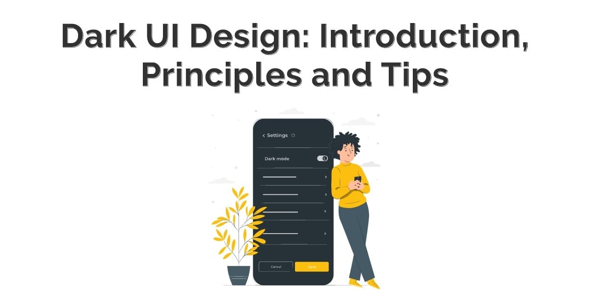
Nowadays, UI UX designers use various modes in designing websites or apps. Most of the time they prefer to use dark UI design or light UI design. Dark mobile UI design is widely used in designing. It conveys power, luxury, elegance, style. Dark mode UI design offers various difficulties so there is a need to use UI web design dark perfectly, so they look elegant.
Dark UI vs Light UI
Designers see a brand fit, cultural suitability, color psychology and analyze the emotional impression. It’s a complex balancing act. In the financial app, their target audience is different, so mostly UI designers use cool elements. Using too rich, dark, stylish becomes irritating when people try to check their balances or pay a bill.
Dark UI design is challenging in B2B SaaS apps because using web UI factors like tables, data, widgets, forms or drop-down looks odd on a dark theme UI design.
Various color patterns don’t work effectively with dark mode UI design because it depends on brands, product type, context, and environmental factors.
Schedule Your 30 Minutes FREE Consultation
Contrast in Dark UI Design
When we talk about contrast in dark mobile UI design, we do not consider the black theme as a dark theme. There is also a low-light theme and the primary concern with dark UIs is fulfilling enough contrast so visual factors and text are legible. Most of the time UI designers use black to finish strong contrast. It is better to not use true black for backgrounds or covering colors.
It is black for UI elements that are used occasionally. We use black for miniature UI elements or an enclosing bezel. Many designers suggest including a detailed dark blue tint to dark grays for specifying the color scheme. It creates a more reliable dark tone for digital screens and a charming dark UI color palette.
If we design according to color psychology, it expresses various colors how it relates to people. In every country, colors used in different ways like black are concerned with death, mystery, and evil in western cultures. Green color relates to growth, or blue is known as smooth color because we correlate it with sky and water. Digital products with dark UI design connected with strength, grace, that which are in trends.
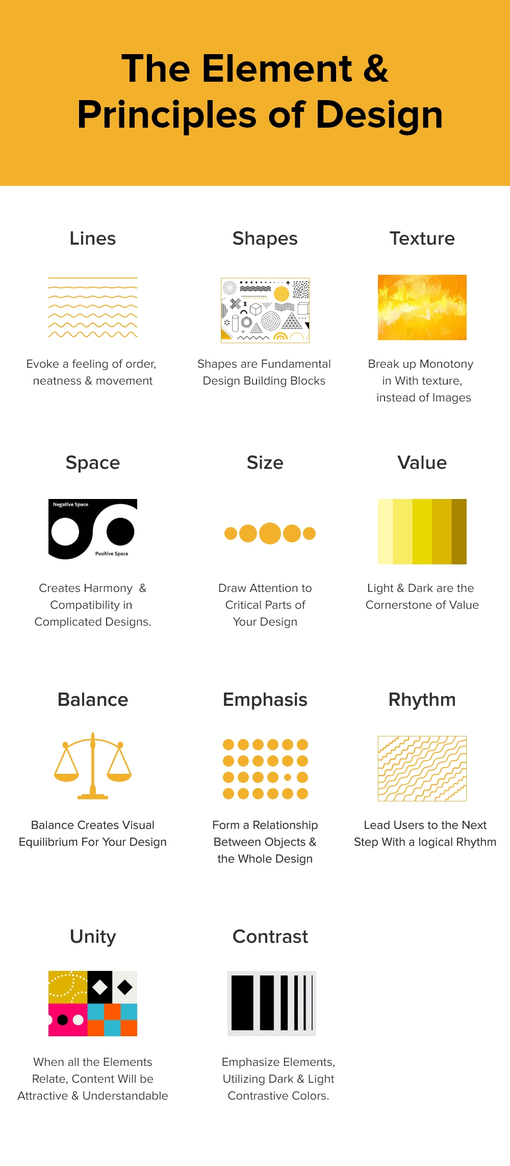
Elements & Principles of Dark Mode UI Design
UI UX designers always use primary elements and principles of design so that they perfectly design apps. The key factors are :
Lines
It helps in designing to get a feeling of correctness, movement, order & help in describing various factors in the best way.
Shapes
Shapes are primary factors to express the various parts in multiple shapes. It helps in design and development blocks.
Texture
It helps in split monotony with patterns instead of using images and looks elegant in design.
Space
Space helps to create consistency, adaptability in complex designs. It helps to understand the design format.
Size
It draws consideration to significant parts of the design. UI UX designers use size according to the niche of the product.
Value
Light and dark uses of colors are essential to increase value.
Balance
It is necessary to create stability or balance for designs. Using all factors completely balances dark theme UI design.
Emphasis
It creates the relationship between objects and the perfect design.
Rhythm
It helps in managing users to the next step with a consistent rhythm.
Unity
When we use all the related elements, content becomes engaging & natural.
Contrast
The designer uses dark & light contrast colors to feature primary elements.
8 Tips For Dark UI Design
There are many ways to use dark UI design entirely. Let us discuss some tips to recall when we use dark mode UI design for the product.
Never Use Pure Black/White
It is better to use a dark theme in our dark UI design because the pure white text does not go well with a pure black background. The unusual comparison looks unpleasant, so it is better to use dark gray as the leading surface color.
Dark gray coverings decrease eye strain & light text on a dark gray surface has inadequate contrast than light text on a black surface. Dark gray canvas shows a full range of color, altitude, and depth because it’s simpler to see darkness on gray alternately to true black.
Use Less Saturated Colors
Saturated colors that look great on light surfaces visually resound against dark surfaces, making them harder to read. There is a need to desaturate primary colors to compare adequately against the dark surface. UI UX designers use light tones for better readability on dark theme surfaces. The common variations don’t make the UI less powerful but assist to provide contrast without creating eye strain.
Approachability Color Contrast
It ensures that content is pleasantly readable in Dark Mode. When using dark theme surfaces, it is expected to be dark enough to represent white text. According to Google, Material Design uses a contrast level of at least 15.8:1 within a text and the background.
Practice “On” colors for text
“On” colors are colors that show up “on” top of factors & critical surfaces. We typically use them for text. The default “on” color for a dark theme is pure white, but it is a shiny color and visibly “vibrates” against dark backgrounds. Google Material design always suggests maintaining a considerably darker white:
- The high-intensity text has the darkness of 87%
- It applies medium importance text to 60%
- The disabled text adopts obscurity of 38%
Light text on a dark background looks more vivid than dark on light. It is good to use lighter font weights for dark mode.
Analyze Emotional Perspective
In designing a dark UI design for an app, wants to reach out the equivalent range of emotions in dark mode. We recognized various colors depending on their background.
It suggests a dark theme does not convey the same as the light theme. A dark and a light theme always excite various emotions & it is enough to take credit for product identity. A dark mode always does not have to be gained from the existing light theme.
Communicate Intensity
In light theme design, creating dark theme UI design is required to build hierarchy and highlight significant elements in the layout. In light mode, UI/UX designers use shadows to reveal elevation.
The higher the surface goes, the deeper a shadow it casts, but the same method does not work in a dark theme because it is difficult to see a shadow on a dark background. It is appropriate to analyze the surface of each level. In dark themes, the designer uses material-raised surfaces, factors that help in developing dark mobile UI design.
Never Convert Light To Dark
It affects to select when on or off dark themes, but this feature serves to bad UX. It is reliable not to use auto-enabling a dark theme, & users apply dark theme on or off practicing UI control. Users can decide mode manually, based on their requirements that call for space and design the switcher.
Test Design In Both Forms
It is better to test your dark UI design in both appearances and improve the design as required to change each one. Analyze your product after dusk, with warm lighting.
Dark UI Design In Our Projects
UIUX Studio has been providing services since 2009 & creating the best dark mobile UI design. We are implementing these services worldwide for our clients.
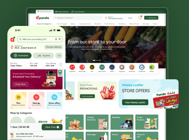
Our UI UX design agency uses dark theme UI design in their projects. Our experts know how to use the dark mode UI design so that it becomes engaging. Check out Belvedere & Barber.
Hire outsourced company for dark UI design that helps in engaging more target audience.
Chat with us on sales@uiux.studio for more details related to design services.


