Most people search for products or services online. It is necessary to make the homepage design engaging because it is a welcome sign digitally. It becomes a way to approach people when they visit any side. Many factors make the homepage interesting. The design also matters a lot, but many other factors make all functions simple and easy.
It helps to make the homepage creative and engage more audience. When any visitors visit the website, they see the homepage first, so there is a need for the best speed of page loads so that visitors can easily stay on the homepage. Companies want to convert visitors to the homepage into users. The initial action in getting over more customers is to know the components in every homepage.
Schedule Your 30 Minutes FREE Consultation
Importance Of Homepage Design for Website
The primary reason the user visits the website is its content. UI/UX design agency demand to produce practical and insightful ways on their website. Selecting a layout for content is necessary for designers to start a current project.
Many designers consider the web layout for all sites needs special to accomplish the objectives of the project. The most leading websites use related layouts because these layouts have three significant benefits:
Usable
The basic website layouts are simple because it proves that users work with them efficiently. It has many uses and its designs are also impressive.
Well-known
We set up a reliable user experience by developing a knowledge of understanding with users. The visitors view an original sense and it sees familiar features. Most users give preference to condensation content rather than focus on the unique design of the website.
Save Money
The reuse of current web layouts is a time-saver and also saves time for UI designers. They consume less time in experiments with design and concentrate more on visual hierarchy. The alternative aspects of the project have a direct impression on the user experience.
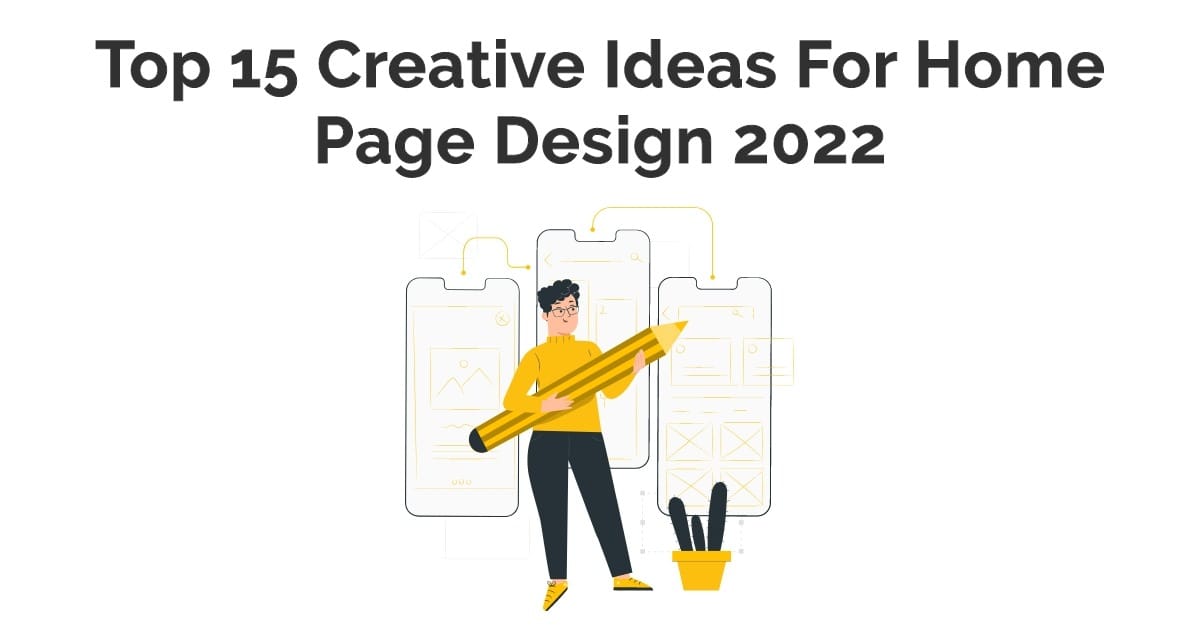
Creative Ideas For Homepage Design
All projects of design are unique and require an individualized concept. It is essential in familiar with wireframing and impressive site layouts. UI UX designer uses innovative ideas for homepage design. It helps to engage the best designs that serve in targeting more users.
Let us check the unique homepage design for website that makes the website more attractive.
Single Column
Most designers use layouts to present the primary content in a single, vertical column. This kind of design is the simplest of this list and comfortable for users to handle. Most times, visitors only scroll down to view extra content.
It is simple single-column layouts that are prominent on multiple websites. Using more mobiles affects the acceptance of this sort of layout because single-column designs fit mobile screens excellently. We use this design in apps of many personal blogs that are based on minimalistic layout principles. It becomes a familiar layout for microblogs, such as Tumblr. We use a single-column design for long scroll pages. It is necessary to maintain navigation always in sight.
Split screen
A split-screen web design is ideal for a page that has two major sections of the content of similar importance. It enables designers to represent both components concurrently. It gives equal attention. We use this layout when any website provides two quite specific adaptations of the user journey.
We use a split-screen design, sometimes that does not grow well as content grows. It is appropriate not to select this variety of web layouts when you require presenting textual or visual data in split parts. UI designers also create unusual actions by including animated details.
Asymmetrical Layout
It is an absence of balance between two sides of the design. Asymmetry is a preferred technique in the art world that later develops into prominent schemes for generating website designs. The user involves asymmetry with unevenness but, asymmetry aims to set up a balance when improbable or not favorable to practice the same weight for two sections.
Asymmetry forms to set up balance or effort, and simplifies secure scanning practice by centering a user’s attention on individual objects. There is a need to change the width, scale, and color of every asymmetrical section of content the designer pushes the visitor to remain visually involved. We use this kind of web layout when designers prefer to set up attractive and remarkable designs. It applies to create asymmetry for the effective area that dominates the eye from one factor to another.
This design work is suitable for landing pages that immediately engage the user points when encountering a webpage. It performs well with sites that have less than 25 pages. We know asymmetrical website design is not practical for every site. It probably works the best for minimalist layouts. UI UX designer uses various factors with high color contrast to combine visual power to particular design parts.
Grid of Cards
Cards are efficient containers for clickable information. It allows designers to show a vast quantity of information in an absorbable method. Bite-sized researches help users to find the content they want or drop into parts by matching or tapping the card.
The significant thing about a grid of cards is quite manageable. Grids constantly change in size, spacing, and the number of columns, and the style of cards varies based on the screen. It works best in a responsive grid layout. It also appropriates content-heavy sites that present multiple features with a corresponding hierarchy.
The user interaction with a card is convenient when users don’t get on accurately on a card’s headline or image to approach content details. It needs big screens for the best user experience because illegibility on small screens presents a bad user experience.
Magazine
It is a complicated website layout because newspapers and magazines generalize this style of web layout. It has issues in implementing enormous quantities of information for the reader in a simple-to-follow manner. Designers use this grid system in print media. We present it by using a standard grid that provides flexibility with a multi-column layout.
They use different visual weights to compute data. Digital magazines use a multi-column grid that enables them to set up a complicated hierarchy and also mix text and images. The initial goal is to scan, read, and follow a page quickly. UI design companies attempt to establish a visual rhythm for this style of website layout. It tries to create natural scan areas on the page that enable the eye to travel from one block to another. The designer attempts to check the various sections from challenging for attention.
Boxes
This design has a spacious header-width box and also has a smaller box. It takes up a section of the larger box’s screen. The size of the smaller box ranges from two to five. Each box links that lead to a larger, more complex page.
It is a functional layout that is used for individual portfolio-like sites and corporate or eCommerce websites. The large box shows products, while the small boxes provide further information on the product.
Sidebar
Navigation is an essential part of any website. The primary menu is the first thing users search for when they navigate. It is reasonable to control menu opportunities by arranging a fixed sidebar in top-side horizontal navigation.
The sidebar is a vertical column on the left or right section of the page & the sidebar lingers static. It always continues to be visible on the rest of the page as users scroll the page down. The navigation is also handy. This design performs better for websites with a comparatively restricted number of navigation options. Sidebars include content besides a menu, like social media links, contact information, or visitors quickly find it.
Featured Image
The homepage design for website is based on the idea that using concepts in design is the simple approach to sell a product. We know featured models set up emotional relationships with visitors. It has a big, bold photograph or illustration of the object, making an impressive description of the first impression. This web layout is perfect when there is a need to show one product or service that focuses a user’s entire attention. UI UX designer uses this type of layout to create a genuinely immersive, spontaneous experience.
F-shape Layout
We create this type of website layout based on the way users read content on the web. The F-shaped pattern, essentially explained by NNGroup, specifies that users frequently scan a large section of content in a sequence. It looks like the letter F or E and It sets the eyes of a user at the top-right corner of the page that scans diagonally. It drops to the latter line, and same again and searches for engaging content. This pattern is significant for mobile users because it is easy to scan. It is acceptable for pages that present specific possibilities for users to scan.
The user reacts better to the F-shaped layout, which affects a natural scanning pattern. It becomes valuable for new homepage sites or pages necessary for search results. It is worth giving the relevant content on the left & reasonable views of the page. Now it is accessible to focus user attention on a particular element by bringing more visual weight.
Z-Shape Layout
It also simulates simple scanning habits. Z-Shape Layout helps users to start in the top-left corner. It scans the top left to the top right, also creates a horizontal line. The eyes shift down and to the left side of the page, making a diagonal line. It bounces back over to right again to form a second horizontal line. Sometimes it varies and drops quickly in an F-shaped pattern. The Z-pattern is useful for sites with a unique goal and less content. This pattern is useful in managing user consideration to particular points by practicing well-placed visuals, text, and CTAs.
Curated Visuals
This homepage design for website is valuable for company employees that select what visuals reveal to the user. Curated visuals are genuine illustrations that are exclusive to your specific company. It quickly connects with the target audience.
It represents the message or emotion of a company that needs users to feel connected with its products or services. The web layout enhances the homepage of the company. It presents visuals comprehensive and valuable to the target audience.
The best example is Avocode’s use of images throughout their company website. Using illustrations for business visuals enables us to overcome relationships to engage a vast range of users. Using the specific color in the brand enhances the brand message to convey to users.
Clean & Easy Layout
It is necessary to keep the homepage layout clean and clutter-free. The user feels affected if there is an extreme result of info and images. There is a need to organize a more professional design for website content. When we select clean navigation for homepage design, it becomes more engaging. It is important to keep relevant content or images over the fold. Here, the user’s eyes catch more content.
High-Resolution Images
We know a picture is worth a thousand words, so on the homepage. Images attract users on the websites. There is a need to use the proper resolution of images. You can select the images files from PNG or JPEG. It helps to make websites speed in the best way.
Powerful images have the responsibility of many lines of text. Apply high-resolution images that assist users to explore the alternative pages of your site.
Color Scheme & Background
We know powerful factors set the tone of the homepage effectively on all site pages. Using the best color palettes makes the homepage more attractive. It makes the background more colorful with convenient preset color patterns called color palettes. UI designers also use personalized colors to make it more engaging. It is better to use the color scheme that suits your brand.
Optimize Buttons
The homepage requires buttons that work right. The buttons, or call to action, are gateways to separate pages, websites, promotional items, product galleries, and many more. When we use the button, the primary goal is to make the user action and click on this. It is necessary to keep the CTA clear and short. Fewer words have more impact on users.
Wrap Up
UIUX Studio has been providing designing services since 2009. Our designer team uses the best layout for homepage design. Hire UX design firm that helps to design your website in the best manner. We know the unique homepage designs have a powerful impact on the users. It simply targets the audience and provides the best results & expands your business with unique designs.
Get in touch with us at our email sales@uiux.studio