UI Colors
UI UX designing involves colors and playing with colors wonderfully is the best way to attract more organic traffic. In designing UI colors play a crucial role to develop a better user experience.
It covers multiple methods that need to be completed so that an interface engages the target audience’s demands.
Every step requires attention for their mute details and creates a user interface in color preferences. UI designers use many hours to select the right color to design with the best contrast of colors.
UI Colors in Design
A color is a potent tool for creating effective UI design. It is the soul of UX designers to create the best UI design colors. Selecting the best color is an art and able to change the mood of the user in a blink of an eye.
It encourages, suggests, appeals, intimidates, highlights, persuades, also shares motions saying nothing. It can become a splendid weapon in the hand of a designer. UI designers know how to use colors in their designs.
There is a need to understand the psychology of colors and the objectives of websites or apps. Every business has its preferences and aims, therefore, there is a need to analyze every detail. It helps UI designers to use the best UI colors.
Schedule Your 30 Minutes FREE Consultation
Tips For Choosing Right UI Colors
When a UI UX designer works on projects, they analyze every mute detail of projects. It helps to select the right colors in their designs because every project is based on various themes. UI designers always want to select UI colors according to a theme.
Let us discuss some tips that every designer follows for websites or apps.
60–30–10 Rule
Most interior designers use these methods in their home designing projects. It is also important in the UI UX designing process because it balances the color combination proportion in designing.
We mix the colors in the ratio of 60%–30%–10%. The most important role is to the powerful hue. 60% for the primary color, 30% for the secondary color, and 10% for the color which supports making the accents.
It becomes engaged for human eyes also knowing all the visual aspects constantly. There is a need to know the right proportion of colors so designers happily combine the colors without the risks of turning the UI into a colorful combination.
Contrast
Color contrast is an essential part of any visual design. It identity for each UI factor and executes all of them particularly. User interfaces, including only shades from the related color family, have several chances to draw users’ attention.
Designers easily handle the level of variation depending on the goals to achieve. If we want our target audience to pay proper attention to the special UI elements, there is a need for two-color contrasts such as blue and red.
In UI UX designing, we use notable contrast for CTA button designs. A high level of color contrast always does not run adequately. If we use contrast in copy content and the background colors, there is difficulty in reading or scanning the text.
Designers always create a moderate level of contrast and use high contrasting colors only for highlighting aspects. User testing helps designers to clear the efficiency of their solutions.
Psychology Of Colors
Psychology is one of the essential studies helping in a design workflow. Color psychology is important in the designing process and also helps to understand the influence of colors on our human mind and behavior or trends.
It states that our mind responds to colors while we rarely notice them. Our brain delivers signals to the endocrine that delivers hormones responsible for mood and emotions.
Each color has its impact on our mind and knowledge of the opinions helps UI designers to convey the message to users to generate the required action.
Meaning Of Colors
Red: It suggests feelings involving love, confidence, passion, and anger.
Orange: It is an energetic and warm color, making the pleasures of excitement.
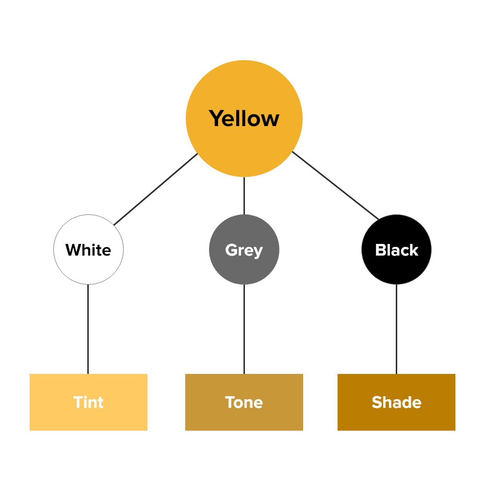
Yellow: Yellow represents the color of happiness, the sunlight, joy, and warmth.
Green: Green is the color of nature, which produces calming and continuing feelings.
Blue: It describes some corporate images also correlated with distance and sadness.
Purple: We correlate Purple with royalty and wealth and the color of mystery and magic.
Black: It represents a mystery, traditional and modern.
White: White color means purity, innocence, wholeness, and clarity.
UX designers always recognize that visual consciousness is individual for everyone. All factors depend on many factors but the key aspect is about the target audience preferences.
Colors Related To Culture
Colors represent various aspects of our life, using them in the UI designs presents various themes. Every country has its own culture, so there is a need to know about cultures before we use UI design colors.
All projects are concerned with various countries worldwide, so there is a need to understand the project goals and their background.
The major aspect is that one color may have opposite meanings in various countries. In European countries, white color represents purity and uses at weddings, but in many Asian countries, this color means death and sorrow.
UI/UX designers always use the color according to country color so that their target audience will happily use products and services. Designers reduce risks of misinterpretation by accepting the means of cultural color understanding.
Color Harmony
UI design’s primary aim in their design is color harmony. The primary aim of the best design is to please users and make them comfortable.
Designers always want to get the balance into user interface design. Color harmony is the arrangement of the colors in a design that is perfectly and adequately for users’ knowledge. Harmonic colors lead to a first reaction from the website or application.
Many designers analyze all points from every angle and also recognize the basic color schemes that work completely. Let us discuss some important color harmony.
Monochromatic: It is based on one color with various tones and shades of it.
Analogous: This scheme involves colors placed right next to each other on the color wheel.
Complementary: We can use this with the mix of colors arranged in front of each other on the color wheel and it strives to deliver high contrast.
Split-Complementary: We relate it to the previous one, but it applies more colors. If we prefer the blue color, there is a need to take two others next to its opposite color, like yellow and red.
Triadic: UI UX designers work on three separate colors which are equidistant on the color wheel. Expert designers suggest using one color as a principal, and others as accents.
Tetradic or Double-Complementary: It uses four colors from the wheel that have corresponding pairs. When we compare the points in the preferred colors they form the rectangle.
Ideas From Nature
We all love nature and it becomes an inspiration for UX designers to use UI colors. Nature is the best designer in the world & becomes an inspiration for UI designers.
Color combinations that are seen in the natural surroundings are always ideal. People love to watch sunsets, dawns, autumn, forests, and winter mountains that are full of natural color combinations.
There is a need to get inspiration from the world so UI designers can use color creativity in their designs. The UX designer team creates the best design with the help of color combinations in their designs. It increases their creativity.
The success of a website or apps depends mainly on the colors chosen for its UI design colors. There is a need to use the right colors that help users to feel comfortable with a product.
UX designers use colors in creative ways to put people in the frame of mind. It constrains them to take action by using the relevant color palette. There is a need to use colors perfectly so that users can attract to websites and apps quickly.
UI Colors Design -We Use
UIUX Studio is known for its creative designs. Our designing team uses UI colors in the best way so that we come with engaging styles. We are providing services to many notable companies and use the best color contrast in design.
Let’s see some of the major projects that color combinations we use in it.
Project: Freshminds
Platform: Web, Mobile
Our Role: UX Research, UI Design, Landing Pages, Social Media, and Print Design
Colors We Use:
- Brilliant Rose #EE4D9B
- Tundora #4A4A4A
- Abbey #58595B
- Silver #cdcdcd
- Wild Sand #F5F5F5
- White #ffffff
Project: Belvedere
Platform: Mobile App
Our Role: UX Research, UI/UX Design
Colors We Use:
- Black #000000
- Mine Shaft #343434
- Driftwood #B8904A
- Silver #C0C0C0
- Straw #D6C38E
- White #ffffff
Our expert team of designers works on various projects and delivers all projects according to their color guidelines. Using the UI design colors is a creative way to design websites or apps.
Sum Up
Using the right color according to the project is an innovative way to attract more clients. There is a need to use the right color palette for designing the best sites or apps.